- Views 2,542
- Downloads 424
- Fans 2
- Comments 15
-

-
 67.50%(required: 65%)
 Design
Ling 75% bigshootergill 70% saxman1089 70% Scoop 70% Sulakke 70% Xeccah 70% CoasterCreator9 65% Cocoa 65% csw 65% Liampie 65% RWE 65% G Force 60% 67.50% -
Description
One of the most classic RCT themes, but we still haven't seen it enough!
Impulse was a great help in this. He did some really nice foliage and helped me with some parts of the coaster and the supports.
Also thanks to Faas for giving some good advice on the coaster and TPM for hosting the park and helping with the layout. -
2 fans Fans of this park
-
Full-Size Map
-
Download Park
424
-
Objects
291
-
Tags
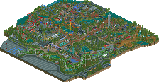
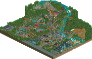
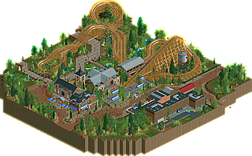
![park_3124 [MM2014 R1] Copperhead](https://www.nedesigns.com/uploads/parks/3124/aerialt2764.png)
Everything about this is lovely - the layout, the framing, the station - but that queue is just so randomly bland and weirdly under-detailed.
I love weathervane (I said right?)
Attached Thumbnails
Here it is, then. I had a blast working on this, even though my builder share reveals I didn't do much. MK asked me to collaborate on this project, and I thought, yeah, why not. GCI has always been my cup of tea and I was genuinely surprised when MK showed me the layout. Just some small tweaks and it was good to go. Then he started to build the amazing plaza/storefront combo, and I thought it looked fantastic. Eventually, we had it all filled up and it was all ready. In other words, a pretty fun build.
Here's the builder shares for anyone interested:
I practically did a lot of foliage and little tweaks to the pathways and/or layout. I also did the supports for some elements of the ride.
Now for a review.
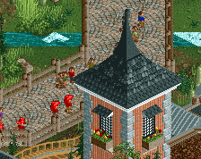
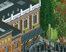
The atmosphere is great. Neat little buildings, great mainstreet, but the thing that pops out the most is that storefront. A serious step up from your former archy. My only complaint with this area is that the nicbrellas kinda look out of place. The paths in general look a bit dead, especially near the main drop, mainly due to the lack of peeps wandering around. I must also say that I completely agree with Ling. The queue line does not look as detailed or as good as the rest of the park.
Foliage is pretty good, I really like the overgrown look of it. I'm not completely sure whether those cacti are in place, but they look alright, so to say.
Layout is just fantastic. It really stands out, despite it being brown, like the majority of the park. Just nothing else but praise.
I think this is a pretty good design contender, and it will definitely add more quality to your RCT2 portfolio.
this is a really nice little composition. the layout is good and I like the way the brake run is positioned for that tunnel after the first drop. the map is all layed out well to balance out the coaster and the landscaping is pretty. I enjoy the scale of the buildings and the vibe is solid, a bit "dutch" but thats cool too. I wish there was a bit more on the map, maybe a bit more warm color to make the surroundings pop. but its a solid little park.
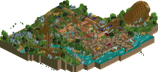
Thats a really big burger bar. Really enjoyed the foliage around the coaster.. really atmospheric too with the watertower next to the first drop. Nice work guys!
Really nice design you gave us! It shows you are really getting better MK, this is overall really pretty and nice. The lay-out of the coaster is good, nicely paced too. You managed a good composition so it has some interaction and isn't just framed in.
Foliage is pretty, just as landscaping. Archy is quite good but scale is bit too big for my likings. They are just a bit too big imo. Also not a fan of the aba path style used in some places, but those are minor complaints. Overall a pretty solid piece of work. Good job!
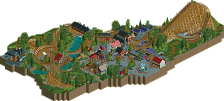
Some really nice micro here, foliage, pathing and some of the arch was quite good. Foliage has a bit of a BG feel which is a huge step up, the layout also was solid, though I felt lacked either height or interesting terrain/foliage. Without any big trees around the ride I feel it wouldn't be that interesting of a coaster.
That sort of brings me to my bigger issue, the macro of the map just feels a bit off. The main offenders being the rotor placement, which I just cant stand. You have these great buildings but place a simple flat ride right in front of them, just feels sort of lazy. Not singling you out here, lots of people do this and I just cant stand it. Always feels a bit forced.
Another small thing I'd wish you worked on a bit more is the placement of the queue and coaster entrance/exit. For a design, the queue is a little plain, just placed in between the station and midway like that. Importantly, if you're going for realism, having the exit path and entrance so far away from each other is a little problem, if you look at real coasters you'll almost always see the two paths placed closely to each other, or at least within a quick walk. Just something to consider for the future, it helps make the rides feel a bit more cohesive and complete I think.
Anyways, definitely a step up for you MK, you're really getting close to breaking out. Just got to consider the macro and big picture a little more and perhaps go a bit more ambitious in your ride design, and you'll have a real winner when you combine it with your growing archy skills and new found foliage abilities. However for now, this is probably only a 60% for me, just dont think the coaster stands out enough for this to get design, in combination with the relatively iffy macro planning.
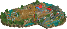
Well done MK! You've improved quite a lot recently and it shows in this. The layout is decent, the archy detailed and all serves a purpose. The foliage too seems okay, if a bit strange sometimes.
I do echo the others about a few points though. That patch of land near the first drop feels empty and boring. Surely a few stalls, or even beches and lights would've fixed things?
Anyway, glad to see you're going from strenght to strenght. Keep it up!
I wish the layout was longer and the terrain was more interesting, but overall I really liked this. Great architecture and general feeling. I also agree that the queue is lame but I think this is good enough for design.
Congrats on the Design MK98!
Grats on your first design MK! Great work!
This is really nice!
While the row of buildings near the Round Up didn't do much for me, the coaster itself was really cute and the station and adjacent buildings are very nice. It feels a bit disjointed but overall I can definitely see why it won design. There's some really nice stuff here.