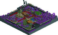
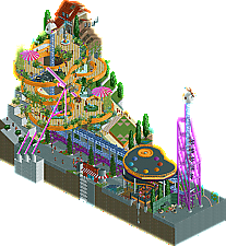
Park / [MM3 R1] A Petty Squabble
-
 07-April 19
- Views 9,332
- Downloads 503
- Fans 2
- Comments 38
![Park_4380 [MM3 R1] A Petty Squabble](https://www.nedesigns.com/uploads/parks/4380/aerialm4172.png)
-
Description
Bick
.
.
.
Bock -
2 fans Fans of this park
-
Full-Size Map
-
Download Park
503
-
Objects
221
-
Tags
Similar Parks
-
Error - Park name not fou
-
Internet City
-
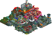
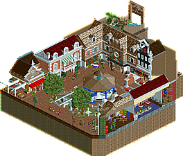
[H2H8 R1] Wit's End
![park_4074 [H2H8 R1] Wit's End](https://www.nedesigns.com/uploads/parks/4074/aerialt3814.png)
-
Virus
-
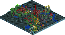
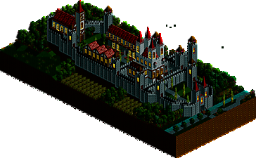
[PT4 R5] Unnamed entry
![park_2850 [PT4 R5] Unnamed entry](https://www.nedesigns.com/uploads/parks/2850/aerialt2503.png)
-
The Happy Place

How to vote?Round 1 - Group O
__________________________________________________________________
inthemanual - A Petty Squabble
JimmyLaessig - RIP Holland
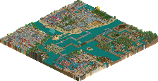
Version1 - Burg Bärenfels
hoobaroo - Atlas Bulwark
__________________________________________________________________
First of all, check out all the entries in this match. If you can't view one or more entries, for example if you don't own LL, then please, do NOT vote. Once you've viewed all 4, select your favourite and second favourite in the polls above.
After 3 days, we will close the poll, the results of the two polls will be added together, with the votes from the second poll weighing only half as much as votes from the first poll, and the 2 highest scoring entries will proceed to the next round. The third placed park will place its creator on the reserves list for the next round of the contest.
Votes are public and so any cheating of the system, betrayal of honesty or mistrust will be picked up on and will be dealt with.
Initial reaction: holy crap these are intense for round 1.
Dang Hoobaroo.. really impressed. Had to rotate my laptop screen to understand the sideways castle.. really cool.
ITM: really nice conceptually strong platforms!! The coaster station would look good in any park.
Jimmy: Strong archy. Even though its a cutout of a larger park, the interiors were done really well.
V1: A night time micro is a bold choice. Very scenic miniature castle. Could've used a tiny bit of movement like the other 3. Still a really cool considering the variety of buildings/structures inside the castle wall.
This has frightened me
Alright! Way to kick off MM3 with a strong first round!
My votes:
1. ITM - beautiful color palette. Very out of the box and artistically explorative, which is always a plus in my book. The art palette station is very well done, as are the platforms. Bick Bock is cute, and the overall composition is very nicely put together. Love the overall concept but I also don't understand all the references so I'm sure a lot of it has been lost on me (D.A.R., warm/cold, etc.) Coaster was not much to look at but I understand the back and forth concept behind a shuttle like this. Nice use of trackitecture names to add to the concept, but some unnamed stalls / staff is a missed opportunity to sell the narrative even more.
2. Hoobaroo - what a wonderful surprise! From your screens posted just before MM3 kicked off, we all knew you had potential, but this is a step up from those first screens. Overall concept is intriguing. Not sure about the coaster layout or the meaning behind the name Higgs. The tower is nice but could use more detail, especially since it's been cut off the map, that interiors would have been a nice addition to add characters / story / narrative to the concept of these two worlds. The sideways world is great in idea and the execution is aesthetically pleasing but without a ride / peeps there, there is not much intrigue to keep your attention there. Overall a great effort and earns my 2nd vote, I'm excited to see what's next from you!
3. Jimmy Laessig - great architecture, very pleasant and well crafted. Not much else to comment as I'm not aware of the concept nor the meaning behind the ride / park, if it was a recreation or inspired by a specific reference? This is what I imagine when I think "micro park" and yours was a good example of the "part of a larger park" style.
4. V1 - Cute castle, well crafted and I like the surrounding orchards / foliage. Very clean and aesthetically pleasing. However the night palette + no ride + no peeps + no staff + no other intrigue or concept = seen all there is to see in 10 seconds.
Damn hoobaroo that was an idea I had for a future park ahahaha you pulled it off so well though and I love it. You have so much talent with this game and while I think there's was you could improve, you're off to an incredible start and it's so cool to have somebody new with talent like this. Amazing concept, and visually it felt very Cocoa (that's a good thing)
ITM, I can't tell if you're throwing shade at me and AVC and other rct art nerds but ironically this is a really interesting piece and has a lot to unpack. By sheer virtue of critising the artistic fluff in the community, you have created an in depth, expressive and intellectual release that will be talked about for years with countless arguing over which movement it fits into. IDK if that was your intention but lmao
Jimmy, it's cool, I like the archy, just hard to see because of the tight horsehoe shape. It's good rct, but it feels like a part of a park rather than something self contained
V1, I really liked the night time setting and the micro scale castle was really cool, it just needed some movement and sound to make it feel a bit lively
tl;dr - I really enjoyed ITM's and V1's a lot.
Petty Squabble - I'm not huge on verticality in micros, but this was cleanly pulled off. Subtle theme was really clever too, and there's honestly not much I have to say in terms of anything particularly negative. It's great.
Burg Barenfels - The lack of movement didn't cross my mind; I love miniature modeling and stuff, so this is right up my alley. Love the night time atmosphere and all the little details surrounding the castle.
Atlas Bulwark - I was very close to voting for this one; really, all of these entries are fantastic. There's a lot of detail hidden underneath the structures. I'm a little confused if the big blue wall is a waterfall or underwater or something different. I think I get it being sideways? I sorta wish the underground bit reflected that a bit more too. Really excellent concept, perhaps a little further polish would have brought it to the next level for me.
RIP Holland - Solid work, very nice architecture, well thought out interiors. I think it's let down a little bit by the composition of the section (horseshoe, as said above), but none of these entries are far off from each other in my opinion.
Great work everyone.
Jimmy - An excellent realistic micro. Details are excellent and totally on par with the modern greats. The diagonal facade was one of the best diagonal structures I've seen in a while. my only small nitpicks are that the umbrellas were a bit low.
V1 - I keep trying to zoom in on this. Excellent miniaturization. Unfortunately lifeless though, but the night palette adds some mystique and charm to the entry.
Hoobaroo - Really clever idea. Super cool execution as well. Some of the colors and details may be a bit overly whimsical, but overall a fantastic piece of RCT. I'd be surprised if this doesn't move on.
A Petty Squabble - Brilliant. Loved the cheeky dig at D.A.R. and the way you made the rats vibrate is so absurdly perfect, it's hilarious. Foliage is fine for what it needed to accomplish. I didn't quite get some of the things that looked like glitches at first but then seemed to be intentionally, like the duplicated supports or parking spaces (?) next to the coaster. Conceptually though I think it's going to be hard for anything in R1 to beat this.
RIP Holland - Loads of fun interior detailing. I can see whether or not this makes it through setting the tone for the rest of the contest - whether people are going to award insane amounts of micro-detailing because the micro format makes that style more accessible, or if people are going to want to see stuff that's conceptually bolder. It's plenty warm and lively, not overly ambitious. Perfect for R1 I think - showcases huge potential, but plays it a bit safe.
Burg Bärenfels - I had to actually switch off the color palette here to fully appreciate it. The use of tiny trees is so utterly perfect here. I wonder if having the castle in a slightly more square or circular footprint might have given you more opportunity to do something interesting in the middle, as a bit of a set piece? Other than the relatively small primary structure and the chapel at the end, it's actually sort of hard to identify anything else. The other "structures" look like they belong in a small village, but the overall structure isn't big enough to be a proper walled city. As part of a micro showcase in a park I think this would be brilliant, but I just don't know if it stacks up against the other stuff in this match.
Atlas Bulwark - I think a few objects (that, naturally, don't exist yet) would have really driven this home, for things like vertical water or rotated land blocks, but holy hell what a concept. I think the exposed underground section was a good call but could perhaps have used more development - the rock work in there is really painful in comparison to the tasteful landscaping outside. The building style underground also doesn't quite match up with the style outside, like one is trying to be realistic and one fantastic, rather than one conventional fantasy and the other "scientific" fantasy, which is sort of the vibe I got from your description. I do think the vertical drop coaster is maybe 30% longer than it needs to be - it's already quite a busy plot. The fact that I have so much to say on this one definitely speaks to the surprise that a lot of us feel at this entry. Brilliant concept, and that's what this contest is all about for me, so I'm voting this one through.
My thoughts:
A Petty Squabble: As pretty much expected from you a very conceptual micro. I don't get a lot of what you went for in the map but I think the main idea is lovely. A very fitting commentary on our discord server. Would be lovely to get an explanation for all the little details at some point. Great submission!
RIP Holland: Very strong realism entry right here. I think you did a very good job capturing the dutch area and I really love the general architecture and detailing. Lovely work, as I expected from you. PS: No idea how much of the Dutch area really burned down, so RIP is a tad dramatic
Atlas Bulwark: A lot of people rated you highly based on the screens you posted a couple of weeks ago and I think you even surpassed these expectations. Amazing entry with a very convincing sideways part. You managed to build a colorful castle without making it looks messy. This truly looks like something build by an experienced player and I have no doubt that you have a bright future on NE.
Burg Bärenfels: Let's just start by saying that I knew I would be fucked if all other three submitted. I definitely felt more like a fourth seed when Hoobaroo was drawn into my group and I think that suspicion was confirmed. I don't really think I would have done better with a more traditional micro. I was actually shocked when I saw that nobody has ever done a micro scale park in MM, at least to my knowledge. Originally my entry was supposed to be Hemmelsburchten from the Efteling dark ride Droomvlucht, but I kinda started free building a castle in micro scale and was more interested in doing that instead of the more abstract castles the dark ride has. I am quite happy with my micro and wish the other three members in my group all the luck in the world since I'm sure they all get to build a round 2 submission.
The castle is meant to have three parts: The garden/lawn in the front, the actual keep in the middle and the civilian's quarters in the back with an inn, a house for the servants/soldiers/etc. and the church.
1. Petty Squable: firstly, I appreciate the "digital media" tag- really a first glimpse into the overarching theme of this micro as best as I can work out (and I guess with any work of art, its the job of the audience to have their own interpretation). On any level though, its aesthetically very appealing. Lovely, flowing layers and beautiful colors. I love the mine train catwalks and the way the spike goes through the platforms of people. The ride at the top of the structure reminds of lenox mall in a way which strikes me as intentional, at least in my interpretation of the park being about the sort of rct/ne/rct-as-art meta conversation of the last couple years. theres a lot of cool details, some of which I don't understand but thats fine because they all add some level of complexity to the composition. the "DAR" rats (disneys american realism? ), the palette building, the two-sided facade which drips down the edge, etc. I think you did a good job with the foliage and atmosphere too, and used some more abstract bits to your advantage without making it too overwhelmed with floating objects and hard-to-read lines. great work, easy #1 for me. (and how could I forget the conceptually stronger umbrellas in this park??)
2. hoobaroo: I have to say, the fight for 2 and 3 was really close for me, even if the polls aren't really reflecting that. they both show skill in very different ways. I was so impressed by this though, and happy I backed you at least one round in my bracket- I think we all saw a lot of potential in your first screens here which really shone through again. Colorful, warm, a bit dark, atmospheric- like a more naive version of turtle. The sideways stuff was managed excellently and I loved the dive loop off the side of the park. Its a bit rough around the edges, especially underground, but the ideas and vibe shine through.
3. jimmy: so so close to number 2, so don't let the polls get you down. this entry is really good still, with some great archy and a lovely little idea to pay homage to. obviously it suffers in comparison to itm and hoobaroo just on content and rides but that doesn't diminish its quality at all, just its ability to contend in the matchup. solid realism and I particularly like the diagonal off-tan building.
4. v1: for all your negativity you still turned in a good entry with a pretty neat idea that I hadn't expected from the aerial. It works really well for the most part, with the exception of the leadlight windows whose scale is just burned into my brain and sort of kept 'resetting' my interpretation of the overall scale. Still, the castle was nice but I really think you did the most well with the surroundings. Lovely little forest with farmland. I think you know you got outplayed but I think your entry was still really solid in a very difficult matchup- perhaps one of the hardest in the whole bracket.
hoobaroo - amazing world/concept, the real pros here have feedback to improve the small details but as a new NE member the sideways section is so impressive to me
ITM - even though I don't get the jokes the plot feels so lighthearted and fun while still having really skillful stuff like the "conceptually strong platforms" with the riding going through.
Jimmy - such great interiors here, love the restaurants/shops and the pirates queue with paintings on the wall.
v1 - gorgeous and meticulous but not much to see after an initial viewing
ITM: Wow, really cool visuals here, beautiful to look at. Cool to see something more abstract and less grounded than your previous micro stuff too. I think you executed the concept well and it definitely lives up to expectations, though I struggled to understand some of it.
Jimmy: Quite enjoyed this, the architecture is top notch work and the detailing in the interiors is fab. The diagonal facades especially were fantastically done.
Version1: Nice work dude, didn't quite realise it was meant to be a miniature at first. Wish there was a ride on the map though, or some frozen staff or something. The castle was nicely made though.
Hoobaroo: Damn, this was a surprise! Really loved this. The concept is wonderful and feels like a classic micro, and it just feels so fun and inventive. The underground portion could have been better executed I think but this is still my favourite of the round. Well done.
Let me go through the easier choices first.
#1. ITM. This is the winner for me. Loved the station, that is the highlight of the entire micro, super creative stuff here. The support work is right on, and I love how you used the trackatecture along the launch section. That area of the park turned out so clean. I'm not sure how I feel about the foliage on the upper platforms. I think it messy's up an otherwise clean garden feel. The teeter-totter at the top is a nice touch, as it gives guest a reason to go up there. It hits a soft spot with me as It reminds me of the one I rode in Vegas. Overall great micro, winner for me.
#4. Version 1. I like the night mode, I feel like it adds to the atmosphere. But that's about it for atmosphere in this one, and that is the biggest problem for me. There's no peeps, no rides no cars, no fires, no smoke from smokestacks, nothing moving. It just feels lifeless after viewing the competition. Its a nice castle, and a nice micro. I feel this may have fared better against a different group of parks. And peeps would have helped. Sorry man, nice micro, but 4th for me. Hopefully it catches someone else's attention.
And now that leads me to the hardest decision of this group. A cool idea vs well executed realism. Fantasy vs Real life. An Imagineer vs Engineer. Who to send through?
#2. Jimmy. Well its the realism that wins for me. But more specifically its the interiors. They are what put this over and punch your ticket to R2. Shop looks like a shop, restaurant looks like a restaurant, etc. They add so much life and charm to this entry. The archy overall is very nice, especially the green shop and teacups. Love the atmosphere here, a stark contrast to V1's entry. Great job. I should have put interiors in my micro F***.
#3. And that leaves Hoo. I liked the idea, the sideways building is really cool. Reminded me of a scene in one of the shitty Pirates of the Caribbean where they go over the side of the world. Archy was good, colorful. The cutout, while nice to have, didn't do much for me. I feel like it was just a bunch of rocks down there and not too much to see. Props for fitting a whole layout down there though. This is tough, I don't have a lot of bad to say. It was close, Jimmy's just edged it. Its probably my personal bias to realism, its not personal. A sold effort and a unfortunate 3rd.
A fantastic round, I really enjoyed looking through these parks. GG boys.
#1 ITM
I don't think I have anything to add to what others have said. It's just a great micro. Really liked the palette and it all just looked good.
#2 Hoobaroo
WOW. Just wow. I fell in love with this one. The way you integrated that dive coaster in such a small footprint is just phenomenal.
Why didn't I put this in first place? Because it also had its flaws. You've got an eye for good archy, but the use of basic objects made it look as if it wasn't finetuned or just too plain. Great work, there's a bright future for you here.
#3 Jimmy
Nice realism, although I do think it didn't really suit this micro scale. It'd look way better when it's part of a park, just like its real-life counterpart. What's there is nice, though.
#4 V1
I feel sorry for him, because his group was very talented. He also found himself in an unlucky seed. His entry was nice to look at (I really liked that dark atmosphere), but it lacked movement, in my opinion. Most of the times things like architecture, water or just anything else compensate for the lack of movement, but here, it didn't work out. For me, at least. Because I think that although this entry was far from horrible, it just didn't spark my attention in any way. Your building skills are still improving, though. I think this result shouldn't let you down. You're doing great and if you just keep building the things you enjoy, you'll be golden in no-time.
great first match! All four entries were strong and the builders should be proud.
#1 itm:
This is a testament to how well you've mastered the micro format. Its not overwhelmingly dense or vertical, yet I spent a good 5-10 minutes continually finding new little things. You did a great job picking a few motifs and sticking to them throughout, such as the monorail platforms. The station was also a great idea that was pulled off really well. Though I don't completely understand the story, the chicken heads and rats were hilarious to watch. Only negative feedback I have is that pallette actually hurt my eyes a little with the brightness, and there were a few sloppy/unfinished bits like the windows that were off (unless that was intentional?) but that's just me being an asshole.
#2 hoobaroo:
I knew you had potential from your screens and this is a huge step up from those. Based on this you could be the dark horse of this competition. Love these types of micros and it reminds me a bit of Jimemo and Levis's entries from MM1. The macro on the main block of buildings look great and i think refinining of your micro will come with more experience, at which point you'll be even tougher competition for the #1 seeds. Also the sideways buildings are insane. Coaster for the most part is good but kind of wish there was less cover on it (without cutaway) and more interaction with everything else on the map.
#3 Version1:
I don't think voting will go your way on this but don't feel demoralized by the results. I think a lot of what I see from you reflects your lack of confidence/stress, but this felt really natural and like you had a really good time building it. All the way through, the small scale is pulled off convincingly and it really does feel like a model. Unfortunately, although it fits the theme, the lack of movement and rides made me spend much less time viewing it than the others and it doesn't quite hold up against them, but I could've seen you getting first or second in another bracket.
#4 Jimmy:
Great archy and interiors! Although it looks really nice I don't have much more to say than that. I think I'll always prefer entries that capture the entire idea within the map over "snapshot" entries. Again, I think this would've advanced you to the next round in a different bracket though.
What an awesome first match, I feel a little bit intimated by the quality.
ITM:
When I saw the overview image I already knew this was gonna be good, and good it was. Although it did look a bit more impressive from the overview image its a very strong entry. The shapes you created with the monorail track were awesome and I also liked the station for the impulse coaster even though it was quite simple. I'm not sure whether I completely got the theme but I enjoyed it nonetheless. I did get an error trapper multiple times while having this park open, not really sure why.
Jimmy:
Pretty nice entry, I'm a sucker for diagonal buildings and I think you executed them well on this map. In general the archy of this map was strong and I loved the little details like the bridge. I think this entry was quite atmospheric although I do feel like the overall concept is maybe a bit boring compared to the other entries in this match up. I also wish you extended the black tiles all the way to the edge of the map, it felt a bit sloppy the way it looked now.
Hoobaroo:
Very cool concept, I thought about doing something like this for H2H as well but in the end I decided against it, however I think you executed it beautifully. I like how colourful everything is and it really makes everything look better even in places where the archy is a little bit less effective. I do wish that you had made a custom object for the sideways water but overall this entry was still very good. Nice work and definitely the most surprising entry for me this round!
Version1:
Very nice entry, I love the concept of scaling down the scale of the things on the map, when I first saw the overview I was like: how the hell does that fit within 15x15 tiles? The castle itself is really nice looking and I think you executed everything quite well. I do think however that the map was lacking movement, which I think is something which is difficult to add given your concept. Because of this the map lacked a bit of life and overall there wasn't really anything to really draw me in to explore the map more. I was also hoping for a strong readme from you since you did so well with the readme for the Apprenticeship.
Like I said, overall I think this was a very strong round, definitely a bit unlucky as I think the people who will lose in this round would probably have done better in other rounds.
This is a great round and there aren't any weak entries... I honestly had a hard time voting but here are some quick thoughts:
1. Atlas Bulwark - It was tough picking between this park and ITM's entry but I chose this because it was just so much fun to look at. Some of the archy and rockwork needs improvement but this feels so refreshing and yet for some reason so nostalgic. I'm looking forward to seeing more from you hoobaroo and I wouldn't be surprised if you got far in this contest.
2. A Petty Squabble - I admittedly don't get most of the references and wish there was some explanation but as far as the actual park goes, this is awesome. The artist's palette is amazing, as are the platforms, and it's all so clean. My only complaint is that the palette seemed unnecessary... that pink color hurts me eyes.
3. RIP Holland - Kind of an unlucky entry. The architecture was great and I really liked the interiors but it didn't catch my attention for long. I guess I'd rather see an entire concept executed rather than a segment of a park. This park and V1's would probably hold up much better in a less conceptual bracket.
4. Burg Bärenfels - Another unlucky entry and a nice park that was well executed. I legit tried zooming in more the first time I saw this and the miniature effect was very convincing. All it needed was some motion and a little more ambition. The nighttime effect also kinda got in the way.
1. Squabble
2. Bulwark
Wow, certainly a lot of diversity within this first match. I personally think voting will come down to people's preferences for a particular style, rather than the degree of execution and skill.
#1 Hoobaroo - Atlas Bulwark
Love it. The whole sideways thing is a great concept and you've presented it cleanly. Using the default garden clock as the clockface is a nice touch, as are the barrels. I like the castle design and colours, and the rides for the most (above-ground) parts. The underground seems a little undeveloped in comparison, but not enough to dissuade my vote. As a nitpick, it's a shame there isn't a vehicle you could've used for Cross-Atlas Commercial Express that had a fully vertical sprite. But still, great entry.
#2 Version1 - Burg Bärenfels
I think what I like about this is the way you've defied the idea of micros, and created a large landscape and structure. Yes, as others have said, it is static, and I think a little flowing water, a boat moving about, or a flag flapping in the wind would've added a welcome bit of life to it, but as it is, I think it works almost like a picture. There's lovely detailing all round, a nice mix of textures, and the gardens and fields are very believable. I also think your palette choice is justified too, with the bright windows creating warmth to what could otherwise come across as spooky. I really like this entry and the attention to detail you've paid in it.
#3 JimmyLaessig - RIP Holland
It's gratifying to see someone pay homage to a tragedy in this game, even if it is only on 225 squares Some really pretty work throughout. The architecture is excellent, including some highly detailed diagonal facades, and I think the shop interiors are well done too. As mentioned, the horseshoe shape does close it off a bit (but I suppose it's the most effective way to pack in the details), and from certain angles the brown and tans are a bit dominating, but I'd mark that down to capturing the realism, and overall these aren't major drawbacks. I think it's just my tendency to lean away from heavy realism that prevented me from voting this higher, as what is there is superbly done and very credible. Nice work.
#4 inthemanual - A Petty Squabble
This park certainly had an awesome impact on my first opening, but after looking around it, I think I'm missing out on a lot of the references. I can see the fantasy vs. realism aspect (and I do really like the idea of a back&forth coaster representing this squabble), but other than that, I feel as though a lot of the jokes are going over my head, and I'm left to interpret everything into being what I want. Granted, this is how art works, but to me it's a bit of a... copout, where nothing is wrong because that's how it's supposed to be. Nonetheless, there's a lot of individual elements that I like, such as the form of the elevated garden platforms, the D.A.R. mice, and the Bick/Bock chickens quite suitably showing how this squabble sounds. Overall, there is a lot to appreciate, and I admire your decision to tackle something like this in a micro. I can certainly understand why many will vote this highly too, but I guess I'm too much of a philistine to fully admire it.
edit: sorry ITM, this sounds a lot harsher than I intended. I did enjoy the park and it's technically clever, but it's just not my preferred style in comparison to the others in this round.