Park / Pollution at Its Finest
-
 09-April 19
- Views 9,163
- Downloads 499
- Fans 0
- Comments 31
-
No fans of this park
-
Full-Size Map
-
Download Park
499
-
Objects
206
-
Tags
Similar Parks
-
La Residenza Di El Padrino
-
Cloud Harbor
-
Overlook Hotel (fixed)
-
Forest Frontiers
-
Daytona Derby
-
The Dawg Pound
Round 1 - Group I
__________________________________________________________________
Liampie - Nibiru Periapsis
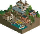
In:Cities - Ponta Delgada
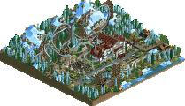
Jaguar - Karst
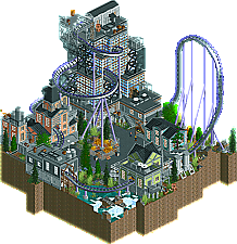
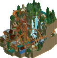
barNID - Pollution at Its Finest
__________________________________________________________________
How to vote?
First of all, check out all the entries in this match. If you can't view one or more entries, for example if you don't own LL, then please, do NOT vote. Once you've viewed all 4, select your favourite and second favourite in the polls above.
After 3 days, we will close the poll, the results of the two polls will be added together, with the votes from the second poll weighing only half as much as votes from the first poll, and the 2 highest scoring entries will proceed to the next round. The third placed park will place its creator on the reserves list for the next round of the contest.
Votes are public and so any cheating of the system, betrayal of honesty or mistrust will be picked up on and will be dealt with.
Wow. This group is stunning. I'm going to take a while to vote on this one. All 4 entries deserve to go through
What a group this is! This entire contest is just a treat. Absolutely brilliant stuff from all of you.
#1 Jaguar
This was a hard choice for me as I loved the constant chaos of Liam's entry, but I thought this massive chunk was just a bit better. It felt humungous, yet very sophisticated. There's just a lot to explore. I really liked that aspect. The giant waterfall was also executed beautifully. I can only imagine how long this must've took too build.
#2 Liam
Chaos. Chaos everywhere. The hacks on this were crazy. Just mental. Loved those explosions. No clue how you pulled that off. Just brilliant.
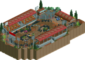
#3 In:Cities
Nice looking Italian village, just a great atmosphere. I think the thing that made me put this on #3 is the awkward hill before the cobra roll. The rest was just excellent. Furthermore, I think the overusage of white also contributed to this. Still, a very good entry.
#4 barNID
Great stuff. I don't have much other to say than that, I think. The lack of peeps was a bit of a downside but apart from that, this was pretty good.
Damn, shame someone has to lose this one, not sure if I can vote.
Based it off of Ponta Delgada in the Portuguese Azores - which explains all of the heavy white usage.
Although, Delgado makes it sound even more exotic - so you can leave the spelling how it is Laimple
Well, as I've typed in around three previous groups, this is the hardest group I've to judged so far. Lets see if that statement stands for more then an hour this time lol.
#1. InCities. Gorgeous. Beautiful palette. I loved the archy and the atmosphere it creates. I don't think too much white was used, I think you did a great job of balancing it actually. This is a micro executed to perfection in my mind. Small details in this add alot for me, I like that the tower is open so you can see the lift hill. I love the river ride and how much we get to see of it. The cutaways to the river ride under the station are awesome, rock work foliage down there is spot on. I think pacing is important and this micro nails the perfect density in my mind. This is my winner of the group, and close to my favorite of the contest so far. I think you would have given Xtreme97's masterpiece a run for its money.
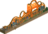
#4. BarNiD. This is about as good as it gets as far as 4th places go, I'd go as far as to say it's a crime. It's a shame your in a stacked bracket. The archy here is nice, I liked the station building and the tall skyscraper is nice too. I like that the skyscraper is almost all glass, so that we can see the coaster go through there that's a nice touch. I'm going to echo Impulse and say that peeps would have helped this one for me. it's amazing how much those guys provide atmosphere for free. I like the layout of the coaster, however I do not like the supports for the top hat. I think some top thrill dragster/king da ka supports would have looked better there. Overall a great entry, sorry I have too put you in fourth. Glad you entered the contest.
And that leaves the battle for the last advancement spot in my head between liam and Jag. Two very different ideas.
#2 Liampie. I'm giving it to the crazy mess of a space battle. This is chaos, this is madness, this is fun. I love it. So many cool things here, I like the Air Force ride. Lazers everywhere. The crashing ride for noise is genius. Nice layout on the coaster, landscape is barren/destroyed which helps sell the atmosphere for me. Trash man was funny. Archy .... exists i guess lol. The rubble building is the highlight for me, the ufo's looked ufo-eeee enough I guess. This held my attention for a long time, and i'm sure I still didn't see everything. I don't know. Its fun, it's second for me. Well done
#3 Jaguar. So the dreaded third place for me is Jag. There are really beautiful spots in this. I loved the mine train station, and the ruins on top. Foliage on top is warm and lively. That river on top that starts the long cascading waterfall is beautiful. But overall the whole piece as a whole doesn't come together for me. I think its far too tall, and there are large parts that is just dirt walls. I can see you made an attempt to break up the monotony with the rocks, which is a creative idea, but looks messy or too busy for me. This is a hell of a micro, it crushes other brackets, just comes across as big and awkward and unrefined, especially when compared to the density and pacing of Ponta. That's why its third and not second for me.
Another killer group of entries. Stop it, you're giving me anxiety over my group.
No order:
Karst - I admit it, I'm not the biggest fan of massively vertical micros. I also admit that I found this hard to read and a little much when first opening it. Despite this, the more I looked through it, the more I appreciated it. There's certainly something to be said for the amount of effort and detail put into this, and it's commendable. I wish it wasn't as tall as it was, but the little things and the incorporation of rides is a winner, and I do like it.
Ponta Delgada - Massively atmospheric - we need to do another duo. I think you did a great job using the terrain elevations to your advantage. Unfortunately, part of that leads this to look a little better from some angles than others. Super high quality work up against some really tough competition.
Nibiru Periapsis - I know what one of those words means! Anyway, I wasn't sure when I first saw this. Then I opened it. This is insanity. There's so much motion and detail - it's almost too much. Almost. The more time I spent, the more I noticed and the more I was able to appreciate it as a whole. Highlights; Ice style sped up on the carousel sounds great and fits this surprisingly well (how the hell did you do that? I think I know...). The coaster's lift is very creative. All the little UFO drones and military hardware. It's pretty insane, bordering on a bit much for me, but I'm fond of this.
Pollution at Its Finest - I think this is a solid entry. It's up against some really, really tough competition, but you did a good job at incorporating aspects of movement and a bit of verticality to it. I will say that I think peeps would have elevated this a bit, the foliage colors are a little weird, and that the coaster feels a bit shoehorned in. Regardless, well done - a bit more polish (and not being up against other extremely strong parks) would make this a stronger contender in general.
I'm officially nervous about my bracket.
wow, another absolute deathmatch of a round. There are some hungry af lower-seeded players!
1. karst: I debated for a while whether I would reward this with a first place or not. On the one hand, its giant and full of cool content- on the other, its a bit "pandering" to the micro meta. Then I realized that's a stupid pretentious reason and I should just vote for what I enjoyed the most, so you got it. I assume its meant to be one of those central american cenotes? the landscape doesn't quite give off that shape but I read the context well enough. The actual caves and stuff are done quite well, best stalagmites I've seen maybe ever. I enjoyed the rides winding around and the little holes to different secrets- reminded me of dig site x mekong in some respects, which is great. I think the rides could have possibly been used to more 'dramatic' effect- especially the minetrain/aqua coaster sort of just bumbled around on the mid-tier level instead of having more cool interaction moments. the actual top was nice and the foliage was a real breath of fresh air which is understandably missing from the bottom levels color-wise and atmosphere-wise. Actually, I feel like I've seen cenotes with cooler mossy bottom floors. Does this entry need to be so massive? probably not. regardless, it was still super fun.
2. incities: probably the most well-constructed and clean entry this round. Just really high quality parkmaking I've come to expect from you. Actually, I think you've improved (at least in the micro setting) in terms of layout and overall composure. Really a high quality entry and I have to reward that with a second place. I loved the dark contrasts for the archy and the underground scenes. The coaster is a bit weird though, especially that double down after the cobra roll.
3. liampie: struggled for a while whether to place this first or last. I love it in some ways and also it feels a bit slack in other ways- but I assumed it would probably get voted in anyway which I'm perfectly happy with so I dropped it to third. the theme is fun and silly and I love all the dinosaurs with lasers and jetpacks. the pyramids are a cool vibe and executed well. I don't really understand the coaster layout and it doesn't do a lot for the park composure-wise, but its nice to have some movement- it probably would have felt super empty without it. The evil sphinx was also a nice albeit confusing touch. I don't really understand the plot of the micro but still its a cool scene.
4. barNID: also a really solid entry- I regret placing you last coz its a solid showing. the coaster is cool and I really like the big glass building. You do two things in every screen you post that I sort of question though. One, is coloring your tall grass the saturated green instead of the more natural lush green option. This can work in very particular circumstances for sure, but does sort of come off feeling unnatural in some settings. The other is surrounding all your buildings with square grey/brown frames. There's nothing particularly wrong with it (takes me back to egg_head and others 10ish years ago) but it does sort of pull atmosphere/theme out of the buildings. It works in a sort of industrial/shipping container/ sleek modern sense but if you were interested in dabbling in other themes, I'd recommend being slightly more 'purposeful' with your trims and detailing in order to match the theme and atmosphere you want. Anyway, thats just some friendly advice- feel free to not take it at all (which I sorta hope you do anyway lol). Your style is cool and you're a really solid builder- very happy if you stick around and build with us a bit more!
Damn these entries are amazing! I knew I was going up against three good players but I'm still amazed with what you guys accomplished with 225 tiles. Good luck to whoever moves on:)
Thank you to everyone who made this contest possible it was a blast
Congrats to everyone in this group, another set of great parks.
My first vote went to Liam, this was just pure kooky joy. Choas in the best way, with lots to look at without having to go super call. You've managed (here and in the last MM) to get a lot of interesting and fun content without resorting to the huge, intense dramatic parks that are becoming more common. I'm not sure how far that can carry you, but for this round it was just enough. It had a freshness and a humor to it that I really liked, so well done.
My second vote went to Jaguar, for the drama. This looks like something i'd make (particularly because 1/4 ground tiles). It was huge, dynamic, with a lot of content woven throughout and some really beautiful atmospheric moments. I do think you could have done a better job with the rocks dispersed throughout the ground, as it looks too even to be natural but too chaotic to be purposeful, but that is a really nitpicky criticism. Overall, this is just pure MM goodness, well done.
Incities, i've said it elsewhere, but you got out-micro madness-ed. This was amazing work, really beautiful and well put together, but it lacked the concept, the drama, the activity of Liam and Jag's entries. I agree, the color palette was great and I loved the archy, atmosphere, but it just felt like it needed a bit more content and something to make it stand out not just in execution but in concept.
barNID, this was also a high quality micro, I liked the height, the archy and little elements like the tunnel were really nice. As noted, the lack of peeps hurt compared to some really activity-heavy parks, and the coaster was a big odd. I know, it's super hard to build a decent coaster in a tiny space, but altering the shape or something else creative could have helped. Honestly, coaster's are just the trickiest in micro's, they always seem just a bit off. Also, I wonder if, like, switching the direction of your coaster could have worked, like it starts with a 'tour' and then gets really coaster intense? Anywho, this micro showed a lot of skill, but just missed on the drama.
All 4 should move on, but let me explain my vote.
Jaguar's made my jaw drop. You'd think that its just a giant mess, but every part that is sectioned off has clear and developed character.
Liam did something not many others could do and that's why I gave him the edge. I mean beautiful architecture is awesome and BARNID and Incities were spectacular, but I gave the edge to creativity.
Liampie- Whoa! I love how you managed to capture both the chaos and desolation of a post-apocalyptic world in your micro. The sped up ice theme music from the malfunctioning carousel and the tractor beam lift hill were genius. Second favorite of the group, and very very close too.
In:Cities- I like it! I love the atmosphere and the architecture. There's not a whole lot about it that really stands out, but it's a very solid entry.
Jaguar- Speechless. Just like Zuphiro, you made me forget I was looking at a micro. If the sheer size of it is something to behold, the amount of detail and character packed in every last square is even more so. Best of the group and one of the best micros of the tournament so far.
barNID- Pretty good entry. I'm impressed with the skyscraper and how the coaster interacts with it. However, the end of the coaster layout is pretty awkward, and the lack of guests makes it feel empty. Refine your work and you could go a long way.
A huge fan of Delgada! Really clean, really well composed, and the perfect amount of movement. Exactly what I want out of a realistic micro.
Nibiru - Is this based on Scientology? It's crazy and fun, but the sheer amount of movement is almost a little distracting. Some parts are hard to read, but it's jam packed with good ideas and fun.
Karst has some moments of beauty, and is really nice in certain ways. However, I don't think it's really well composed. The rides had weird layouts, the odd regularity of the rocks in the cliffwork was distracting to me, and the bottom section didn't maintain the strength of the top section. The top area was phenomenal, however and this very nearly took my vote.
I know i put a bit of negativity into this review, but it's mostly because there's just so much content here. The good parts are great: the ruins, the trees, the entire upper area, it just wasn't maintained throughout. A very strong entry nonetheless, and likely to have taken my vote in most any other bracket.
Pollution: I thought this was nice. It showed a lot of developing technical skill, and a natural talent for composition. The parts that held it back for me were the distracting window panes on the back side, and weaker foliage. Overall a very respectable entry in an unfortunately tough match-up.
Nibiru Periapsis - The laser custom ride is awesome. The sphinx is awesome, Rapture is awesome. This isn't my favorite of round 1, but it's up there. Space ships and dinosaurs and lasers, what's not to like?
Ponta Delgada - The composition and architecture here is some of the best in round 1, up there with Faas and Xtreme97. The palette is nice and toned down, the log ride is tasteful and I love the grotto under the map the ride loads in. The coaster layout is... poor. The dive under the path looks like a reactionary afterthought, but the lift in the bell tower is a cool set piece. There's something almost Six Flags Magic Mountain-esque about this map.
Karst - Mostly this entry just smacks of trying to do way too much. It's hard to get a sense of depth and what the overall shape of this waterfall is. You basically have two entirely different entries built on top of one another and it's just too much for round 1. It's not really a "big idea" park in the same way a lot of the show stealers for round 1 have been. The white water is the wrong color and makes the palette of the map way too washed-out overall. I will say, the elevator lift cables are a great little touch, the stalactites and stalagmites are wonderfully well-done, and there is a huge amount of effort on display here and the technical quality is high. I just don't love it.
Pollution at Its Finest - Another technically great map bursting with detail. I do think the coaster layout is a little... odd, but it works for the map. Some of the coloring bothered me, like the too-dark-green trees (why do people keep doing that? it looks awful... and it's not like the base game trees ever went anywhere, you can look at what their coloring was...), the randomly white flanges, the white water being too bright. I do think way more could have been done with the pollution idea though. All you really have here is some yellow grass and a lot of puffy smoke objects.
1. Karst
Looks like someone wants to attract the NE geographers haha. You did good in my case. This entry has a very high technical level and it manages to make something look beautigul, i would have never thought would look beautiful in this game. The landscaping and cave structures are also very realistic. I approve!
2. Ponta Delgada
No elevation, no 200 layers, but this is amazing! The palette works very well over here, also that gate is just phenomenal, would have loved a little bit more conceptual depth so probably.
3. Nibiru Periapsis
Good entry, a bit too messy and random for my taste though, although that also somehow is the concept. I also am a huge fan of the custom ride and generally the ride design and composition in this!
4. Pollution at its Finest
Last place for me, but definitely still a great micro! I like the architecture, very royr-esque, definitely good effort there. Would have loved to see you going deeper a lot more with the concept though, than just painting the foliage in a different shade of green, i agree you could have done much more there!
1. Liampie - This was wonderful. So much chaos and action, but I'm most impressed by the concept and the execution of said concept. Every idea is so well thought through and well executed. The laser ride, the drones, the sky force, all the dino-cannons, the pyramids are simple yet stunning, the fast ice theme, everything was well composed, had little details with staff, overall just fun and exciting. You also really created a "mood" that a lot of other people's work lack; the whole atmosphere felt unique and different, with the music and strange color choices and sporadic movements of all the parts. Really entertaining and refreshing. Of course there wasn't much architecture / foliage, but with all the action I barely noticed it. One of my favorites of R1 thusfar.
2. Jaguar - I predicted you would show up and wow everyone and you did! The whole thing was well composed and I will have to steal your wonderful custom-trees up on the top. Cutting through this park was super fun to see all the layers. Enjoyed the elevator ride, with the little detail of the chairlift which was nicely done. Staff was great too, and loved that the whole thing was peepable. Really lively. Liked the landscaping and the caves with the stalagmites were wonderful. I would've liked to see more mist on the bottom layer of such a huge waterfall though, and in general, some gradation of theme / colors from bottom to top instead of the same theme throughout. Really well done and looking forward to your R2.
3. InCities - Some of the finest archy you've done! Really pleasant and beautiful, peaceful and calm. Nicely composed. Not a fan of that strange dip in the coaster though, but generally I enjoyed the color palette and composition. Some concept beyond the setting would've helped elevate this.
4. BarNID - impressive for a new showing! the entirety was well made and had some good ideas running through, could use some architectural refinement and detail, and the ending of the coaster layout could've used a rehash. Some color choices could also been changed, but overall I enjoyed this.
1. Liam - Aliens & dinosaurs shooting with eye-shooting lasers. Complete madness... This micro screams awesomeness! Favorite micro of the contest so far! Also really great coaster. No doubt winner of this group imo!
2. Jaguar - Awesome landscaping! Great use of height, wish you'd make it more open from the side so there we could look more inside, maybe didn't do that because of time restraints?! Dunno. Either way a really good looking micro.
3. InCities - Archy is really good and obviously the strong point of this micro. I like the composition and that gate. I'm not a fan of the coaster though, while it gives some motion in the map I can't get over that bump after the cobra roll. It just doesn't look smooth, sorry. This is a really strong group because this micro belongs better than 3d place.
4. barnID - Impressive micro to enter NE. Archy is nice, a bit too trimmed though here and there. Coaster is pretty good but the brakes and end is a bit too abrupt, even for a micro coaster. You were in a really strong group so a pity... But I'm sure you made your entry here and I'm curious what more you'll give to NE in the future.
Nibiru - just insanity! in every square inch the movement is so over the top that it blankets the piece and feels cohesive, packed with great details and zany little interactions
Ponta Delgada - gorgeous, architecture feels elegant. emulating a real location forces a restraint that I really like in this case, like very focused
Karst - very impressive and massive, extremely well composed and huge amounts of care.
barnNID - super strong showing, quality coaster layout. nothing that turns me off or anything but having seen your reddit stuff I feel like you do well with big spacious layouts and are still adapting to smaller plots / high density (me too!)
Lampie -- You're a nut man, I envy your creative vision. The lizardman invasion concept is awesome, executed to a T. So much fun to look at.
Cities -- very clean cityscape you made here. I like how integrated the coaster is with the architecture, especially Corsair's lift hill inside the church tower. This micro made me feel a cool breeze, and want to be one of the peeps chillin on that little beach.
Jag -- This thing is 400-feet tall, which is ambitious as hell, but this is just the first round man! Builders like you give people like me and barnNID no chance with this dense, 400-foot-tall stuff. Not fair!
Joking aside, I love the waterfalls, and the general scenery. Yours is an instance where I think just the top quarter of the micro would have been enough for you to still get my vote. Really impressive stuff though, I'm not trying to hate on what's there just because it's tall -- like I said, it's very ambitious, and would have driven me absolutely mad trying to build, so respect. Did you set out to make this almost exactly 400 feet tall, or is that just where you had to stop?
Last thing, the mine train coaster was stuck on the lift hill for me, which did make me a bit sad.
BarnNID -- Well old chap, I think you've found yourself exactly where I find myself in my own bracket -- facing some incredible talent. I like your entry, the scenery was nice, but the last bit of the layout didn't have much flow, and with such a small area, every element really counts. Lookin' forward to seeing some larger-scale concepts!
The idea of the flying saucers here another one there was incredible. The color of the fire differed I loved it.
I did not understand, but I just loved the dinosaurs, especially that dinosaur hanging with a cannon on each side, haha I had fun, very cool.
Jaguar) The vegetation on top is 10, the waterfall incredible, it looked beautiful.
Inside the stairs different, I loved it.
All the details on the mountain loved it, I liked mainly by the height and colors, I imagine so many pieces, one after another, I guarantee you had a lot of fun.
In:Cities) I loved the buildings, towers, the colors brown and white, the way they combined the colors and objects was excellent.
I enjoyed the archy and the atmosphere, good balance.
Small details made the difference.
I love the river ride and what you can see, the cuts to the river ride underneath the station got cool, very good stone work foliage.
barnNID) Good display indeed, quality roller coaster layout.
I liked the height / tower, the archy and small elements like the tunnel were very good and the buildings are great in my opinion.
You're competing with RCT beasts, it's not easy, I know what I'm talking about, I admire what you did because I know it's very difficult to build roller coasters in small space, nice work.