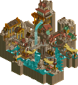
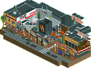
Park / Club Psyke
-
 10-April 19
- Views 5,286
- Downloads 590
- Fans 0
- Comments 17
-
No fans of this park
-
Full-Size Map
-
Download Park
590
-
Objects
233
-
Tags
Similar Parks
-
Forest Frontiers
-
Six Flags under Texas and Inhumane Harbor Waterpark
-
Airhaven
-
Steam Edge Engineering Ltd.
-
Andy's Room
-
Cappadocia


How to vote?Round 1 - Group G
__________________________________________________________________
Jappy - Club Psyke
CHE - Cloud Harbor
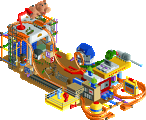
Stoksy - Westfield
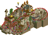
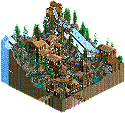
ReneTP - Chamonix
__________________________________________________________________
First of all, check out all the entries in this match. If you can't view one or more entries, for example if you don't own LL, then please, do NOT vote. Once you've viewed all 4, select your favourite and second favourite in the polls above. After 3 days, we will close the poll, the results of the two polls will be added together, with the votes from the second poll weighing only half as much as votes from the first poll, and the 2 highest scoring entries will proceed to the next round. The third placed park will place its creator on the reserves list for the next round of the contest.
Votes are public and so any cheating of the system, betrayal of honesty or mistrust will be picked up on and will be dealt with.
Jappy: I have no idea what the fuck is going on here but I love it and absolutely did not expect something like this from you. 2nd place, keep it up train boi.
Che: CC9 but Greek. I like it. That's one hell of a sexy B O A T. The atmosphere was... weird. I think it would have been nice to have a version with peeps, but I understand why they aren't there. This was tough to place third, I think it does hold up to Jappy's micro rather well, but I overall just enjoyed the atmosphere in that one more, I can see how people would vote this over Jappy though.
Stoksy: You absolutely fucking nailed it. I fucking love this holy shit. When I first opened it I was blown away by how much it feels... real. I've been to like 5 or 6 Westfield centres here in Melb and this felt so much like Chadstone or Knox etc. I looked it up and realised this is a recreation of what I'm guessing is the local one to you. Really accurately done, and I appreciate the artistic liscence you took in colour and texture. You easily get my vote here.
ReneTP: I liked the composition and setting, and I think you have a good sense of that. The NCSO was rather basic, I think you've got a room to improve but you definitely have shown that you are creative and adaptable in a way that I think will blossom in the future. I cannot understate Deurklink's tutorials for now in order to learn all of the little tricks and nuances of the game. I wasn't a fan of the layout or the way the chairlift kinda took a awkward path around stuff, but I really did enjoy this. I think having black tiles around would have greatly improved the atmosphere, and overall I got the impression that had you been given 25x25 or 50x50, you could have gotten a bronze level vote (around 50 to 60%). I hope to see more! <3
1. Jappy- geeez, this is just awesome. I looove your color choices for this map. The night time palette works well stylistically, and does a great job in supplementing the nightlife atmosphere. The architecture is well done too. This whole map oozes atmosphere, and this was a real pleasure to look at. Looking at the images in your readme, I do feel that more vertical space between the ocean floor(?) and the boardwalk would have been nice for adding the depth that you can see in those pictures, and add more to this world. From my limited experience here, I was under the impression that you did mostly realism, but this was a great display of what might not be your usual style. Great job!
2. CHE- I just really like what's going on here. I'm usually really big on having peeps, but no peeps was the right move. You had a good idea with the long grass under the rocks to give that chipped floating vibe, and maybe a more liberal use of that trick wouldn't hurt. The boat is a well made centerpiece. The small details add up to a pleasant atmosphere that makes this map enjoyable to dwell on, despite the lack of movement.
3. Stotsky- Remarkable realism here. Great detail all around, outside, inside, all over. The only reason I found myself putting this at #3 was that the scenario just doesn't do much for me, despite your exceptional execution. Despite my placement, well done.
4. ReneTP: There is an eye for tasteful composition that you have here. Your architecture is a little repetitive, in the sense that the many buildings blend together because of the similar windows and roofs. But again, the composition you have set up shows promise, with a good idea on how to place macro elements. Also, for such a small plot, 500 guests is too packed for a starting amount. Also, make sure the rides are on when you save so the viewer can load in to an already functioning park. Overall, this is by no means a bad entry. Take the same layout and ideas you have here and refine them with more focus on immersion through micro, and you're already on your way to something good.
1. stoksy: fuck yeah haha. Just so dang accurate, you are a master of gritty australian realism. This honestly makes me laugh. I think the awnings make it hard to see a lot of your great work, but also are very australian (rip extreme UV index). damn I hate westfield lol
2. che: really high quality work here, I think you're someone to look out for in the near future! sick boat and classy landscape, really handled the floating vibe a lot better than others by adding depth and texture to the bottoms. Pretty architecture and landscaping, I found it quite loveable.
3. jappy: a really really close third. The vibe is fun and the line of houses are pretty awesome. In a way, the concept art you included ruined it for me because it doesn't really live up to the crazy mystery and deep atmosphere of it, and I'm not sure you 100% nailed the club building. I found the train a bit confusing and didn't help the micro's composition or add a lot of interesting activity. anyway, all that said, its still really a solid park with some sick buildings and fun details. I think you'll probably get through this round anyway
4. renetp: I was surprised by this in a good way. Its sort of naive rct2 ncso but still really good- the landscaping flows well with the buildings and the main ride is very cool coming onto the ski jump. it felt like a chunk out of the old epic rct2 parks like euroscape or something. stick around here and build more like this please!
He damn well fucking is holy shit I never thought you could make rct look Australian until I saw stoksy's Luna Park stuff and this micro. What an absolute fucking legend. He's going down with eggboi and Russel Coight as heroes of this nation
CHE, this was clean, warm, peaceful and enjoyable. Well done.
Stoksy you absolutely nailed this! So close to reality. The atmosphere is right-on. I put your micro on #1 above Jappy, and that says a lot, because Jappy's entry is very strong.
#1 Jappy. This is my favorite of the group. Nice colours here, I really like how you embraced the palette. The lights on the archy is really cool, so atmospheric. landscape was nice. Solid micro, good enough for the top spot.
#4. Rene. I liked the setting and the colours. This micro is nicely laid out, it has just the right amount of height and density. Highlight of the micro is the ski jump for that, that was a really cool part. Archy isn't necessarily bad, it's nicely composed. Its just that a macro style suffered against micro detailed competition.
#2. Stosky. I can't pretend to have visited this place in person, but from a quick google image search it looks like a good re-creation. Cut away view is very useful to view this entry, there are some nice interiors in there. I liked the buses out front they add alot of character. Lots of detail in this one, good enough for second
#3. CHE. I was very close to voting this through. This is the strongest atmosphere of the bunch. Nice warm colours and foliage. The boat is probably the most interesting thing on the map. What's there is really good, but there's not too much to look at really. This didn't hold my attention for very long. This micro is another one that suffers from no moving peeps or rides or anything. Seem like i'm viewing a screenshot. I liked it, just not quit enough content to take down rene or Stosky.
Club Psyke - I love the atmosphere but I don't really feel like I "get it".
Cloud Harbor - Hmm, hard to get my thoughts down for this one. It needs something else, but I don't know what you could add without ruining the peacefulness. It's really close between this and Club Psyke.
I loved the buildings. Great work.
CHE) I liked the central boat and the lighthouse. Landscape looked elegant and beautiful, atmosphere nice.
STOKSY) I loved the concept and the buildings / colors / details, but the buses for me were the total charm, here in Brazil we call "TROLLEIBUS"
CHAMONIX) I found the architecture simple but pleasant. I liked the roofs. I think the landscaping has worked well with the buildings.
Missed the black tiles, would have added a touch in his work, but enjoyed it anyway.
Jappy really sold me on this new world. It feels alive and real, and that's a key to earning some good votes.
Stoksy must really enjoy his commute if he can get so detailed about bus routes! This returning finalist brought a great first round punch, but didn't quite have the life or creativity to take my top vote.
CHE made a really competitive entry up against some tough competition. Some peeps and movement would have helped sell it a little more.
Chamonix was a really strong freshman entry, and particularly close to me, as my parents just returned from a trip there and have been telling me all about it. Charming and really nice to see!
A lot of these matches have been a battle for 2nd but this one one if the few I was agonizing over the first place vote. Ultimately went with the more creative and unique one.
Jappy - I just love how this looks as a whole. The mix of blues and purples in the middle is beautiful. Love the juxtaposition of building facades with the abstract-ness of the center, creates a really surreal feeling. The buildings themselves were really charming and intricately detailed while still feeling relatively coherent. The club/boat is incredible too, feels a little Ghibli-ish almost and the sign is great. I really have nothing bad to say about this one, probably top 5 of the round.
Stoksy - Photorealism at its finest. You've created a snapshot of reality without sacrificing aesthetics. I've always enjoyed this sort of realism that isn't necessarily even a big theme park but just a snapshot of the everyday. All the interiors are beautiful, especially the chocolate store. TGI Friday's patio and Chocolate patio looks great too and I would love to shit in that fancy bathroom. My only complaint if I'm being picky is without cutaway, the area in front of TGI Friday's is a little overly white/grey. You did a great job making this feel alive and full of movement without a ride on the map.
Che - Lovely map as well. For some reason the stillness here felt striking and intentional, like it was supposed to be a painting. Maybe I've just stared at the Tolsimir snow objects too much but they feel too much like snow to me and not clouds probably because they're light blue here. Beautiful entry overall with some very tough competition.
Rene - Very nice first release, unfortunately couldn't really compete with the others but I'm excited to see more from you.
My first vote went to Jappy, for the pure drama, stylization, and vibe of this park. The strip of archy was fantastic and really atmospheric, and some of the artsy elements were so well done. I will say, I think the palette and style covered up some of the rougher edges of the execution, and the 'club' building itself felt a little haphazard. But overall, this was the standout for me.
My second vote went to Stoksy. I will say, this was very close with Che for me, because this felt a little hard to read for me. Some of the levels and the archy, while well done, just blended or felt cluttered for me, the interiors didn't wow me. But, I liked the overall vibe and the buses and strong-front elements felt excellent. Loved seeing the buses weave around each other, really impressive.
Che, very close for me, loved the concept and it felt beautifully atmospheric and executed. Only things that held this back for me was the lack of a ride or peeps to bring some movement or activity, and I think the clouds in this are lacking, largely because we've seen some better clouds in other r1 entries. But overall, well done on this micro.
Rene, a nice entry, but this was really hurt by the composition and the execution. Many of the components felt out of place or not well tied together, but I think you had the base for some good atmosphere. Definitely would recommend looking at the macro elements of some of the other micros or smaller parks on the site.
Jappy- I'm guessing this has to do with the theme from Psyke at Walibi Belgium, but I really have no clue. But it's really fun. I love this palette and I think this one probably utilizes it in a bright and fun way better than others thus far. It's really lively with the signs, and fire, and smoke, and little bugs. Again I have no idea what's up with the theme, but the meandering subway thing is kind of cool. The attic party is a fun detail on the cutaways of the buildings too. This was the strongest map this round in my eyes.
Stoksy- Really nice commercial district. The awnings kind of blocked some of the visuals, but it seems accurate anyway. I'm glad you did some good cutaways for the various stores. I think it may have been too stale without it. Love the salad bar in Fridays and also the More than Chocolate restaurant on the other end. I think you're going to have to bring something with a bit more movement next round, but this will get you through for this one. Great work!
CHE- Quite close with this map. It's very relaxing. The ship is quite nice along with the general atmosphere. My biggest thing with it is I didn't have anything to keep me watching after the first browse. Would have been great to have some kind of tracked ride, or some peeps, or clickable items. Super pleasant overall!
Rene- Please open your rides ahead of time! I had to make sure I didn't miss anything while opening the rides. Nice overall composition in a classic style, but I'm afraid you were up against some very strong parks. I'd consider paying attention to avoid layering architecture like you've done-- I think it'll help with your structures.
Club Psyke - I looked initially and was impressed, but then I was so intrigued by the theme and readme that I had to google Psyke and Shimmeria and whatnot. Knowing about the Walibi Holland attraction ended up really enriching a second viewing for me. I love the dangling E on the sign and architecture of the main street, nice interiors too. The palette, bright cave textures, and little touches like flittering butterflies/moths all contribute together to the unique atmosphere.
Cloud Harbor - Lovely palette, everything feels light and airy with goes well with the theme and title. The boat is great, the monorails as dangling sails works so well here. The inclusion of a lighthouse has a cool worldbuilding effect for me - thinking of flying ships guided by lights, what other harbors are out there, etc. I don't know why but I love the little tiny disconnected island a lot.
Westfield - Such a realistic mall recreation, great details throughout the interior and exterior. Friday's logo is amazingly accurate. I can't imagine this being done better, every bit shows care. I guess for me personally the everyday subject matter is just harder to get excited about.
Chamonix - The main hotel building is nicely tucked into the landscape, and I love the ski jump idea. Could use more variety in the architecture and I wish rides were all open initially.
Brief comments from KaiBueno! (Disclaimer - I'm renewing myself to the community and know very little of you, your parks, styles, etc. My views are framed from what I see as I open it, with a twisted 2005 perspective of wazzup.)
Psyke - New to me is this dark mode in Open, and this club district nails it. Solid "ride", love the glowing yellow rounded glass area on the right. The club street area has a lot of variety to it.
Harbour - Static still life, but really sweet lighthouse and ship. The curving layout adds to the bay/harbour feel, the red/white colors classic to the T.
Chamonix - I'm not keen on hacking (for me, yet), but this is a nice example to hack for a ski jump. I like the ski jump part best, the rest of the area is a nice throwback to the old jagged rock style for mountains.
Westfield - Mall, check. Buses, check. Looks like a Westfield, certainly...but the cutaway "inside" view kinda clutters it for me.
__________________________________________________________
Winners
Jappy: 35 + 10/2 = 40 points
Stoksy: 8 + 28/2 = 22 points
Eliminated
CHE: 3 + 7/2 = 6.5 points
ReneTP: 1 + 2/2 = 2 points
__________________________________________________________
Jappy and Stoksy proceed to Round 2.
CHE is eligible as a replacement for Round 2.
Congratulations to the winners!
Highlights
Club Psyke: party street
Westfield: mall interiors
Chamonix: ski jump