Park / O Papagaio
-
 20-April 19
- Views 2,732
- Downloads 506
- Fans 0
- Comments 11
-
 65.00%(required: 65%) Design
][ntamin22 75% CoasterCreator9 70% G Force 70% Liampie 70% Camcorder22 65% Cocoa 65% RWE 65% Sulakke 65% bigshootergill 60% csw 60% saxman1089 60% Scoop 60% 65.00% -
Description
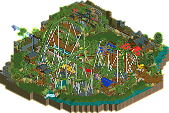
Grab an ice-cold caipirinha from the Churrascaria for some liquid courage and take a ride on O Papagaio, featuring two world's firsts for a dive coaster: a non-inverting loop, and a wing over drop halfway through the course.
Conquered O Papagaio? Take on Tapacéu, one of the only S&S Sky Swats in the world! When you're done, hop on the Skyride to check it all out from above! -
No fans of this park
-
Full-Size Map
-
Download Park
506
-
Objects
188
-
Tags
Really nice slice of park here. Unlike some NE members I have not presented my master's thesis on "Realism In B&M Dive Machines: Their Support Structures and Operations", but it seems to me this has struck an exceptional balance between looking great and being practically laid out.
I think the ride design and layout in general here is very strong. On a vertical drop coaster usually there's a lot of fanfare surrounding the drop pullouts with tunnels and viewing areas, but here the showpiece is absolutely that triple inversion. It's great to see not just the .. Sea Serpent and a half? Pretzimmelman? Norwegian Bonus? but the splash track highlighted as elements with great proximity and visibility to the main path. The chairlift passthrough is just bonus, but a nice touch.
Foliage is also handled really well. It does seem to be a little on the side of the "spam small objects" but the traditional clumps of trees and nice patches of empty grass work really well. There's good attention to detail throughout, and I like the small touches of the coaster footers getting slightly different path treatment or the signage at the queue split for the Sky Swat. The seating area at the churrascaria is particularly nice imo. Altogether just solid enjoyable parkmaking!
Some places to improve would be architecture - everything here is serviceable, but could use a little more character and variety. The naming and bright colors help communicate the theme, but I had to do some googling to learn that the namesake is a parrot. I think some feather motifs, custom music, or more overtly 'brazilian' theming would help make this stand out; everything's pleasant and realistic, but doesn't sell me as a unique and memorable theme. Another minor thing was that although the rest of the area feels lively the sky swat corner is pretty dead - would have been nice to see a stand-in invisible stall or something to get guests in the queue and moving trough that area.
really nice work. The layout is pretty interesting, I wish a diver would be made like that IRL! sort of a mix between a wingrider and a diver. Good, clean landscaping and everything is well constructed. Its possibly a little light on content- didn't take me so long to get the vibe of everything there was in the park. One thing I'm not sure on is multicolored metal rooves- I usually leave that sort of accent coloring to awnings and other details, and have rooves be some sort of more 'natural' color for whatever material/theme you're going for. While the colorful roofs feels lively, it does sort of deprive the theme of substance/atmosphere- I'm sort of left not knowing exactly what the theme of this design was, other than "nice landscaping and realism". Which is still good! Just needs a bit more refinement.
I liked the colored rooves at first, but from the peep's point of view, it's sort of minor. Definitely agree more trim at eye level would enhance the theme. Your path flow is nice and organic.. not boxy and grid-like, which is something I'm guilty of!
In terms of the layout.. this was quite nice! That triple element at the beginning is really unique and its interesting to see something from a wing rider B&M end up on a dive machine. I enjoy nice fast and swooping turns on coasters and the turns in and out of the splash area would be fun to ride IMO.
All in all, nice work!!
So I liked the name PAPAGAIO because the roller coaster seems like a papagaio, very good, supports well positioned,green looks great.
The water well where the roller coaster car passes was 10.
The CHURRASCARIA (steakhouse) was very well built, loved every detail.
You wrote in Portuguese, many Portuguese words are the same as Spanish, hehe, very cool, I loved it.
It was cool the structure of the tapaceu left.
The details/colors in yellow, blue and red combined with the name Papagaio.
Nice work.
Lovely design you have here. The layout is quite unique with that first inversion and not too unrealistic, feels quite inventive. I thought the post-brake run drop was really great and the interaction with the queue and sky ride are great points, though I don't think the catwalk needed to extend all the way to the splashdown.
The foliage was nice and lush throughout. The magnolia tree sticks out a bit and doesn't really fit in, but the rest was fine. The custom flat ride was cool and well constructed but could have done with some peep activity in the form of a dummy ride underneath, just to as least fill the queues and make it less of a dead zone.
I'll echo the thoughts from the screens that the station was too short and stubby, and I'm also not a fan of the green colour of the coaster, it really needs to pop and it doesn't do that at the moment but I understand that it's linked to the parrot theme. Overall though this was really good for your first submission.
This was quite nice!
The layout is believable, but still unique and something different. The roll off the mid course is a neat element especially. It's quite realistic in a lot of the other detailing too, which is good. The squat station doesn't bother me too much, but maybe an awning off the back to shade the train in the hold brake would give it some structural beefyness to look more substantial.
The skyride through the middle of the layout is nice as well. I can feel the BGW influence in a lot of ways here. The sky swat is a fun blast from maybe a decade or so ago when everybody was putting these into their parks (myself included). It's not too bad on the whole, though a bit more detail would probably help you out.
I want to like that Culinary building, but I can't really see it. Unfortunately the coaster sort of blocks things. It looks like a nice bit of architecture, however.
Really my biggest complaint on this map is color. It doesn't seem to know what it wants to be. You've got primary colored awnings, but brown and black structures without any really color or accents. Then in the middle you have a skyride that's ice blue and dark purple. And around it all is a coaster that could pull it all together, but instead falls into the background. Wish as lush as your landscape is, you lose it in the trees. Parrots are a bunch of pretty colors, so even a bright ride track could work just fine. Green works, but only in some specific situations, like when your background offers some contrast. The overall effect is that your map lacks a bit of cohesion.
But aside from the colors, this is all quite nice. Hope to see plenty more from you soon.
Can't believe I have an accolade on here--been lurking and occasionally commenting for years but finally felt ready to submit. Thanks again
Congrats, well done.
Didn't quite think this one had enough for design, but I'm happy you could grab your first accolade regardless. It's always tough to win designs and I think to win it as your first is impressive. Excited to see what comes next!
Overall really lovely submission. The coaster lay-out is really unique and something completely different than we're used from B&M divers. Yet it seems a believable realistic lay-out. Good job!
Foliage and landscaping is fine too and helps set the atmosphere. The buildings you've got there are nice, the station looks a bit too small though. I also did mind the different roof colors. I would have gone with just 1 or 2 colors.
Congrats on design! Well deserved.
Lovely release here. Great flowing layout and good park infrastructure.