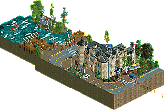
Park / A Day in Drumnadrochit
-
 30-April 19
- Views 5,741
- Downloads 411
- Fans 0
- Comments 19
-
No fans of this park
-
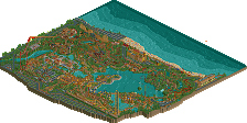
Full-Size Map
-
Download Park
411
-
Objects
202
-
Tags
Round 2 - Quarter-Final 6
__________________________________________________________________
Recurious, Steve, and gdb forfeit. Faas and CHE have been chosen as replacements.
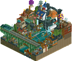
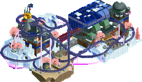
Hoobaroo - Sky Midas
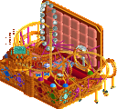
Faas - A Day in Drumnadrochit
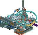
CHE - Daytona Derby
__________________________________________________________________
How to vote?
First of all, check out all the entries in this match. If you can't view one or more entries, for example if you don't own LL, then please, do NOT vote. Once you've viewed all 4, select your favourite and second favourite in the polls above. After 3 days, we will close the poll, the results of the two polls will be added together, with the votes from the second poll weighing only half as much as votes from the first poll, and the 2 highest scoring entries will proceed to the next round. The third placed park will place its creator on the reserves list for the next round of the contest.
Votes are public and so any cheating of the system, betrayal of honesty or mistrust will be picked up on and will be dealt with.
wow this is an awesome matchup. hard to decide! also sad that I'm the first reviewer but c'est la vie
1. faas: As much as hoobaroo impressed me, I was just in love with this. Just cute and hilarious. I love that the photo in the newspaper is just you (I'm not sure I'd seen anyone else in their own readme before?) And the moose article made me laugh a lot. (I hope thats a teaser for r3!) The park itself is quaint but well made and with enough details to really catch my eye. I just really like the idea of a micro park being like a diorama or a photograph of a moment in time- in this case, you with nessie. Creative and fun all around
2. hoobaroo: fuck yeah dude. This is awesome. I love building this fantasy story in my head of some sort of gold asteroid that a guy found and established infrastructure on top of. The whole thing is vibey, with lots of fun and skilled detailing. Definitely very AVC but thats never a bad thing!
3. CHE: still a really nice micro. I love the textures here, I should get around to experimenting with more of those WW objects too. The actual ride is a nice idea but couldn't quite hold my attention like the other two did.
CHE I loved how clean and comprehensible yours was. Very interested to see what you'll build outside of the contest.
Faas: loved how much motion this had for something without rides. Great way to sell a little story, and totally standard faas fun.
Hoob: Killer idea. The coaster was a bit too fast which was a bit distracting to me, but an otherwise super solid entry. Looks like you're developing a very creative, exploratory style.
CHE: Hard to pick for 3rd place here, but unfortunately I had to. This was a really fun idea to see brought to life in RCT. A few ugly object choices here made the difference between this and the top spots for me, unfortunately.
Hoobaroo: Wow, another excellent micro from you! Really looking forward to more of your work because it's brilliant. I adored this micro, certainly reminiscent of AVC's work but all the better for it imo. The architecture is wonderful and there's so many lovely touches of character here that I can't help but love. The coaster layout could have been a bit better but otherwise this was a really strong second entry and my favourite of this group. Loving all the balloons this round too!

Faas: A close second, I really enjoyed this micro. From the overview it seemed there wouldn't be much to see but you packed in a lot of little details and the background/readme was a lot of fun too. The visitor centre was lovely and the "Faas being photographed" object got a chuckle out of me
CHE: Great idea for a micro and you pulled it off nicely. I quite liked the object choices, we don't often see those roofs used and they fit pretty well here. The shoestring on the trucks was great too. Good work but unfortunately falls shy of the other two.
1. Hoobaroo: Impressive again.. love your style. It's colorful in spots and I like the structures you made.. and all the cute little balconies here and there. Only thing missing for me is an explanation of everything. What was your head canon on this?
2. Faas: Close 2nd. Super atmospheric.. and having the Loch Ness Monster and her (?) eggs was a nice touch. All the tiny details were great. Your object of being photographed was hilarious. Definitely better than R1.
3. CHE: Nice and clean. Your entry reminds me I need to learn how to shoestring. Anywho, The object usage was great.. simple at times, but the atmosphere was solid. Was the Octan sign LEGO inspired? I used to love my Octan race car set growing up.
1. hoobaroo: Incredible to see how quickly you've improved, as this is a huge step up from your first screens and R1. Excited to see what you'll building a year from now. It does lean a bit heavily on AVC inspiration but I don't mind seeing more of that style. You did a great job filling this out with movement with the coaster and train, balloons, fireworks, etc. It all just feels so festive. One of the better clouds in the contest so far as well. One thing is although it is a fantasy entry, I'm not entirely convinced by the coaster colors or layout, those are both bits you could focus on to take your skills to the next level.
2. Faas: As much as you'll hate me for this, again thought this was very fun and cute. A great idea, and you managed to include a lot of life and movement without a major ride. Love the little details and all the naming as well with "Hot Lochs" and "Nesstea". Even the monster itself was cute with the googly eyes and eggs lol. Glad to see you get another entry in!
3. Che: Really liking your style with these last two entries, even if they have been the best of the round for me. A simple idea that I'm surprised hasn't been done before, executed in a simple but well done way. I'd almost want to see a little more grit and dirt for this theme. Hope to see you build a full scale solo eventually as I think your building style would be well suited for it.
1. Hoobaroo: Absolutely lovely! Colors are spot on for me, love the pink coaster though it was too fast. The landblock work is fantastic, really well done and I love the use of that texture in gold. I will definitely be using that in the future. A lot of motion all around, the core was nicely tucked into the land and was perfectly integrated. I'm not quite sure of the overall theme, but generic fantasy doesn't always need explanation. I think the next step to push your work even further: focus on layout and architecture. Easy #1 for me in this round.
2. Faas: Good theme to pick for your style, really well executed and a nicely put together micro. The entry building is very well done, and I enjoyed all the little details. Nessie eggs in the water are a nice touch here. I would love to see you do a coaster in MM, not sure if that'll be coming or not, but these quaint dioramas are really picturesque and atmospheric. Great stuff.
3. Che: I really loved this. So simple but cleanly executed, really fun to watch the cars go in the figure 8. I also love that RS tin roof, it works perfectly here. Edged out by Faas due to amount of detail / content, but great entry nonetheless.
So many matches, wanna get through, so just some quick reviews for now:
Hoobaroo - Incredible, you really pump out strong AVC vibes, I love this so much. There's definitely room for improvement, but the archy is amazing. You're getting my vote, you're an extremely promising player with so much potential, it's lovely to have you in the community. My one big feedback for all your work so far is that your coaster layouts feels very bland, and if you're looking to improve from here that's what I'd focus on imo. I loved the atmosphere in this micro, keep this up!
Faas - This was cute! CUTE! Very comfy, strong Faas atmosphere and I loved it. It gets my second vote, but you made me smile, it was a great micro, I just personally prefer hoobaroo's fantasy style. It did feel a bit empty in some ways though, I think it was missing a bit of life but I'm not sure why exactly that is.
Also this felt like knockoff DKS lmao, but that's not a bad thing and doesn't detract from the quality for me.
CHE - This was good, interesting concept, well executed, a bit simple, but it was fun. It was just uh, empty? I don't really know, it didn't feel like a micro, it felt like I was in cutaway view of a larger park and idk, it wasn't very self contained and keep my interest for long. That said, I enjoyed what was there.
Faas great player, charming work of course, beautiful building, perfect roof, good foliagen, nice colors, cars with small parking details that make a difference.
But CHE did something simple, maybe common, but very very cool, the track at 8 loved it, at least I do not remember seeing something similar, this detail caught my attention, captivated me because it was different, innovative, I kept imagining I can drive one these?
Highlights
Sky Midas: fireworks
A Day in Drumnadrochit: Faas is being photographed in front of Loch Ness Monster
1st - Who? - Sky Midas
Man where did you come from? Seriously this is great. Colors were solid, the amount of motion was perfect, and the amount of rides you fit in there with all of the different elevations is impressive. Only critique would be how fast the main roller coaster is going, but thats very minor. Really excited to see what you build next!
2nd - faaas - Loch Ness
Recognized this as Loch Ness immediately. Great work building a convincing atmosphere! Love the little touches here and there like the yellow submarine, the eggs, the Scotland flags, the frozen staff, etc. And the readme image is hilarious. Excellent job!
3rd - Che - Dirt Rally
Man this was awesome. I wish I could vote for this one as well, but I enjoyed the other two just a bit more. Execution is flawless, and the overall idea is great. I wish I could see this fleshed out in a full park. Very very good work.
Sky Midas - I be working on my own micro like "golly gosh for a NE noob I am making improvements" then I see you make this fucking thing and maybe I should just throw my computer away. DAMN. The architecture is the real highlight for me, fantastical but grounded and packed with pleasing details.
Drumnadrochit - Especially great building, really entertaining concept. The fun details in the parking lot and roadway really liven up the setting. Good stuff.
Daytona Derby - Cool idea, overall good execution and nicely focused. Fun to watch but not as immersive of an environment as the other two.
Faas:
Very believable piece. The building had the great scotland style, I really loved the summertime optics/colors of the pavement and street. I like how you put yourself and the scene of when the photo was taken there. All around just very charming and likeable. There was no boring part and always something nice to see. What I didn't like too much were the underwater eggs.
hoobaroo:
Opening screen like in your first micro is pure awesome. The large building with the glass facade is super good looking. Unfortunately, it seems like you tend to lose sight of the other perspectives a bit when building. So when rotating there are some unrefined spaces. For example the tower has not the same amount of detailing on the other sides. I'm not a big fan of the coaster colors, also the train seems to go a little fast at the beginning. Also I felt the theme is a little random and the rides didn't add too much to it. Still, a very cool entry, if you accomplish to get the visuals/composition of the starting perspective to the other three you will go through the ceiling!
CHE:
I found this really adorable. As posix said what's so great about this is the clearity and comprehensability. With this however comes that there is not so much to discover. You have basically the same stand twice on both sides done with full tile objects. A little more creativity to break it up would have been cool (commentator's box for example?). The garage was nice though. Good job!
1) A Day in Drumnadrochit - Felt like it had everything that you did right with Spaghetti Harvest as well as everything it was missing to do well against its competition. This one has a really refreshing composition for a micro and feels like it has a fully formed and captivating idea. Spaghetti Harvest was a cool idea, but it fell into being too subtle. This one is still subtle but draws me in way more - with the little Nessy as well as the tourism sign being a couple highlights. I really liked the was the road wraps around like that, and the castle itself has the skill level you've demonstrated with things like Bob, but retains the charm of your past stuff as well.
2) Sky Midas - This one is way more immersive than the others, but also still rather clunky in my opinion in its construction. The weakness was the big form of the tower that is never broken up or given any relief to add in some interest. It reminds me of like a collision between Le Reve and Corsair Veridian. Cool theme if it does feel a little bit like the colors and approach we see with AVC in a way. But I'm not too caught up in that aspect. I think there's just still some left on the table to improve technically which is why this one missed my #1 vote by a hair. Though I think this is much stronger than your Round 1, and it's no doubt you're becoming a notable builder really fast.
Daytona Derby - I really, really wanted to get a chance to vote for this one. Cool, stylized, and grungy - I love it. It's just quite a bit less in scope than something like Sky Midas, and not quite as effective across all aspects like Drumnadrochit. My favorite thing as the use of the curved rusty roofs - very awesome. The theme is also really fucking fun. I had a really hard time not giving this one the nod.
Hoobaroo who? idk, but that's an awesome entry, great little layout. Loved the Loch theme, great idea by Faas who I am happy to see got in the contest. CHE's entry was also really good, considered it for my second place vote, a really good ride.
Hoobaroo- Wow! Continuing the great work from R1 with another solid entry here. There's a lot to enjoy. I really like how you've done the massing here. A main path area at about mid height separates top and bottom nicely. And the ancillary tower island with the bridge and the other little island set lower really complement the main tower. Nothing feels out of proportion. The coaster has a bit of a weird layout, but it's clear that didn't take precedence-- it really works around the architecture rather than the opposite. I wasn't a huge fan of the train having to go off-map to reset up to the top. Wish you could have made that work on the thing. The colors are very AVC-- though I could never really build with them, you've done a nice job with it! Great work and congrats on the advancement to R3.
Faas: I'll be honest in that I didn't expect much when I first opened it. But wow I was totally wrong. This is great. So many wonderful details. The submarine at the visitor's center, the dinosaur used for the sign, the frozen statue staff member, the church ruins with the broken cross (wow!), the little picnic areas-- it's all excellent. I appreciate the monster being kind off subtle, but still there. Mostly it's the atmosphere that makes this great. It's lovely. I would love to see this level of character on a larger map from you. Fantastic work.
CHE: This was a lot of fun. Unfortunately I think you got out-detailed by the others, but I enjoyed watching this ride run. The details are fun like the crashed car, the Octan sign, and the little maintenance area. The grunge kind of reminds me of Alex's Junkyard map. This is one of the best uses of that RS tin roof object which typically looks pretty awful. It works well here. Nice work overall! Hope you'll build more like this.
Midas - Wow, I like how this is tall and multi-leveled but it doesn't feel forced like some have been. The left main building is gorgeous, especially the front with the blue glass, blue roof textures and dome. The Tower is nice as well, though mostly as a way to get to the the boats in the Sky. Also impressive is the size of your coaster down below. Something to keep in mind if I ever to a micro again, since I tend to build decent sized coasters is to push them under and still have spacing like you do up top. Good job.
Day - Love the Visitors Center archy - classic and feels like it has enough room for a gift shop, museum and offices...and then there was the Encounter! Nessie is nicely tucked away in the water, and the biplane overhead an added bonus. Well thought out simple concept executed well.
Dirt - captures the atmosphere well, and I like the race hack. Overall the subject matter is up against a lot in the other two. I think you've achieved the feel of the subject, which not all entries can say. Hope you are happy with how it turned out.
__________________________________________________________
Winners
hoobaroo: 28 + 15/2 = 35.5 points
Faas: 14 + 24/2 = 26 points
Eliminated
CHE: 2 + 5/2 = 4.5 points
__________________________________________________________
hoobaroo and Faas proceed to Round 3.
CHE is eligible as a replacement for Round 3.
Congratulations to the winners!