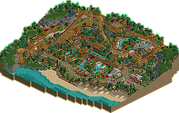
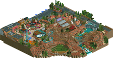
Park / Obeah and the Cursed River
-
 11-May 19
- Views 3,190
- Downloads 456
- Fans 8
- Comments 16
-
 76.50%(required: 65%) Design
bigshootergill 85% csw 85% SSSammy 85% CoasterCreator9 80% RWE 80% saxman1089 80% Jaguar 75% posix 75% G Force 70% Scoop 70% Cocoa 65% pierrot 65% 76.50% -
Description
Evil may lurk even in the sunniest of destinations...
-
8 fans Fans of this park
-
Full-Size Map
-
Download Park
456
-
Objects
185
-
Tags
Obeah was amazing, I loved the tracks, curves, the supports that adapted was very good.
Monster slide great idea a different toboggan, and the wine roof was a charm.
Cursed river with all those stones around on the river bank provided a really nice environment, along the waterfalls is always welcome gives a special touch.
I liked the makeshift bridge with track and the fence was cool the detail it did, the roofs and buildings matched well with the ambience, good atmosphere.
The chair lift post is perfect.
Foliagen looks great and the flowers in wine and orange looked good.
I do not know how to speak English, so I will talk my way, general vision a pleasant happy place, far from the city big and noisy.
Nice work.
Copying my comments from RC&F:
"God damn Terry.. this is amazing.. wow. The RMC was nice.. and a great centerpiece. The rapids were bonkers... the layout for that alone was a stand out. The way it sat below everything, but still had room to breathe was well designed. The drop was unique I thought as well. Your archy was great as always. Definitely got that tropical theme.. and the spookiness/voodoo vibe too. The ghost train slide was creative. The landscaping was top notch too. This is some gold/spotlight work on NE in my opinion if you expanded the map."
Wow, this is excellent. I didn't expect much going in, but consider me impressed. Lots of cool tricks, it's so lively and full. The foliage is wonderful and atmospheric throughout. So much of this didn't even feel like NCSO and not in the "I'm finding ways to hack NCSO to look like CSO" kinda way, it's just so rich and lively that I'm not looking at the objects. I'm just there.
Clear 80% from me.
I like flowers, their colors are great.
Interesting, nicely built cableway route - unfortunately, in one place runs so low
(someone might try to grab the passenger by the legs and throw him off the chair).
Nice pink building with bushes in the pots at the entrance, open shutters, palm trees growing between the bones - nice. Using the wooden objects in architecture raises the mood. Super bridges - exquisite.
Flowers, jungle trees, bushes nicely composed! RCT transports passengers well (technicians have worked on the project?). The river too. A modest slide, full of inventiveness and an extra golf course. Overall, lots of fun in a picturesque area. Greetings, all the best.
ah, good shit. I really like the layout, definitely shows a lot of improvement over your previous stuff- good flow, curves, interactions, etc, and not too drawn out. A lot of people use "RMC" as an excuse for a heap of ridiculous and frankly ugly inversions all over the place and I think you did a good job holding back and using them where it made sense with the layout and created cool drama.
the vibe is decent- kudos on using the martian soundtrack, definitely adds a lot and I wish people cared more about music. There's some really solid jungle-ish archy throughout, even if its a bit too varied and as a result, as is often the case with ncso, the theme becomes a bit difficult to pin down. that said, all the rides are great and atmosphere shines through, especially the rapids. Good choice of brighter water and it meanders wonderfully around the park. The golf is layed out in a cool way, and overall there's a lot to see- slides, top spin, etc. Nice work. I think the foliage could use a bit more love in variety and placement (and height/density a bit more carefully) but didn't do anything specifically wrong- these are just little things to break to the next level of great parkmaking. For me I think it scrapes in as a design- I'm keen for more terry CSO though!
The most impressive aspect about this to me was that NCSO can look this way in RCT2. Also loved the peculiar ride design. Well done.
Phenomenal work. Candidate for best NCSO design this site has seen.
So, I'll make this clear and get it out the way bc some of the following might sound harsh and I don't mean that: This design is great
- This is a really good break away from your usual NCSO look which for a while now was becoming more and more... plastic? Raspberry Acres and Moonbeam and Falco di Ferro felt unnaturally clean in a lot of ways, lots of plain textures with strong colours.
You've overall stepped away from that here, and it really shows. You have a good variety of textures in the park and they compliment each other and are used sparingly enough to not feel too crowded.
- The coaster layout is a great improvement from your usual. It feels less stretched out than what we've seen in the past, and it doesn't go anywhere unnecessary. That said, I think after the dive the second half is a lot worse than the rest and it could have done with more of a tight, twisty feel than the many turnarounds you have. It fits in well with the landscaping.
There's a lot of comfy small details I loved. The way you avoided having any raised dirt path so that you could use it as a roof texture without clashing was a nice touch, along with the maze track used to create more realistic tunnels and mini golf track for wooden walls. <3
This is where the negative feedback comes in, because while this is one of the best NCSO releases in a long while I think you've got room to improve and it'd be great to see how you evolve;
- Your foliage... needs some work, at least imo. It's a lot better than most, your use of negative and positive space is great, but I think you've fallen into the trap of not using tree textures in an abstract way that has led to a rather rough look overall. Taken on its own, it isn't bad, but the colour and texture doesn't compliment or contrast the surroundings in a way that lets anything stick out within the foliage or around it. It is as its best next to the open grass areas, and at its worst in the middle around the dirt, rock, sand and brown objects.
- The colour work in general is rather flat. What you have fits the theme yeah, the warmth of the palette you're using really carries the tropical vibe, but you've got a pretty dense chunk of park here with a swath of very dark colours that end up clashing in macro. You need a bit more than just the water to break it up. Too much brown on purple, dark green and magenta. The coaster itself feels rather mundane and unimpressive because it doesn't stick out from the surroundings with the scheme it has.
- The composition is just such a mixed bag for me. Remember how in Falco di Ferro the invert was too stretched to fit the rapids? It feels like the inverse here to me, where the rapids feel forced into the coaster retroactively. The height variation did not add to it at all, it was too shallow and incline for such a long drop, that area where the coaster turns over the rapids lift turns me off. The rapids felt too squished with no room to breathe and like they used to be longer but the final third got cut or something. On a micro level it works well though, I especially like the little waterfalls as it goes along the mini golf section.
The mini golf was fucking wonderful though, it worked soooo well. Great stuff.
The park layout as whole though was meh for me, very circular and the coaster is boxed in. The back section of the park with the slide felt very underdeveloped and the slide itself felt stretched thin (great idea though! And the surrounding landscaping was amazing). So you sort of have these areas designed around the micro-interaction of everything nearby while ignoring the macroiinteraction and composition to create little screenshot sized scenes that are amazing and then mixed in with awkward transitions between them? Or just a lacking big picture.
IMO this is just a little bit better than Moonbeam. It has the same issue with composition and the inverse issue with texture (Moonbeam was way too smooth and felt like everything was made out of candy) but is presented in a more focused package.
I think Steppenwolf and The Bayou was better, but this was certainly great stuff
This might be my favorite NCSO design.
I agree^
So many cool details to explore. I particularly love the little piece of land that the Top Spin is on with the waterfall. Perfect use of open space and interaction with the rapids. Also, the queue is very well done.
Congrats on the well-deserved design!
you ride design is night/day compared to thundering sierra. you also have a steppenwolf level of convincing ncso building. strong 85 from me and congrats on the obvious design.
i look forward to more
congrats terry, it seems like you've really captured a lot of people with this one. keep it up!
Really excellent work.
Your sense of placemaking is incredibly strong. Some of the best doing NCSO at the moment I would say. I love how well you use the elevation change here to create some excellent interactions with rides and paths. The little airtime hill after the first drop that cruises over the rapids is picture perfect. Loving all the little bridges with the mine train track too. One of my favorite details is the banner over the path down by the water where you used a single block of Goliath sign behind brown glass to give that way some really unique texturing. I haven't seen someone do that before. There's actually so much I like about this design in general.
Maybe my only real complaint is the coaster doesn't totally feel like an RMC. The pacing on the 2nd half is a little bit slow perhaps. Credit to you, however, for having a working midcourse that's actually necessary. Speaks to a strong ride design.
All in all this is pretty fantastic. Solid 85 if I had gotten to vote.
Yes, Terry! Excellent job, my man! What a great design and fantastic NCSO take on RMC. Congrats on finishing this, looking forward to more work from you in the future.
PROs:
+ nice, long RMC layout that interacts beautifully with the surrounding area, especially the rapids. I loved that MCBR before the dive loop, which was an excellent idea that I could totally see RMC use, and that big turnaround in the first half of the layout
+ the station and exit bridge looked great
+ tons of surroundings with interesting ideas/rides/architecture to add more life to the park
+ nice rockwork around the rapids, very natural looking
+ the walls on the rapids came out beautifully, especially the way you hid any imperfections with flowers/rocks
+ love a good themed mini golf, especially surrounded by a coaster
+ foliage: something I didn't notice my first time looking at this, but it's flawless. It fits the theme perfectly and looks good almost everywhere, especially in filler areas on the periphery of the map
CONs:
- the beach could've used something, especially since you had paths leading down to them
- (nitpicking) all the peeps wearing yellow hats got distracting
- architecture was...just ok? There wasn't a bad building, but I couldn't find a memorable building either.
Love it, another wonderfully creative NCSO release by Terry!
Some of the best NCSO I've ever seen. Incredible work!