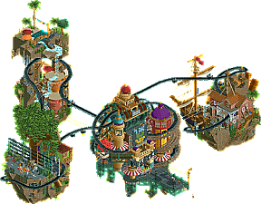
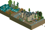
Park / Behind the Music
-
 21-May 19
- Views 7,213
- Downloads 477
- Fans 2
- Comments 18
-
2 fans Fans of this park
-
Full-Size Map
-
Download Park
477
-
Objects
292
-
Tags
Similar Parks
-
Steam Edge Engineering Ltd.
-
National Mall of Schwarzkopf
-
Assigned Male At Birth
-
A Day in Drumnadrochit
-
Writer's Block
-
Ascension
Round 3 - Semi-Final 1
__________________________________________________________________
Cocoa - Behind the Music
Stoksy - Hyperion
Liampie - Urban Renewal
Faas - Thin Air
__________________________________________________________________
How to vote?
First of all, check out all the entries in this match. If you can't view one or more entries, for example if you don't own LL, then please, do NOT vote. Once you've viewed all 4, select your favourite and second favourite in the polls above. After 3 days, we will close the poll, the results of the two polls will be added together, with the votes from the second poll weighing only half as much as votes from the first poll, and the 2 highest scoring entries will proceed to the next round. The third placed park will place its creator on the reserves list for the next round of the contest.
Votes are public and so any cheating of the system, betrayal of honesty or mistrust will be picked up on and will be dealt with.
1. Cocoa
Love this, very creative, a very cool idea and overall a very good execution.
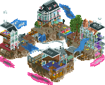
2. Liampie
Love the amount of cool details on the wrecked building. Also some cool ideas in there like the wrecking ball and the transfer track on the crane.
3. Faas
When I first saw the overview I did not expect much, but I was pleasantly surprised. I like the humour in this entry with the indian army posing with the yeti and the coaster layout was nice.
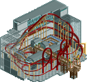
4. Stosky
A very strong entry again. My favourite part was the satellite which was very well made. The other parts were nice too although I felt that at some points it just looks like a big mess of track.
Haven't looked at the other groups in detail yet but from the overviews it looks like this is the strongest group of this round, so you all can be proud of your entries!
Battle of the Veterans!!!
I was really looking forward to seeing this showdown of some of the longtime NE members... it definitely had top quality entries from each builder!
#1 Cocoa: Damn dude, you killed it again! It's amazing how you can take 3 themes we've seen so many times before and add a new element of a tape player to bring it to a new level. Unreal!
#2 Faas: I know you were trying to stick to a certain theme through MM, but I'm glad you decided to go down a different path with R3, this was the Faasness I was hoping to see. Love the theme and execution, brilliant stuff! Snapping photos with Yeti was awesome!
#3 Liam: Stellar work too man, the last piece of the track being set into place is perfect! You nailed the vibe.
#4 Stoksy: You too broke out of your norm for R3, great to see you trying something new... love theme here too, well done!
Cocoa - wtf
It's just not even fair how good you are at this game. This is such a great use of the conveyor belt track. The main island is so full of movement and life. I love the dynamic with the ferris wheel, and the green iron supports work so well. I think the water section is my favorite for sure. Those bongo drums
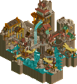
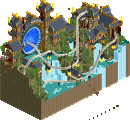
Faas - Baby Expedition Everest
I love the continued theme of legendary creatures you've continued from the previous round. This entry is very well done and I can honestly say I really love it. Very convincing theme, and tons of little details packed in. I love the cave with the real Yetis.
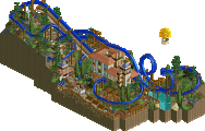
Liam - Construction Site
This map is really a lot of fun. I love how much energy and movement it has. Not to mention the spinning cars add a really cool dynamic! The yellow hardhats are a really smart touch. I can't help but want to see this section as a part of a much larger map. Excellent work.
Stoksy - Space Park (somewhere in Australia)
I love the colors you used in this! I think they work very well in giving off a space vibe. it's always amazing how you're able to pack in so much detail to your maps, and this is no exception. While it can be a little cluttered in places, I think there's enough contrast to make it work. I love the tethered astronaut.
Cocoa - You really are a creative genius omg I love this so much. What an incredibly unique idea, and you pulled it off stunningly!

Faas - very very cute :3 I liked the departure from your other micros to mix things up, I like this and the Lock Ness thing just as much but for different reasons. The archy here was very lively, although I think your object/colour choice in some places was questionable. I guess Jappy did it better
Coaster is adorable, as is the theme and the way you executed it. Loved it all round.
Stoksy - Really hard to place this one because I very much love the theme but the direction you took it was kinda weird. Feels so similar to VenusGP and right after I recreated it lmao. It just got a bit chaotic with there not being any defined floor for the bumper cars for instance, I think the composition hurt this one the most but the archy is really lovely. The coaster layout is pretty meh, the whole thing just goes too fast. The overall shape feels comfy, big Grona Lund and Space World vibes, but in a way that made it feel like you were trying to build something more realistic and then turned it around at the last minute into a group of floating rides in space, it's kinda weird.
Gud shit though, just needs more polish.
Liam - Possible hot take but I really wasn't that much of a fan here, although I can recognise and appreciate the technical skill involved. It was just too crammed for my liking, lots of tall objects making it hard to see behind them. The concrete building in the middle felt weird, like it was just too close to the other one but not close enough to be one building. The theme's kinda cool, and the crane placing the track was so well done. and the wrecking ball was cool. The eye in the window spooped me.
It feels somewhat mellow, no music or background noise? I'm not sure how to place this, I guess I just don't resonate with the theme, it's good rct though and I can see that.
Every single builder in this match made something that feels so familiar to their style but also confidently pushing boundaries in a way that elevates their entry to something beyond anything similar they've produced previously. Phenomenal work all around the board.
what a ridiculous round. I'll leave reviews after the voting, but everythings incredible
Wow right out of the gates with an outstanding round!
Cocoa: My first thought is that I wonder how many people here have never actually used a cassette type in their lives. Showing my age, perhaps. What a clever idea. So many nice little details too. I like how each environment is some type of stylized instrument. From the waterfalls onto drums (or the violin strings) to the pipe organ volcano, to the Jurassic band and vine harp, it's a clever abstract take on something I don't typically appreciate-- the in-game music. I play 99% of my time with the sound off, so this was one of the few times I had fun turning on the sound and listening to the game. The main island is great with all the little music notes and tower details. There's a huge variety of colors, but they also all look great together. Happy to see no coaster for the sake of a coaster either-- this is just a fun art piece with a really clear idea. Love it.
Liam: The more that I've looked at this one, the more I'm enjoying it. There are so many fun details. The coaster isn't bad as a coaster, despite no block brakes. You don't really see spinners much, so that's neat. But the real winner are the details. The Last Piece track I somehow missed on first viewing, but is a great touch. Love the use of the sphere is the wrecking ball. Peeps in the yellow hard hats is a clever touch and the fact that they enter through the fence from the sidewalk. Port-a-potty theming as toilets is just one of the nice construction details I enjoyed-- from the sheet piling on the edge to the half demolished row house and the dumpsters being filled. The raft works surprisingly well as an elevator as well. All in all the details pushed this one over for me. Really nice work.
Stoksy: Really enjoying the layout on this one. It packs a lot of layout into a small space and still looks great. We've seen a number of space themed parks so far, but someone this one still feels unique and original enough. The little bits of architecture that kind of fragment off to nothing made it feel like it was just kind of floating out there. The satellite was my favorite single structure-- just really well put together and nice detail. Same with the solar panels on the station. Underneath kind of started to get a little busy for me, though I appreciate the amount of stuff you tried to cram in. I'm sure there's more cool stuff like the little hanging bridge to the lift off ride, I'm just having trouble seeing it all. Really fun map to explore. Great job.
Faas: This is a really nice entry helped mostly by the little detailing. The coaster was ok although I wasn't the biggest fan of the layout. Seemed to lack some flow towards the end especially and having seen a number of these Cheetah Hunt-esque layouts in the contest now, it's got to be nearly spot on. The architecture is rather nice-- bold in color choice, but the detailing is strong. It's really the details that help this though-- all the clickable things from the 'actual yetis' to the one posing for photos all the way down to the frozen bodies and all the climbing gear scattered around. The little ladder to get into the station is a nice touch too. I was not the biggest fan of the foliage-- I know you were trying to transition between the base of the mountain and the peak, but it feels like a lot in a short amount of space. Still, a very nice map with a lot of cool stuff to explore!
1. Cocoa - Great match all around but this was an easy choice for first because its legit one of my favorite parks ever. Once again you're frustratingly good at this game with your perfect and seemingly effortless execution of already brilliant ideas. Each section was the perfect mix of the literal and abstract and I spent the most out of any micro just taking in all the little ideas and finding all the instruments. I want to think this is intentional, but one thing that stood out to me was the use of chime in the water area when that instrument is present in the actual RCT track itself. I don't have enough good things to say about this one, amazing job.
2. Faas - Close one for second, but I thought this was the better idea with about equal execution as Liam's. Its typical Faas little things and cute-ness, but more "grand" which is appropriate for this stage of the contest. Lots of nice little details, good map layout and elevation change, and a solid layout too.
3. Liam - This was high quality overall but I still can't help to think that you're still phoning it in a little lol. I think my biggest issue was I couldn't get behind the overall concept entirely because it just reminded me too much of Parkourcoaster. I was much more impressed upon actually viewing it as it had some great ideas that looked nice, like the track being placed by the crane, half destroyed building, dumpsters, and outhouses. I think you pulled the mess off pretty well but I think it could've had even more dirt and grit.
4. Stoksy - Good to see you break outside your photorealism comfort zone a little bit, and overall this was pretty good! While there was a lot of nice details and I enjoyed the coaster overall, I thought it was a little too present and all the track overpowered the rest of the map a bit at certain angles. Love the station and dome buildings though.
Cocoa: Great idea to use the tape recorder and the in game music.
Stoksy: Great looking micro from the overview, but when opening it in-game it left me wanting more to discover.
Liampie: Great to see a micro themed to my master's degree haha. Great little details, but I don't think it's enough the reach the final (just like mine) with this fierce competition.
The treadmill got the maximum, I had a lot of fun and my imagination was a thousand.
Dinosaurs near the wall on the road, I loved it.
Waterfall was 10, I liked the buildings rich in details.
Just not a fan of ships, but wonderful work no doubt.
Stoksy - Hyperion
Excellent creativity for the satellite, the solar panels very good.
Space stations are a lot of fun and I find it hard to do, good work.
Faas - Thin Air
Rich in detail, the photo with the "snowman?" haha liked it
Helicopter is good, good creativity.
The water trickling down the snow was a charm.
Liampie - Urban Renewal
I am a big fan of tractors, cranes, elevators, I love this world of construction and machines.
The pendulum stayed the maximum, the elevator in the wine color I loved, and the great crane that lowers the track I was in love, the mechanics imitating the workers was 10.
Building was great, details on good measure, no paraphernalia this was cool.
The bucket in blue with the stone inside, good imagination.
Pixed wall haha you are full of details, I loved it.
Really nice work.
Cocoa:
Concept+Realization: There is not much to say here, the idea of the micro is absurdly awesome. As mentioned before, you come up with some default themes and add a twist that makes it totally forgiveable to see stuff that has been done before enough times before (giant tree, sailing ship). It must admit that it took me a little while to understand and that the music is actually generated. Looking at the title that makes me look a little stupid though. After realizing it, it was just pure joy and everything made perfect sense. By taking only selected elements you don't overdo while still having enough to look at. The moving instruments (violins) were my favourite pieces. What I didn't get were the drums in the water theme, I don't hear any drums in that one!
Visuals: Technically this micro is top notch level. I love how the tapes are floating through the space from the three islands to the central one in a never ending stream. Each individual island has its distinct theme clearly to see. To me the middle island is a little random. While the archy is cool I can't see 100% how it supports the theme there. But that's just a little nitpick because it's just damn nice to look at. What I didn't like too much was how you made it on floating land pieces maybe something more "down to earth" (literally) would have worked better, don't know. Moreover, the largest downside were that in some angles you had some covered views between the island what made it a little hard to discover.
Credibility: Well, I have never thought of how they do the music in RCT, now do I know. Only nitpick (again) would be the inconsistent instrument choice that didn't quite fit with the actual music.
This was the clear winner for, just such a cool concept and with the execution to expect from you. Can't wait to see you Finals piece. I must also apologize for not having commented on your other micros, but you are really a master in this discipline since Howl's moving castle.
Faas:
Concept+Realization: I did not quite get the concept of your micro. It's clear that it's about mountaineering with a irony twist. Well I guess for a micro that should be enough. The division in summit area and base area at the same height works well due to the crevasse (had to look up this word). The setting is well sold with all the nice little scenes at the summit area. I liked the rescue scenes most (including the tiny helicopter). On the Nepal part there were not so many little details to discover mainly because you had to include all the logistics but that's fine.
Visuals: I am really digging your style mainly because of its peep appropiate scale and the vivid colour choices. Your micro once again is a classic example for this. And obviously the small scale helps you to fit in more content in a micro. So there is so much to discover. The coaster layout works well with the landscape, I was not fond of the clipping turn over the station building. The tea ride was a nice idea and was perfectly integrated.
Credibility: So they found the yeti and it was not even one! The station/temple was actually really convincing and looked very much how I would expect it. Great work with the textures here, too. The mountaineer equipments were great and convincing, too.
I very much liked this micro. Also the name is really cool, good and fitting choice. What it didn't make reach Cocoa's though was the not so clear concept and a that Cocoa's entry had more depth and scope in the sense that it stood for more than just a creation by itself if you get what I mean. Nonetheless, your entry was cool and the humor you put in is always the one I like myself, clever and not just silly jokes.
Liampie:
Concept+Realization: Very good concept, something I wanted to do by myself for a long time. I'm liking that you show the Urban Renewal in process: One on side already the fresh buildings in progress, in the middle the demolishion crew with the halfly smacked down house on the right and some old houses next to it that are just waiting for the wrecking bell (that's how I interpret the closed down doors on the sides atleast). By including all these three parts you build a timelapse in an actual snapshot which makes it very much more interesting. Good job on that.
Visuals: Well here comes the problem I have with your micro. Building shells in general don't look very cool and are repetitive and so were you two buildings there. Also they were lacking a bit on details to sell the in construction feeling to me. Other classic construction site details were obviously there like the transportable toilet and the blueprints exposed (nice choice with the shitty shop). The both large vehicles/cranes are super nice and well built, the wrecking bell itself was fun to watch. I didn't like the coaster too much the layout was a little strange, especially for a spinning coaster I think. The turn over the street to me doesn't work and distracts a little from the scene. However, the missing track piece was a genius idea. Props for that, although a proper timing would have been even better.
Credibility: Finally a micro were this category makes some sense! And I must say, the cranes are super believable, also the lift worked well. As said above I think it is a little too tidy to be a construction side. Apart from that I think you have translated well the general idea into RCT. Also I liked a the yellow hats that you gave those peeps, that's a cool idea.
Good micro, but I think it's missing a bit to make it a great one. I think the concept was here the strong point and how you put those three elements of it in line.
Stoksy:
Concept+Realization: Good to see that you tried something else than you former micros and that you stepped out of you comfort zone. But I don't want to judge the contest perfomance and only the current piece. It's a generic space station theme with the typical elements. Nothing really stands out as something clever or overly cool done. However, sometimes you don't have to do this to produce quality work and that's what you did. I know by myself that it's hard to convey the in space feeling with the fixed gravity in RCT. I think it makes it even harder if you keep the typical vertical stacking of elements or include a ride that's a free fall tower. These points distracted in my opion a little from the theme. With the coaster I had less problems, mainly because it's a very cool piece of coaster at the same height more or less.
Visuals: Good stuff were the station parts with the curved rooves and floors. It's always nice to have this curved piece of car/monstertruck ride track as it has such a nice reflection on it. The coloring in general was nicely done and in particular I liked the coaster colors. They gave a prominent blop of color and left no doubt what was the main object of the micro. I had problems with some of the structures of the station as I couldn't really tell what was inside of it and what outside. Also the sharp edges around the flying saucers didn't help with this. What I think what didn't quite fit to the rest was the Mars bar. However I very much liked the idea of it somehow. Another thing I did not like were all the peeps clipping through the blacktiles which made the viewing a little distracting. The highlight of the whole map for me was the satellite as it looks so realistic and exactly with the right amount of detail. Great job on it!
Credibility: As said in the first paragraph I always have my problems with gravity in these kind of creations. I think you could have embraced this aspect a little more by letting off from RCT. This would have helped the space station feeling in my opinion!
I think in the end this might have sound a little harsh and heavy on critism and I'm sorry for that. I think you put out quality work but not as good as the other three guys in the end. But that's how it is in contests I guess.
Awesome group and I'm astounished by the quality of the works! Still, for me (and apparently for almost everyone else) Cocoa is the clear winner here. Faas and Liam were about even with Stoksy closely behind, in the end I went with Faas for second place.
Cocoa - wow, clever idea and great execution. Tied together a "floating islands" concept a lot better than I did.
Stoksy - great scott, there's a lot going on. The chaos of it all really made it for me. I loved the colors and just how much you managed to cram in
Faas - clever story and faithful to your style. a real charming entry suitably competitive in a challenging round.
Liampie - Reminds me a lot of your r3 in MM2, except with a lot better ideas this go around. Fun, but outclassed by a few more interesting entries.
SUPER competitive round, well done all on making this really hard
First vote to cocoa, this was incredible. All the cocoa atmosphere wrapped into a really artistic and interesting idea, bravo for that. It took me a minute (and a message to Timmy) to figure out the music thing, but that was so clever and really put this beyond for me.
Second vote to Faas, which feels unusual for me. The atmosphere here worked SO well, and I thought where as your scale sometimes holds you back, it really worked here. I loved some of the little details and that's what pushed it beyond for me.
Liam, a brilliant park with some really well done little details. I do seem to remember a relatively similar park from last MM, but that isn't fair to dock it given some of the obvious similarities and inspirations in other entries. Overall, I just felt that Faas had a bit more atmosphere and character that got my vote.
Stoksy, Loved this and the fun space theme, a lot of fun and interesting stuff. But, It felt pretty cluttered in a way the other parks avoided, and was missing a bit of the clarity they had. Great work though, well done.
Behind the Music: What a wonderful concept that was executed brilliantly! I didn't even know you could do that with a conveyor belt ride... I'm gonna be stealing this idea for a future park...
The main island reminded me a lot of that unfinished boardwalk you made, which is great to see integrated into an actual release. I think the chosen themes worked fine, but the water theme was a bit hazy in terms of the music matching the island. I loved the detailing throughout with all the instruments, it kept me interested and looking for a lot longer than most other parks this MM. I think you're going to be the forerunner going into Finals and I can't wait to see what you'll be making next!
Hyperion: I love the station and colors used here; overall the micro is just very beautifully done! I think my biggest issue here was the coaster though - while I loved the color and the look of the track, the layout was very messy and overwhelming, covering the entire lower portion with a sprawling mass of track. If the layout was more refined and left some breathing room, the overall macro composition would've been tighter and cleaner. The rocket ride at the base was a nice touch as was the overall look and feel. I think you did a great job here, definitely just needed to clean up the clutter.
Urban Renewal: Simple idea, great execution. The naming of the staff was a nice touch and I loved the use of the yellow hard hards on the peeps! The ride had a great layout, and the surroundings were well executed. I think it just lost out to Stoksy for me because of the overall concept and look, but it's a very well done micro.
Thin Air: Really atmospheric and the coaster layout I really enjoyed - compact and clean. It looks a lot smaller than the other submission for some reason, and I think overall I just didn't find enough to keep my attention after a few minutes.
Definitely the hardest vote for the round. Great submissions overall.
__________________________________________________________
Winners
Cocoa: 34 + 4/2 = 36 points
Liampie: 4 + 12/2 = 10 points
Eliminated
Stoksy: 2 + 10/2 = 7 points
Faas: 0 + 14/2 = 7 points
__________________________________________________________
Cocoa proceeds to the Grand Final. Liampie is eligible as a replacement.
Congratulations to the winners!
thanks for the love everyone!
I'm due some reviews to you others for the incredible round.
Liampie: probably my favorite of the three. There's a heap of awesome details and little things to keep your attention, from the wrecking ball to the track on the crane. Its crazy how sophisticated this game is these days... And also the layout is very solid, definitely one of the best spinners I've seen, and it interacts super well with the whole environment. Solid atmosphere and good detailing all around.
Faas: charming little layout. I like all the little stories throughout that make it feel so busy, and there's some good archy and atmosphere to boot. I love your "diorama" entries but I'm also happy to see a real lively coaster from you before the end of the contest.
stoksy: well I'm definitely happy that you tried something different! Its got some pretty solid work, on a bit of a messy base. I think the double-layered track is a bit overpowering to the whole thing, although the atmosphere is quite nice of the whole entry. It probably would have done really well being not a square tbh. Some really solid satellite and space station structures though.
Warning, my comments are thin. I just mowed the lawn in high heat but feel compelled to post...I owe it to you guys.
Music: Cassette tapes. Do I have to say more? Yay. Oh, and music notes on the pathways. Everything had a nice balance between the islands. Maybe I'll go read what CP6 said again.
Urban: Love this idea of urban areas and coasters and parking garages? I love the hacks, from wrecking ball to the raised track on the coaster. Even the normal storefronts look solid. What happened at Roberts, a break in? The aerial doesn't do this one justice.
Thin: Zombie peeps crossing a bridge are cool, otherwise this feels like a safe/solid entry? I don't mean to critique too harshly since I was knocked out in rd1, but this feels more normal in a round where there needs to be chances taken?
Hyperion: Speaking of, a nice change up for you, but I'm not sure how to critique it. It's like it is a space station, but also mostly the coaster? I know I did something similar recently, but this feels more coaster than themed, and a lot of theming is prevailing for impressions this round.