Park / Arctic Research Centre
-
 21-May 19
- Views 5,723
- Downloads 391
- Fans 0
- Comments 19
-
No fans of this park
-
Full-Size Map
-
Download Park
391
-
Objects
128
-
Tags
Similar Parks
-
Westfield Marion
-
Altar
-
Zuphiro Weather Forecast & Research

-
[MM3 R1] Orbis - Sky Castle
![park_4401 [MM3 R1] Orbis - Sky Castle](https://www.nedesigns.com/uploads/parks/4401/aerialt4165.png)
-
Corrosion Complex
-
Carnival Pinball
Round 3 - Semi-Final 2
__________________________________________________________________
WhosLeon and dr dirt forfeit. MK98 and MrTycoonCoaster have been chosen as replacements.
AvanineCommuter - The Summoning of Mephisto
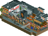
Jaguar - Speculations and Machinations
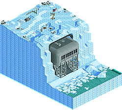
MK98 - Arctic Research Centre
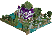
MrTycoonCoaster - Castle Madness
__________________________________________________________________
How to vote?
First of all, check out all the entries in this match. If you can't view one or more entries, for example if you don't own LL, then please, do NOT vote. Once you've viewed all 4, select your favourite and second favourite in the polls above. After 3 days, we will close the poll, the results of the two polls will be added together, with the votes from the second poll weighing only half as much as votes from the first poll, and the 2 highest scoring entries will proceed to the next round. The third placed park will place its creator on the reserves list for the next round of the contest.
Votes are public and so any cheating of the system, betrayal of honesty or mistrust will be picked up on and will be dealt with.
(in preference order)
AVC - This some of your best work and I love the change of pace from your usual use of vibrant colour. It's set a different mood than I'm used to. The micro itself is incredible. I LOVE the theme, I love the way you executed it and it's really really cool. My only issue was that it took absolutely ages for the guests to reach the ride and get on it, I reckon it would have been better to move the entrance hut down to ground level and make the elevator non-functional.
The summoning circle up top felt so much like opening the hell portal in DOOM 2016. Paris catacombs and motherfucking DOOM, what a great combo.
Jaguar - This is uh, interesting. So so so many cool ideas and I love all the chaos but I really hated the colours or at least the way you used them, they were really overpowering in a way that made it hard to take in the archy. The coaster was so cool though. The whole thing is cool tbh, it's just a bit too intense for my liking.
MK98 - What's there is actually really well done but there's just not enough there in the first place. I can appreciate something more atmospheric and less dense ie Steve's micros, I just think the research station needed to be bigger and more flashed out. It would have been cool to be able to look into if from behind, for instance.
MTC - Yknow what I really appreciate just how weird your style is. This held my attention for way longer than you'd expect, it's just so bizzare. I love that, I'm glad you do your own thing, it really brings something new to the site even if it isn't good technically.
Geez, what a wild match here fellas!
#1 AVC: Beige IS a theme! Repetitive objects can be so bad, but you made it so good! The archy was very well done for being so big... timing of the balloons was perfect! Great job!
#2 Jag: This is really out there man, wow! I think you've provided half of the new disaster bench with this park. It's hard to tell what's going on, but it's loads of fun!
#3: MK98: Love the serene outside setting (as it should be), and the cut away view was well done too, would have liked to see more to capture my interest longer.
#4: MTC: Another great park from a great builder. Wacky and fun, just love your creativity!
AVC: This was impressive! The top level was great archy, and then the balloons rising thru the ground was such a cool affect. That alone won it for me. Then the catacombs below were over the top! Awesome stuff.
Jag: Pretty wild. My eyes kinda hurt because there was so much going on. Really unique style here and I did enjoy it. Just wasn't sure what everything meant! Cool to see the elevator cars move horizontally.. that was new!
MK98: Similar to Terry Inferno's entry. Very simple, but a cool vignette. Interior was well detailed.
MTC: Very interesting entry. Looked sorta rushed in the end since nothing was named. But, your archy was better than other stuff you've built, and little details like the drain pipe on the back of the castle was a nice touch. Keep it up!
AVC - Diablo thing
You're the best kind of ridiculous and I love you. This is so cool and unconventional. I love that you got out of your typical color schemes for this, and it pays off I think. The textures you chose are also perfect. Architecture is top notch. Easy #1 vote for me.
MK - Arctic Base
Man I love this. The atmosphere is spot on, and I really enjoy how peaceful it is. Great use of cutaway view. Also, bonus points for using my Strangelove posters. The sizzling burger on the grill is a cool detail.
Jaguar - Drugs
I want to like this, but it's just not my preference. That said, this is really really impressive. The sheer amount of movement and interaction is incredible. I've never liked 'color vomit' type themes, but I see what you're going for. The flying eye monster and ribbon-eque coasters are the coolest things on the map for me.
MTC - Big Castle with Rides
I really enjoy your use of different textures. The color scheme you chose is also very nice. I do think peeps would have made this a bit better though. Great to see you continually getting better!
AVC - amazing effect. Great design otherwise. Does the coaster actually run somehow? Not that it needed to. I enjoyed this.
Jaguar - very cool. Love the energy, even if it is quite messy.
MK - funny to see such a calm and composed entry with the other three. Nicely done, but almost too well-behaved in this company.
MTC - do all these custom rides actually exist? I just love how you keep managing to do your macro style in a micro format. Well done.
2. Jag: this is nuts lol. Theres lots of little amazing details throughout- if you layed out this in a more coherent way it would really have shined. But still I appreciate the absolute storyless chaos you were going for. Maybe felt a bit blocky in a weird way? But still just lots of stuff that if you focus hard you realize is actually quite impressive detail work
3.mk: solid, nice work. I love how the base sort of fit into the ice so neatly and interiors worked well. Clean and cool
4. Mtc: very "you"! Always so symmetric and indescribable. You're getting better at detailing tho. Congrats on sneaking your way to semis tho, i love that
AVC- I was sitting there trying to figure out where to start and then suddenly the balloons. Great trick and what a way to open a map. Absolutely loving the architecture. It's using the pieces I would expect from you, but in new and interesting ways. The monochrome look makes those green accents and the blood stand out way more than usual, which I like. Some really dark theming here with the bones on top and the hanging bodies off of the track. That was a nice touch. In cutaway, there was quite a bit to see from the catacombs to that wonderful skull sculpture. The coaster is just kind of 'there' but I don't think it detracts from the whole experience-- I like the way it's using the columns. A nice touch on the frisbee object used there too. Lovely piece overall and a clear winner for me!
MK-There wasn't much here, but it was executed well. I always like the sparse look on top that leads to some more interesting things below. In this case I'd really like to have seen more-- maybe tunnels or stuff trapped in the ice-- but the actual base station here is well put together with some cool details. The little bunk room and kitchen area are quite nice. I would have liked to have seen something else going on whether outside or in, but I can't fault the detail and quality of what's here, which pushes it through for me.
Jag- I expect you'll go through, and it's certainly warranted, but I couldn't really get into this one personally. There was just too much going on and so much of an assault to me eyes that I had trouble following. There's certainly tons of details here... I just can't tell what any of them are! I will say I like the use of the raptor track as a non traditional train. You're using all these crazy objects that you never see-- a few expansion pack scenery pieces especially-- and they sort of go with everything I suppose. You certainly are on to something here, even if I'm not quite sure what it is!
MTC- This was fun. I smiled as soon as I opened it because it's very 'you'. The custom rides are kind of ugly, but the sort of jerky motion on that roll o plan almost seemed to set a beat for everything else. Symmetry as always and while not necessarily a bad thing, it might be nice to see you jump from that at some point in the future and start to branch out. Well done for getting a number of fun entries into this contest!
1. Jag - This was a close one for me and it looks like I'm in the minority which I understand. Its overwhelming, hard to read, but was immensely rewarding to dig into the micro. It felt like there were hundreds of little nooks and mini scenes which were pretty nice on their own. All the deco shapes made it kind of feel like Its A Small World on acid and maybe stimulants also. Maybe I'm crazy, but colors aside, I think the structure itself was fairly well composed in what could've become a mess of unfinished levels and missing pieces. Definitely would be an intriguing one to see the build process of.
2. AVC - This probably would've won it for me, but initial macro impression is important for me and I really wish you'd just left the whole thing open instead of having the huge land block. That pet peeve aside, you branched from your first two entries in exactly the way I hope you would, with a complete different use of color, much darker tone, but still staying true to your unique style. The monochrome really highlighted the bits of color, including the cool balloon trick. All of the wood pieces on the walls on the bottom level are so oddly satisfying to stare at for me. Coaster was also perfectly imposing for this map and I love the helix attached to the pillar especially, some brilliant composition there.
3. MTC - So happy to you make it so far in this contest and you've outdone yourself once again. Love the wacky game show feel of watching all the flat rides in such close proximity moving in time to the Urban music. Entrance looks nice as well as the top of the castle. The biggest improvements you could make would be breaking up some of the huge grey walls with mini levels, balconies, etc, and also I think you overuse the brick path a little bit. Would've been cool to see a bit more of a layout for the corkscrew coaster going through the castle as well.
4. MK98 - Great cutaway (which I missed the first time) and a lot of nice little details on top, but the macro left a bit to be desired, as it was mostly just a big ice block with a grey building. Think this one really would've benefited from some kind of coaster at least in my opinion.
When I opened your park and saw the balloons coming up, I just loved it.
So many skulls and bones reminded me of the Apocalypse (lol), of course, I really liked it.
I believe it made a palace, palace of bones, this sounds cool, architecture was top, the colors turned out well with little green and the little volcano in the middle, helped in the scenery, and the columns are fine.
Working out of the objects around the elevator is nice.
Jaguar - Speculations and Machinations
I love colors and lights, they bring an atmosphere of happiness, it's good to see colors and lights understand.
The tentacled eye was the best, I really liked those lighter bulbs (with light shadow), and the horizontal lift looked good.
The colored ribbons running seem like worms running away, haha, I liked it a lot.
MK98 - Arctic Research Center
I love snow and space things, the American flag I think was the charm of everything, it was good.
A stone here another there, a panel, is perfect, and the astronaut is 10, I like this astronaut since I first saw the RCT.
I liked the building all gray.
MrTycoonCoaster - Castle Madness
This can not comment (lol).
The Summoning of Mephisto - The coaster layout leaves a bit to be desired here. I wish it interacted more with the top layer. On the whole I'm not sure what having the land level so high accomplished - it wasn't obvious on first viewing that I needed to use cut-away to see everything else, and I don't think making it plainly visible would have really detracted. This field of bones that guests siphon through is actually a really cool idea, well-executed. The map contrast is a little low which makes it hard to look at, and the coaster feels like an afterthought. At this point saying the architecture looks nice and unique is just a given with one of your entries, but this lacks the life (intentionally so, I'm sure) of your other entries that have been more surprising and fun to watch.
Speculations and Machinations - The points where the "track" was occasionally illuminated by a passing train was a neat effect. The rest is just so random and loud it's hard for me to process it. I think I get the atmosphere, I'm just not sure I know what it was supposed to be for.
Arctic Research Centre - Neat, for something accomplished with only a single ride. I'm not quite sure how it could be improved or what I'd do differently. I'm not sure a coaster or other ride makes it better. It's lifeless, practically by design, but it lacks the refinement or clarity and boldness of vision of Mephisto. This one's a very close third for me.
Castle Madness - Let it never be said that you fail to deliver. I think this lacks a clarity of theme that your earlier work for the contest had. I would be interested to see you take these ideas and make themed areas out of them, use them to direct smaller pieces of your larger works. I think you've made some fantastic progress with this contest's creative constraints as the catalyst, and your future work will be even more fascinating.
Av: big departure from your typical colorful style, but sold really well. The ossuary walls have just enough variation to keep them interesting, and enough regularity to sell the creepiness.
Jag: This was really hard to follow. I had to go back to it a few times to try and "get it" or dig for details, because I knew you'd put some thought into this, but I never really figured out the process. Enough cool tricks, life, and movement to take 2nd from me though.
MK: Nice, detailed, and atmospheric, but unfortunately lifeless and boring.
MrTycoon: This is fun. It's a good castle for the space, and the rides added enough life that it was a very interesting entry.
This vote was pretty straight forward for me
AVC got my first vote, because of DAT drama, DAT style, DAT atmosphere, it was so good. You've given us such different interesting looks with each micro in this contest, so excited to see what you do next.
Jag got my second vote, cause DAT surplus. This was so interesting and so much and almost felt like a hectic collage, I loved it. Definitely appeals to the artsy color-intense side of me. Well done.
MK, I really liked this, felt so atmosphere and a really great go at an ice theme. But, compared to the excess of the first two, it just felt a bit too little or too empty. But the exterior was ace.
MrTycoon, this was fun and interesting, but still so far from the execution and conceptualization of the others. I'd still suggest you look at the forms and scale of other parkmakers while keeping your flair for color and movement.
Speculations and Machinations - wow I really like this in a weird way... I liked seeing the coaster follow the flailing raptor track strings. The colors were overwhelming which is what I assume you were going for, as were all the movement, and I learned of some new objects / rides here that I'm very glad to know about as they'll come in handy in the future. Overall an "interesting" entry that brought something new to the table, which is always very much appreciated in my book.
MK - very class entry, clean and well done. Something like this needs some movement or some narrative and "little things" to bring it alive. Could definitely have use more underground and even above ground structures and/or a ride, something to show more into the lives of the researchers or what they are researching (something sinister, perhaps? frozen UFO buried in snow, or secret laboratory, something akin to the Thing maybe?). Also, looks like they don't have a bathroom in there
MrTycoon - Fun, it looks like the rides are dancing along to the music! A way to improve would be to break down your architecture into smaller portions and think more about the overall look and shape of them. Currently you have a lot a big structures, I think shrinking down and thinking a little more about how the parts come together would be a good step forward.
Tip of the day: never eat yellow snow
Jag: I'm not sure if any of you know the music video for The Sound of Violence by Cassius, but I saw it a lot back in the day when MTV and other similar channels were actually still about music. I always thought the video was cool and it was the first thing I thought of when I opened this - mostly because of the flying noodles. The other thing I thought of was KaiBueno's recent micro. This one had some more creative ideas and the awesome flying noodles, but I prefer Kai's for the rest, since it was more readable while still being crazy. It had a good ride I could follow around the map, and yours doesn't really. It's crazy and cool looking object vomit but there's nothing to guide me through it! I sound very critical, but trust me, I liked it.
MK: this research station feels very remote and desolate. That's great. It also means there's not a lot to see. I used the cut-away view hoping for a twist, but I just found two (only two
MTC: I still think your round 1 park is your best, but this one is cool too! Someone on discord mentioned that the music really works here, so I switched the sound on (I always forget) and it did work! Seeing all the rides with their flashing lights, and the cool music, it was almost like watching a dance floor in a club. There are no peeps in your park sadly, but in my head I'm making up a story. The park is closed and now the rides are waking up and having a good time after 'work'. Kinda like toy story. Carrossel 1 and Carrossel 3 are going to hook up. Roda-Gigante 1 is on some kind of drugs.
The above order is also my ranking. AVC gets my vote for #1, Jag is my second favourite. MK, MTC, well done on making it this far!
__________________________________________________________
Winner
AvanineCommuter: 36 + 4/2 = 38 points
Eliminated
Jaguar: 5 + 27/2 = 18.5 points
MK98: 0 + 8/2 = 4 points
MrTycoonCoaster: 0 + 2/2 = 1 point
__________________________________________________________
AvanineCommuter proceeds to the Grand Final. Jaguar is eligible as a replacement.
Congratulations to the winners!
bigshootergill: Wacky and fun, just love your creativity! (thx)
ottersalad: and little details like the drain pipe on the back of the castle was a nice touch. Keep it up! (thx)
In:Cities: I do think peeps would have made this a bit better though (yeah, i agree)thx
posix: do all these custom rides actually exist? (hahaha, good one) thx
Cocoa: very "you"! Always so symmetric and indescribable (hehe true - thx)
CedarPoint6: I smiled as soon as I opened it because it's very 'you' (hehe thx)
Camcorder22: So happy to you make it so far in this contest and you've outdone yourself once again (true I was surprised too) thx
Ling: I would be interested to see you take these ideas and make themed areas out of them, use them to direct smaller pieces of your larger Works (yeah, great idea) thx
inthemanual: This is fun. It's a good castle for the space (thx)
FK+Coastermind: keeping your flair for color and movement (yeah - thx)
AvanineCommuter: I think shrinking down and thinking a little more about how the parts come together would be a good step forward (ok - thx)
Liampie: I still think your round 1 park is your best (yeah, i agree - haha good story i liked) thx
It was not easy, many artists here, but this last group when I saw my competitors I panicked (lol)
Sincerely thank all
It was so much fun and cool
How to comment without sounding like an ass...
Hmmm.
Well, to be honest, I wasn't sure what to do with this round. None of these stood out as much as my top 2 from Match 3 (Orrery and Dream Catcher).
Mephisto: Beige and bones and balloons? I don't understand how that worked. The ride was hidden more than an isolated reel, so I'm not sure what to say other than I do enjoy the upper archy, arena seating, etc.
Castle: I feel like I'm staring at a hybrid of a Mario (Bowser) castle topped with ever funny looking flat ride you could think of. Purple and grey work for me, so that's not the issue, but it is a bit Mario/Bowser blocky at times...maybe that would have worked as well?
S&M!: This was weird for me. Specifically me. I downloaded it first of all 16. ALL 16...'cos of color, 'cos of your previous work, and it loaded with an odd sense of the familiar but different. So, at least Liam said it first? Not accusing anything but weird fate, but it was like a hyper colored version of what I just built (with awesome ribbon hacks) but...too much color? I can't believe I'm saying such a thing, as I've been accused of the same many many many many times...but it really was. It was like my panic station coaster dissolved into ribbons, and then the colors went spastic. Even for me. So that was weird, and hard to admit...we cool?
Arctic: I can appreciate the detail for the interiors, and the land building (manually)...but it is completely static against the dynamic death machine that is beige, the energetic castle or the colorful chaos. Otherwise, as much as I want to travel to other continents, good job for this being good enough for me for this or Antarctica.
Converge
Guest Happiness
Ayahuasca
Seizure Warning
a story in four stalls