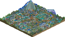
Park / [NEDC5 - 09/10] Paradise Palms
-
 04-December 19
- Views 2,006
- Downloads 456
- Fans 0
- Comments 20
![Park_4701 [NEDC5 - 09/10] Paradise Palms](https://www.nedesigns.com/uploads/parks/4701/aerialm4572.png)
-
 63.50%(required: 65%)
Design Submission
63.50%(required: 65%)
Design Submission
saxman1089 75% robbie92 70% Scoop 70% Camcorder22 65% posix 65% ][ntamin22 65% Cocoa 60% csw 60% G Force 60% Jaguar 60% RWE 60% Liampie 55% 63.50% -
Description
Disable ride breakdowns please:)
This was a super fun entry to make (except the supports) and contest to take part in. I've wanted to make a a fun beach themed water park for a while and thought this was the perfect time!
I'd like to extend a thank you to those who ran this contest -
No fans of this park
-
Download Park
456
-
Objects
259
-
Tags
Similar Parks
-
Oasis of X-citement
-
[NEDC5 - 02/10] B I T M A P
![park_4717 [NEDC5 - 02/10] B I T M A P](https://www.nedesigns.com/uploads/parks/4717/aerialt4590.png)
-
Florida Action Park
-
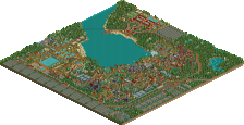
[H2H8 R2] Mzima Springs
![park_4097 [H2H8 R2] Mzima Springs](https://www.nedesigns.com/uploads/parks/4097/aerialt3837.png)
-
Bramble Lake Resort
-
Troy's Ancient Resort
#09 / 10 — "Paradise Palms" by barnNID
63.50%
- no Design win -
( After the panel vote triggers all above panelists should confirm their votes )
Big thanks to the judges and the people who ran this contest:) super fun little park to make
This was fun to look at. A little surprised that it didn't win Design, but maybe outside of the context of NEDC it would have - I think that despite being a waterpark it lacks a little bit of the conceptual "wow, didn't expect that" factor that helps in the format. It's already clear to me that the level of quality in the higher scoring releases is going to be mental.
I'm always a fan of waterparks, so this was a nice treat. I think perhaps the river rapids could have used some more interesting water features to bring this up another notch. Foliage could probably also have used some tweaks, but I'm really impressed. The beachfront was probably one of my favorite parts (even if it could have used a few pops of je ne sais quoi between the buildings). Just love those cute little tropical buildings on the shore. Really great work, and I'm excited to see what you come up with next.
Damn, best work from you yet barnNID. Love the colors here.. its so bright compared to your other work! The support work is good, but more reminiscent of a B&M coaster, which isn't a bad thing IMO.
The station for the ride was the highlight for me. Its a large, imposing structure that is still aesthetically pleasing if that makes sense.
The rapids ride was a bit hit or miss. The monorail bumpers/siding was iffy. I'm not a fan of seeing a gap between the river bank and the monorail track. Rather, I would've been a fan of bumpers or poles or something to guide the boats. Maybe an underwater track.
Otherwise, great entry.. really surprised this wasn't 65%! The beachfront waterpark vibe is definitely achieved here. Such a pleasant bit of rct.
Crazy to see something this good in the ninth slot in a contest, even on New Element. You've shown so many good screens here and on Reddit lately, you're on fire my dude. I think the custom palette is a little unnecessary here, and the B&M supports don't really do anything for me (colors don't quite match up, some supports are on the wrong side for a swinging train, and just in general I think an Arrow suspended is the best excuse to try something different), but that station is perfect and I think you have about the right amount of supporting content to sell the water park idea without it overwhelming the design. I agree with what others have said about the rapids ride, doesn't quite ride the line between realistic and fun as well as it could.
vote notes
Paradise Palms
65
Really cool overall park plan that makes the coaster the star and something for guests to follow through the whole park. Great waterpark attractions and neat how the layout seems very logically placed with the second half in the island created by the rapids loop. Rapids are nicely done and fit the smaller waterpark environment very well, the overall attraction choices and ride placement feel very realistic.
I wish the rapids did more than just drop and then be flat forever. The neon yellow is a fitting choice for the theme but can be overwhelming with the density of supports. Coaster is more just on top of the whole park than intertwined with it. The foliage is used to good visual effect but is extremely samey. Would have been nice to see in the waterfront landscaping.
Loving the bright colours. The first impressions is definitely good, but the longer I look at it the more underwhelming it becomes, relatively speaking. This piece is exactly the sum of its parts, and some parts are too undercooked or unrefined. While most of the park still qualifies as good, little transcends that. The rapids lift complex is the most notable, exception, though. Love that shit. You've got talent for sure, but I'd like to see you move beyond the 'sea of trims and steel roofs aesthetic'. Final note: the coaster layout is great.
Fab work, shows a lot of growth and serious potential. The setting of a water park was really cool. Colour scheme was also great, though the support colours were perhaps a bit overpowering. Station structure had good form and the other architecture was nice, especially liked the surf shop.
Would have been cool to see the coaster interact a bit more with the water rides. Foliage was nice and lush, and I would suggest using the small grass object to create a gradient at the edges so it's less abrupt. Rapids was pretty solid, though the barriers were a little distracting and it could have used some more interesting elements perhaps. The lift segment was great though, and overall the ride was well themed. The splash could have used a bit of path interaction maybe, espcially with the queue which is so close.
Keep it up though, you're headed in a great direction with this and the work you've shown recently and you're a quick builder.
Nice little entry, but I have to say I'm not really a fan. To me it seems like a project where you didn't put a lot of thought into. I mean it's neither a waterpark I'd love to go (3 small slides, one small pool) nor an amusement park. I mean you added a park entrance so I take it as what it shall represent but to me it doesn't make to much of a sense.
Leaving that aside lets look at the park. I like the positioning of the coaster, it rather nicely frames the whole area. The bright support color is a good choice but too dominating. Also the coaster is way too oversupported, I mean you could leave out every second support almost. That would also have helped on the color domination of the yellow.
I agree with the others that the rapids ride was a little boring with the lift building being the only upside. Especially that "hill" right before the vertical lift seemed quite unnecessary. Moreover keep in mind that rapids track normally is one unit higher than all other rides, so when you merge the rapids onto other tracks you will have the boats floating, which is what happens on the splash and looks quite strange.
Going to the archy I quite like the structure of the station building, especially the raised roof in the middle breaks it up nicely. On the other houses I feel like all your floors are atleast one unit too short. Moreover what I noticed what you do (also in your recent project) is that you don't give your houses proper foundations. If you add one unit on the bottom of another (stone/concrete/whatever) wall you add height to your floors (good) and your buildings will automatically look better (and more realistic).
One thing I really liked was the water playground. It's well composed and looks quite fun. Especially the climbing wall is great. Good job on that!
I hope I could give you some feedback what you could improve in future projects. I think especially when building realistic stuff you should always ask yourself if it is believable that a park would have built something like that. You are on a good way, though, your new project already looks really promising!
definitely not bad. One small tip- you used two different music tracks and it clashes badly!
It was nicely lively with some cool slides and details. perhaps it doesn't quite come together as a believable park but overall I did like it. felt like an improvement in your architecture too, although you seem to still be clinging to some tricks which I'm not sure are doing you any favors (outlining walls with thick slabs, etc)
Great entry... i thought this would have hit the design mark. Nonetheless, it's a great step in the right direction with your park making skills. I'm loving the use of palette's in rct now, it provides a breath of fresh air to park making. I always enjoy a tropical theme, so this is quite a lovely little water park. There's a lot going on in such a little space, but that's not necessarily a bad thing, the amount of detail keeps my attention.
The archy is fairly nice, I've got carried away before with trimming everything in my park, but I'm trying to find a balance, which I'm sure you will too. Perhaps you assumed you needed a park entrance, but with a design it can simply be a portion of a much larger park. Taking out the entrance would have lent itself to knowing there is much more to this park that we don't see, so it makes it kind of a small water park with only a few rides.
You've shown a lot of promise, keep on building!
I will refine these a bit more after one more glance, as these thoughts are from memory.
Looking at this again, I'm surprised this placed 9th. The coaster colors are nice, although maybe the bright yellow is a bit too strong, and I appreciate the supports job you did. I really like the station building and queue, as well as the building at the top of the rapids ride. Outside of that, the buildings were all solid, but some of them could have used more sprucing up - namely the towel stand and the one by the Kuna splashdown. Foliage could be better as well, only using three tree types is risky, and the weird dark red color in the underbrush was odd too.
Overall great entry. I think it's right on the line as far as the design vote.
There were parts of this that were great and parts that felt a little unrefined and just odd. I wasn't a fan of the foliage and the river rapids ride was strange with the steep lift becoming an elevator lift, then a steep lift again before travelling down a really long, shallow drop.
Despite that, this is a really nice execution of a tropical water park... the architecture in some parts is brilliant and in others feels rushed. The station and area around the slides are definitely the best parts of the park and I'm a fan of the park layout as a whole.
Overall, it's a nice entry, although the quality and execution does seem rather inconsistent.
Good stuff barnNID! I think you have ample feedback from more knowledgeable folks than me, so I just want to compliment the river rapids ride - love the station, the queue, the lift structure, the foliage - it all really enhances the second half of the coaster.
Overall i did enjoy this but there were a few unrefined bits and issues that kept it from being design level for me. I think 62-63 is a little closer to how I really would put it than 60 though. I love the colors on their own and don't mind the B&M supports on an arrow, they were mostly well done and worked nice for your style. Be careful making them too good or you're gonna end up on support duty next H2H
Although I liked the coaster colors themselves, I think you painted (sorry...) yourself into a corner with them as they clashed with a lot of your other color choices. The rapids colors and warm colors of the water slides really clashed with each other but I'm not sure what would have been a better compliment for the coaster colors. I liked the interaction with the rapids but I think it would've done you better to have some elevation changes on the map. I didn't really like how the rapids were just flat the entire time except for a big drop that wastes its speed (and seems pretty dangerous?) going into the station. My one other criticism is the beach seemed pretty underdone. I don't expect detail spam in every park all the time, but you seemed to be going for modern realism and micro detailing in some places and that lead me to expect more life in some parts of the map and it just seemed inconsistent and rushed as is.
That being said I've said this before but I really like your architecture style. The station looks great and I am just a huge fan of the wood deco trim style. I think currently this is your greatest strength as a builder, while the thing you could work on the most is planning things out a little better, and making sure to add connective tissue/life between all your structures and rides. My review might sound harsh but it is because I really think you have the potential to build something incredible and are already on the cusp of it.
The pool near the Snak Bar was a charm.
These shades of blue and brown is beautiful, gives a great contrast in harmony.
Temple of Eura I love these long descents, it is fun.
Good work.
Love some of the architecture here such as the coaster station and the rapids lift. All the tower structures were well executed too. I think compositionally it's a little weak - for instance how the water slides form a wall in front of the entrance, and then following this plaza you have a bottle necked path leading into the rest of the park.
I think you can also go easier on the diagonal paths - in quite a few places here it makes the path actually look much less organic and more gridded, especially where you have right angle connections. Despite the coaster not interacting so much, I like how it's elevated over the rest of the park. Nice job.