Park / [NEDC5 - 08/10] Isla Mechanica
-
 04-December 19
- Views 1,702
- Downloads 438
- Fans 2
- Comments 19
![Park_4709 [NEDC5 - 08/10] Isla Mechanica](https://www.nedesigns.com/uploads/parks/4709/aerialm4586.png)
-
 65.50%(required: 65%) Design
G Force 70% posix 70% robbie92 70% RWE 70% saxman1089 70% Camcorder22 65% csw 65% Scoop 65% Cocoa 60% Jaguar 60% ][ntamin22 60% Liampie 55% 65.50% -
Description
Ahoy you scurvy dogs! Welcome to Isla Mechanica, also known as....Robopirate Islands!
-
2 fans Fans of this park
-
Full-Size Map
-
Download Park
438
-
Objects
269
-
Tags
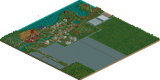
#08 / 10 — "Isla Mechanica" by Jappy
65.50%
- Design win -
( After the panel vote triggers all above panelists should confirm their votes )
I honestly didn't expect to see multiple islands integrated into a submission, and it's pretty great. Fun concept, maybe a little bit ragged in places. Loved the custom supporting at the high points over the water and kinda wished there was more along the big drop. Overall, great work and I generally agree with robbie's points above. Amazing that we're at #8/10 and we've already hit a Design win.
Great stuff Jappy.. really liked the mix of pirate and steampunk. The object usage here was nice too. Like the idea of using an old PT bench and then adding a few things.
Theres a lot of neat little scenes throughout the islands that caught my eye. The island with the volcano had a big mech droid I think? The little village on that island was cute too.
The next island with the 1k rock skull.. that was cool! Didn't notice it at first! The usage of masts on the house porches was a nice detail as well, along with the crashed boat.
The boat loading/unloading gold was great as well. The continual theme of gold mining throughout the park was good continuity.
I agree with CC9 that a design with #8 place is amazing. Lot of good work here. This and Club Psyke provided some great creative ideas this year!!
Lacks a little bit of polish in the architecture and the details, but absolutely succeeds in crafting its atmosphere. Another unnecessary use of a custom palette I think. Could maybe have used either a more make-shift looking support style or a more cohesive one. This split of having a few custom objects and some unsupported stuff and some more default supports makes it look like it was just an oversight. I do wonder if you couldn't have done a little more if the main island extended underneath the top of the second lift for a more climactic setting there before swooping down over the water between landmasses.
vote notes
Isla Mechanika 60
Really cool skeleton mech dude. Unique train choice fitting the theme. Lots of fun, movement and energy. Eclectic architecture fits the theme well. Nice custom supports. Bunches of cool little scraptown bits like the (ore?) hopper going into the ferris wheel. Fun twist on the usual pirate hideout theme. Nice mix of terrain interaction for the parts of the ride over the islands.
Feels a little unrefined. The stretch of coaster out over the water doesn’t really do much for me, just feels empty. “Town made out of found bits” is a hard concept to sell well and make look attractive. I think the main archy feels thrown-together (as in, matches the theme) but doesn’t look all that great. This one didn’t connect with me for some reason. Maybe it’s the stock object use, but it feels amateur even though looking through my list of positives there’s a ton I should love.
Steampunk pirates? Hell yeah. This almost feels like a non-existing Ghibli movie. You made it a lot of fun to explore, but it's too rough around the edges and messy for me to consider this design worthy. It doesn't help that the coaster seems very undersupported in places. Lastly, the coaster layout is great, though.
Love the theme, steampunk is always a favourite of mine and crossing it with pirates works really well, very suited to your brand. The multi-island setting and concept is great. I loved the idea of using small coaster trains and the layout was used quite well in the first half. I do wish the second half interacted with more than just the island, it feels a bit underused like Kai's.
I thought the queue weaving in and out of the landscape like that was really well done. I loved the little elements like the mech droids and the hidden skulls, and the architecture on main island was very lively and colourful. The concept and atmosphere really shone here so congrats on the design win.
it was just a bit too messy for me- I actually didn't notice a lot of the cool pirates for ages because theres so much small scenery and bits thrown around everywhere. especially the archy felt small and patchy. I liked the island vibe though and the layout was mostly fit in, although I think having one lift hill just go out over water is a missed opportunity. nevertheless the wooden support structures were a cool idea, if fleshed out a bit more.
Great theme combo, really cool idea. The highlight is definitely the main island, with that cool port area and the pirate mech droid, the backside with the pirate ship and the sail ride. Archy was decent considering the bench you choose to use, which I also admire you taking a step back in time to a pro tour style. Always love me some Jappy rct!
That being said, I would have liked to see this design more refined, there were some missed opportunities, such as doing more along the shoreline, around the coasters supports in the water etc. Glad to see you hit design bro!
lots of atmosphere and fun little details packed in here! You're mini-cocoa.
Pirate mechs were a great idea, and the ship masts integrated in the buildings was executed nicely.
love your work!
I love the theming of this entry. It's a lot of fun and pulled off very well. I think the theming on the second half of the coaster is a bit bare (half of it is just suspended up in the air), but the rest is great, weaving in and out of trees and rooftops. I like all the details, like all the dock infrastructure. The buildings on the volcano island are great too. And I think this is a contender for best queue line of the contest.
Whatever palette you used is goofed up - there's a bunch of pink dots in the sand. Some of the landscaping looked rushed as well, especially on the main island. And when have you ever seen a steamboat with sails?!
https://en.wikipedia..._Oceanic_(1870)
It’s a thing.
The dots are from the magenta in cocoa’s palette. Something is up with one of the gradients and it takes over some browns.
This felt like Hitchhiker's harbor if it were redone in RCT2, and while I hate to say it, it felt rather unambitious, especially for steampunk pirates. I wasn't a fan of the flat rides just plopped down randomly, and it just felt like cross bracing + gears = steampunk.
Still it's a very strong entry with a lot of highlights. I loved the ruin block skull, and the pirate battle mech is really cool. There's definitely a lot of creativity. Foliage was admittedly hit or miss, but the composition is great and the clumping of buildings is really well done. I also like the usage of multiple small trains for this entry.
While I was one of the lower votes on this entry, in retrospect I'm glad this won design, even if I personally wouldn't have decided that.
Maybe I'm just a sucker for boats and shipwrecks but wow there is a lot for me to appreciate here. One highlight is Steamy Boi and his dock area with the skull and crane. Another strong section is the little town square near the entrance to the Volcano Island launch ride. Each island has it's own feeling but they come together nicely. This is really fun and upbeat.
I feel like this design is great idea but rather sloppy execution. The theme is quite unique. Steampunk mech pirates - I think we haven't seen this before. The U-shape of the layout works well with the setup of the three island. The turn around the volcano is my favourite part of the map. The archy down there is really cool in terms of shapes and colors. This I can't say about the archy on the main island. it feels a little to overcomplicated and too playful with too many little structures (sometimes blocky) not coming together into a cohesive town. Same goes for the castle on the third island. It doesn't seem to be up to your normal quality.
I agree with the others who didn't like the supports a lot. To me they on their own look a little sloppy, especially their horizontal bars and leaving them out on other parts of the track leaves the coaster to be strangely undersupported/floating in parts.
I like the random skull faces popping out everywhere, the stone one on the castle island made out of 1k ruins was cool. On the mechs I am a little torn. The idea is great, the skull heads work really well, but the rest of the bodies are quite blocky imo.
And speaking of 1k ruins, I am not really a fan of sparse 1k ruin spam in the landscaping, either do it heavily or leave them out totally. The landscaping in total is convincing imo, I especially like the area around the queue. Foliage fits with the tropical theme, too.
One last thing that did bother me was the catamaran ride. I mean it's really cool and fits the theme but I have a problem with the amount of boats on that ride. They look like they are all fixed to some invisible string with their equidistant movement. I'd suggest for these kind of 'free streaming' rides to cut down the number of vehicles drastically so in the end it gives the impression of a freely moving ride.
All in all I think you could have done better on this, but I guess you did not target for much more so it's nice you got design, congrats on that!
While I think the execution on this was fairly good, I have to agree with Jaguar that it felt a bit unambitious and a bit like a rehashment of Hitchhiker Harbor, and that's what kept me from voting it higher.
The main island is really a mixed bag with some great moments like the station itself, and a lot of parts where it felt like you didn't fully figure out how to connect things or ran out of time to. In terms of integrating the ride there were a few compositional mishaps, mostly the straight section of track before the first lift that is way out in the open and floating over everything. It kind of seems like Robbie purposely added some challenging to theme sections to the ride and this one handled that particular section less well than some of the others. The supports have been a bit of a hangup for me throughout this contest, and for a ride that is deliberately supported in places (thus inferring the ride is abiding by the laws of physics) there were some very key sections that were way too unsupported.
The two smaller islands were pleasant if not super remarkable. The volcano island has some of the best bits of archy on the map, even if they are a little out of the way. The massive floating second lift didn't really work for me. If you're designing a ride around the existing landscape, it wouldn't make sense to have that sort of element.
Overall even if there were a lot of issues that kept me from ranking this higher, the landscaping and composition and some of the archy were strong enough for this to be a design for me. I guess I'm a little bit disappointed since I know you can do better, but also you said you had issues with time so I commend you for pushing through to finish this.
Very nice the yellow and blue windows, the overall construction is well designed.
The idea of castles and ships is 10.
Busy in a good way, I really liked the lively energy. I think it could be improved with some larger structures alongside all the smale scale shacks - as it is, everything looked miniature. Fun stuff though.