Park / [NEDC5 - 10/10] Spiirokiti Piir
-
 04-December 19
- Views 1,911
- Downloads 375
- Fans 0
- Comments 23
![Park_4711 [NEDC5 - 10/10] Spiirokiti Piir](https://www.nedesigns.com/uploads/parks/4711/aerialm4571.png)
-
![Park_4711_[NEDC5 - 10/10] Spiirokiti Piir](https://www.nedesigns.com/uploads/parks/4711/logot.png)
-
 56.50%(required: 65%)
Design Submission
56.50%(required: 65%)
Design Submission
robbie92 70% posix 65% G Force 60% saxman1089 60% Camcorder22 55% csw 55% Jaguar 55% Liampie 55% RWE 55% Scoop 55% Cocoa 50% ][ntamin22 50% 56.50% -
Description
Welcome to Spiirokiti Piir, my design entry for the New Element Design Challenge #5, and in the end, essentially a mini park competing for a design award against other entrants.
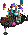
Piercing the darkness of night, it is a neon themed set of piers featuring the required and unaltered suspended coaster and a few other pier friendly rides like the Tilt-a-Whirl, 4-D Theatre and Roto-Drop. In addition to the rides and entrance hall, there is a services building and an Asian food court area, complete with many fantastic food to be enjoyed at many tables w/umbrellas. -
No fans of this park
-
Download Park
375
-
Objects
155
-
Tags
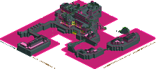
#10 / 10 — "Spiirokiti Piir" by KaiBueno
56.50%
- no Design win -
( After the panel vote triggers all above panelists should confirm their votes )
I didn't expect anything less than a wild, abstract...something from Kai. I'm glad you did something unique; the abstraction is a risk in a contest like this but it's something that you have a great grasp on. I'm having trouble finding anything I'm not much of a fan of. Perhaps there's just a *bit* too much negative space? I dunno. Gotta say one of the highlights for me was the roadline use under that one tower. I really wish there was more of that.
I wouldn't be surprised if this is one of the highest overall scoring NEDC iterations. Here we are at #10 and I'm pretty hard pressed to find anything wrong with this. Awesome job.
I agree on the negative space.. There's not a whole lot to look at. You have a very distinctive style that is definitely a welcome sight in the community again.
The palette wasn't bad, just a bit too contrasty. I think the palette I used for Dry Dock 14J would've been good.
I was a bit confused by all the fenced off tables w/ umbrellas.. they weren't accessible by peeps?
The structure that was at the bottom of the second lift that had the helix around it was well done. The usage of the road lines like CC9 pointed out provided a cool sense of lights reflecting off water. That structure is a good example of good interaction with the coaster overall, especially if you include the Asian food market pier. Would've been neat to see those stalls integrated above ground.. could've provided a cool carnival/street food/market vibe.
I think it's really interesting but lacks a clear sense of what it's trying to be. The coaster exists almost completely separately of anything else on the map. Take away the very sparing single-tile towers that occasionally pass for supports, and basically the only thing that ties the two together is a one-tile-wide blocky station and a color scheme. The only setpiece the coaster really interacts with is that one big tower of quarter-tile objects, but that's floating out in the middle of nowhere. I would have liked to see you lean a little harder into the glass objects for the architecture. It might have given the map a bit more identity and more things that the various parts could have in common. The decorative/inaccessible tables also struck me as a bit odd...
Vote Notes
Spiirokiti piir 50
Crazy choice for a theme/setting and is a cool light show to watch for a bit. I like the arrows above the track. Definitely the right palette choice for the concept. Nice commitment to the concept with the sign texts. Cool how the park has been skeletonized to match the interaction points of the coaster (or the coaster has been built around the “piir”.)
The ride is less interesting to watch here than other entries, and it feels like the coaster itself is less of a showpiece element. There’s a lot of interaction, but it doesn’t match the sort of tension and anticipation of highlighting a big drop or hiding some of the layout from the guests. The park is nice to take in as a total package, but I didn’t really find anything in a particular building or platform that kept my attention for long. The structures are simplistic enough that it’s hard to tell whether they’re part of the “piir” structure, guest facilities, or just there to look good.
woo, I get to be the low dropped vote. Usually I'm the opposite.
The good things about this, are well, the good things I've commented on every other park you've made since you came back. Colorful, different, etc. And thats also the bad thing.
Your motto so far seems to have been centered around fun, whimsy, fantasy and nostalgia and a sort of pushback against what you might call realistic/technical/detailed parkmaking. And that's not bad, I back those things too. The first time I saw your colorful-shapes-space-station work, I liked it. By the third time, it felt like you weren't doing anything interesting any more. I'd like to see you apply your own philosophy of pushing boundaries and ignoring conventions to yourself. It sort of feels like you figured out a scenery combination that sort of works and you're just spamming it again and again- it really pulls me out of the "this is a fun creative exercise" into something more... mindless.
I hope that doesn't sound too harsh. Your perspective is always welcome- I'd just like to see you apply the criticism of 'modernist' parkmaking you'd probably level at the rct scene today, to your own parkmaking philosophy. Be inspired (by real parks or fantasy or whatever), push boundaries, try new things.
Or don't! Its also fun and important to just meditate and build whatever, even if its boring to other people. I don't care. I just happen to be one of the "other people" for you
After Masters Palette I expected something similarly traditional. Like, something that's not floating in space with ridiculous colours. We got the latter and that's okay with me, although I'm still looking forward to seeing a new project from you that is down to earth, as the FLW area in MP was so promising. Anyway, undefined floating space stuff. I'm always a fan of strong colour schemes and this one works very well for me. I like that almost every surface is black, and the colours are mostly coming from (out)lines and trims and other thin elongated shapes, making the whole thing look like a big, complicated neon sign, kinda like that dr dirt screen that has been shown on discord a few times. The contrasts here are also nice. The yellow iron wire fences look great for example. This piece may be your most refined since your comeback, but for a score higher than 55% I desire a little more complexity. What am I looking at? Lastly, the coaster layout is great.
That said, I think it is more refined than the other 2 black void-like parks in my profile and thought it interacted well. Probably would fix a mislabeled sign, change the cars to floorless...that part I regretted after sending in. Otherwise, I dunno. I thought the night time and water feel was there.
...I guess this work and comments are better than the other 15 ppl that bailed on the contest? That would have been me if I hadnt switched to this. Whatever.
I love this. Colors are fantastic, and the overall visuals are incredible. I agree with some of the feedback above, but in the end I think you achieved what you set out to create and I love that.
I think it could have had a bit better supporting to kind of "ground" it a bit more with the setting, but it's not a dealbreaker for me. The color scheme is beautiful and is a rarely used combination seen in the game.
As someone who focuses on graphic design / color composition / contrast / etc, I love this. You always seem to create works of art as opposed to traditional theme parks, and I say carry on. Don't let anything discourage you - nobody is trying to tear you down. Feedback is feedback, and you can do with it what you will.
Josh
Really cool palette and colour use, and I love the neons as highlights. It sticks to your (recent) style well but feels a bit more evolved. There are a couple of nice set pieces for the coaster, but the bulk of the interesting stuff is in the first half and the second half unfortunately felt a bit underused.
The atmosphere was vibrant and the concept/world was very nicely fleshed out. I agree with CC9 that it would have been cool to see the coloured lines on the water used as a motif throughout.
Nonetheless a solid entry and clearly demonstrating the quality of the contest already. I'm also glad that you're continuing to build out-there fantasy stuff.
This is a fantastic entry of which you can be proud. Don't let it bother you that this came last, it's really cool.
I love the way this looks. That's what it comes down to. It doesn't need a back story, but it seems to invite the viewer to make up his own looking at this.
The colours and neons work fantastic, the music fits, the dark colour of the water.....
Complaints? Well, like most, i wish we saw more of that roadline usage throughout the design. Apart from that....
Cool entry, however the overview of it looks better than on close up. This means that I like the overall structure, but all the animated objects for example do distract quite strongly, maybe you could have cut down here a bit for an easier viewing experience. Indeed, the towerstructure with the roadlines below is the most interesting and cool looking part! Reason for this is that it hat some verticality which helps to set the coaster layout into scene. Unfortunately most of the rest is quite flat and therefore you have a little disconnection between the pier layer and the coaster layer imo. Some more larger towers like the mentioned one would have helped to connect these more. Moreover, also at the bottom I couldn't quite tell whether the structure is floating above the water or standing on ground and reaching above the water level, this mainly due to the straight line of the bottom walls.
You created a cool unique design though, I think the score could have been a little higher, would have seen it in the 60's region actually.
Gotta have some abstract park making in this NEDC contest! This design looks like you had a blast putting it all together... searching through object database for just the right set of odd space objects. The mix of colors works well with the darker setting, even having those wild colored weeping willows. I always enjoy this fun side of park making, let loose and build away. Keep giving us more!
Just noticed the "similar design" suggestions on the right side of the web page... the only one referenced was your Bazilli design that you built 15 years ago. It's basically the same style park... this was Bazilli 2.0! Fun side note, that's about it!
You're a very creative parkmaker, but I think the decade-long hiatus hurt you here. It just doesn't stack up to the other entries in terms of level of detail. I don't think the "futuristic sci-fi with a made up language" theme works as well as it used to.
That being said, I did enjoy this submission. As others have noted, the color palette is great. The ride interacts well with the path and buildings. The station building is probably my favorite bit on the map - it is a nice centerpiece and looks fantastic. You did miss an opportunity for a cool, winding queue line though.
Thanks for building this entry and sending it in. You seem to be very motivated to keep building so I'm looking forward to what you do next.
This is super stylish. I love the dark palette and the choices of colors and forms, especially the taller tower elements. There's a focused artistic sensibility that just really works to my eye. I enjoy seeing things colored in such non-traditional ways like the willow trees and chain link fences.
What doesn't work as well for me is the isolated feel and lack of pronounced theme. The coaster is meant to be the star and it just kinda blends in here, especially with the lack of supports. Really a joy to look at initially but I wish there was more context and substance to hold my attention.
I wouldn't fret over this, it's still a good quality entry and something like this in the park format would win an accolade, likely a high bronze. It's reminiscient of Bazilli and was a joy to look at.
I definitely liked this design, but as others have mentioned, there doesn't seem to be a definite theme to this. It does feel rather abstract but in that case, the park probably would've looked better floating in a void rather than being above the black water, similar to colorflood for instance.
The pink version was prettier than the dark blue imo, very vibrant and warm-feeling while still giving off that wacky industrial psychedelic vibe. Kind of reminded me of a Dr. Seuss illustration. The theming itself felt rather unrefined but provided a sort of old school charm regardless.
Shit now I want a Dr. Seuss/KaiBueno park.
Great job with this, Kai. While certainly not my cup of tea, it's miraculous to see you come back after all these years and drop some great content recently. This is no different.
I really enjoyed the color scheme overall for this and I did think the composition was pretty solid. Well done, dude!