Park / [NEDC5 - 02/10] B I T M A P
-
 12-December 19
- Views 3,934
- Downloads 515
- Fans 7
- Comments 21
![Park_4717 [NEDC5 - 02/10] B I T M A P](https://www.nedesigns.com/uploads/parks/4717/aerialm4590.png)
-
![Park_4717_[NEDC5 - 02/10] B I T M A P](https://www.nedesigns.com/uploads/parks/4717/logot.png)
-
 80.00%(required: 65%) Design
Cocoa 90% RWE 90% ][ntamin22 90% Liampie 85% saxman1089 85% robbie92 80% csw 75% G Force 75% Jaguar 75% posix 75% Camcorder22 70% Scoop 70% 80.00% -
Description
P - retty
A -verage
I - nverted
N - ostalgic
T - ransport -
7 fans Fans of this park
-
Full-Size Map
-
Download Park
515
-
Objects
182
-
Tags
![park_4713 [NEDC5 - 03/10] Nøkken](https://www.nedesigns.com/uploads/parks/4713/aerialt4585.png)
![park_4716 [NEDC5 - 04/10] Beyond the Canopy](https://www.nedesigns.com/uploads/parks/4716/aerialt4587.png)
![park_4217 [H2H8/8] MS Office Suite 2003 Resort](https://www.nedesigns.com/uploads/parks/4217/aerialt3972.png)
![park_4715 [NEDC5 - 01/10] Ririku](https://www.nedesigns.com/uploads/parks/4715/aerialt4584.png)
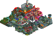
#02 / 10 — "Bitmap.exe" by In:Cities
80.00%
- Design win -
( After the panel vote triggers all above panelists should confirm their votes )
I absolutely love this!
I can see the Master's Palette influences. Some other RCT works that come to mind are Ver-Co's screens and my own MS Office 2003 Resort. It also reminds me of the vapor wave stuff we've seen over the past few years, but this is not quite as ironic. I'm not sure how much of this is a joke or not, but in my opinion this map is better than all of the ones mentioned before. For what it is, it's incredible and tasteful. The style strikes me as surrealism with an 80's Miami porn mansion flavour. Weekend at Bernie's meets Inception. A music (with video) recommendation that also kind of captures this feeling, from the artist that fueled #diamondheights. Anyway, back to RCT. I appreciate how this map is all broad strokes but it still has a lot of character in the little spaces. There's a thousand spots I would love to watch the sunset from. It's masterful, all in all, and it strikes a chord with me. And lastly, the coaster layout is great.
Mmm, 90's nostalgia and art deco. Yeah, not surprised at all this did so well. Am I right in thinking this is the first actual vaporwave-ish thing to actually make it all the way to release? It makes me happy that so many big idea fantasy parks placed so highly this contest - I think we're still seeing the influence from the burst of insane ideas from MM, and that's wonderful. There's no one part of this I particularly like or dislike, but I also realistically wouldn't change anything. It's got exactly as much as it needs to accomplish the goal it sets for itself.
I don't know if this was meant as a joke entry or not, but I certainly didn't see it that way. This was probably my personal choice for first place. The gimmick is fantastic and really fits with the design of the game, but then you went and paired the gimiick with excellent execution and an amazing direction (something we somewhat missed on Winkelheim). The way the coaster and archy pop off the map remind me of the music video for Take on Me by a-ha, which is just an amazing way to show how we, in this game, make a 2D map feel truly real. Awesome job, and congrats on parkmaker!
But this work, wonderfully extraordinarily sexy, hahahaha, very very crazy.
I use Paint a lot, it helps me a lot in my job.
Speaking of park in the screen space, when I saw it I said "what a nice environment".
You got over yourself.
Congratulations team
^Thank you buddy. I hope you and your family are doing well!
Don't forget to look at the other 9 entries in the competition. They're fantastic!
Appreciate all of the kind words.
Gonna have to echo back @ ya.
Wow. Amazing stuff Josh.. easily my favorite of the contest. Such originality and creativity here. I agree with Liam that I got some serious ver-co throwback vibes from this.
There's a lot to look at and enjoy.. its full of vibrant colors... amazing art deco.. and weird sculptures. It's so abstract and so far from the norm here at NE and I love it.
Not sure what more I can add. Congrats on a job well done!
But really your work reminded me of the time that Paint was our life, at the time we had no other editors available, because here in Brazil technology always comes late.
This is so unique and creative. I love that you went in a different direction with this. It's a bit of a shame that the MS Paint effect is best when as zoomed out as possible, but I love the idea behind this. The abstract pieces and architecture really suited this, and I liked your use of open space with hedges. Great job.
I really love this park, and congrats on breaking the 80% barrier. This was an absolute joy to view and fits perfectly into the aesthetic of RCT2. This is like the sequel to MS Office Suite 2003. I also think secondrun919 would like this given all the macro-detailing involved.
I think the most impressive part about this would be the balance between conceptualism and creating an aesthetically pleasing park. It takes that goofy postmodern vaporwave style and instead of making a garish ironic mess, there's a lot of really nice minimalistic design. These are some of the best white boxes I've ever seen in RCT2 lol.
The only real weak spot would be the fact that since this is more macro- than micro-oriented, much of the park is just a sea of grey with pixel art icons, fun to look at for some quick nostalgia, but the park was rather gimmicky. Although for this kind of theme, I don't think that can be helped.
Either way, a very enjoyable entry and a well-deserved 2nd place.
Really appreciate the kind words guys. I had a lot of fun making this, even though I rushed it quite a bit in the end. Here is what it looked like about 2 days before the deadline;
I did most of the tedious work early on, which then left me to theme and fill in the middle section with the coaster. I thought about doing a 'cliche' vaporwave theme in order to hit all of the tropes, but ultimately decided to go for something a bit more nuanced and pretty. I wanted it to evoke nostalgic feelings, but not be overwhelming or in bad taste.
Influences include:
Taco Bell
Walking through an outdoor sculpture garden
LEGO city
Miami Vice
Planet Fitness
The mall by my grandma's house
Microsoft
90's art
Moroccan Water Gardens
Modern art
Masters Palette
I know I've said it before, but I'm honestly surprised I made it this far in the contest. I truly believe that Steve's entry is the clear winner - but it's also hard for me to see how this scored above some of the other entries in the contest.
Maybe I'm a little biased from H2H, but my two favorite parks of this contest were both by Strangelove boyz.
CC9 - you really stepped out of your comfort zone with this, and I'm glad that you were somehow able to take time away from Med school and wrangling nicman on Discord to finish your incredible park.
Otter - you're in your own personal renaissance right now and I (as well as posix) love it. Your park was both beautiful and simple, but still very detailed and fleshed out. I can't wait to see what you release next.
Josh
Congrats on second and presumably a parkmaker spot! I was definitely expecting you to hit that level with Sea World but it seems you're on an even quicker path to greatness than i thought.
I had a tough time scoring this and could've gone for either 70 or 75 and I usually end up going towards my lower score with repeated viewings. Looking at the entire map from afar was really impressive, and the GUI and icons were executed so well. You really put your graphics design skills to use and I can't imagine anyone here pulling off the idea better.
I judged the actual park itself as kind of a separate entity as a window, and I found something about the macro of the design itself a little awkward. Everything feels a little pushed off into the bottom corner, and some of the huge white structures stand out in a not so good way.
Upon closer viewing, I enjoyed some parts a bit more, while the rushed composition in other places stood out a bit. The go-karts area in the maze was really well done and a highlight for me. The statues area around the perimeter was almost a liiitle too cliche for me even though it is the first time we're seeing the theme. I thought the general aesthetic was really cool and I appreciated it as a Miami escapee. Love to see real life influences crop up in a unique way. Some bits of the architecture were really good but most of the building had one of two good angles. The mansion with the helix facing out towards the water is spot on with the Miami look but from the back the building is just so awkwardly tall and unwindowed. Some of the bits on the island with the blue and purple building looked a bit like you were rushed and trying to make it come together quickly while others were pretty solid. The station is the same where I really enjoy the front with the queue and terraced look and then the back is fairly awkward for me with too much bare walls with not much variation. I also think the brake run before the lift is (possibly deliberately on Robbie's part) the least flattering part of the layout and it was a little too present here, although creatively supported. I think I preferred entries that hid that section as much as possible.
One more thing, I really liked the supports on this one, maybe most out of any entry. They looked better up close than from afar but still cool seeing them being executed in such a creative and artistic way while not becoming chaotic.
Overall, this was quite an ambitious entry that was pulled off pretty well as far as ambitious parks are concerned. Even if my score reflects it less than others I did really enjoy this and am hyped for what you release next (hopefully Sea World?!)
This entry came with quite a surprise. The overview looks just perfect. So well pulled off and recognizable. I mean it immediately put me back into my life of being 6 years old and doing weird stuff in Paint on the Windows 98 PC of my parents. Very nostalgic and of course major props to you for the idea but even more for the execution.
On the window stuff I really can't really complain about anything. Maybe the use of monorailtrack for the x-button is a little thick and doesn't fit with the rest plainer one, but who cares. Also good effort on inmporting the original colors, makes it so much more recognizable!
The inside RCT part, the "painting" itself doesn't need to hide behind the concept, though. Even outside of the scope of the whole paint thing it would work as a rather sophisticated, artsy, modern park. I really enjoyed all the geometric forms, clear contrast in color and foliage parts. Especially the use of rapids waterfalls as a fontain element is great.
The gokarts were a good addition and good naming here, it worked quite well imagining them as floating pixels on the canvas. I think this entry has the good balance for a design by not demanding too much on the rides side.
Lastly, coming back to the total picture I actually appreciate that you kept the whole RCT park stuff inside of the paint window. Makes everything a lot more cleaner and thus helps the concept a lot.
Incities, congrats 1st on the well deserved design, 2nd on the 2nd place in the contest and 3rd on the parkmaker spot. Can't wait to the release of SeaWorld, as on the screens you showed the park seems to be with the same kind of cleaniness as this entry.
Somewhat delayed but I found the time to take a look at this. I saw some small shots before and you made my expectations come true. It's really symplistic, I love that. All the square shapes give this park a great, authentic feeling. The queue is absolutely brilliant, I love those interactions with the station building. The paths are also nice, even as the go karts. It all fits really well together in a good and original concept.
No real points of criticism from me this time. Congrats on your parkmaker status and enjoy your christmas!
fuck yeah. This is so good, even though I knew it was coming. Possibly, in my eyes, the best thing to come from this competition.
There's been a lot of vaporwave/90s/outrun attempts in rct the past couple years and most have failed so far, because they ignored the fact that you actually have to compose the entire park in that style to sell it. You did such a good job here with that, and the outside paint.exe background is a hilarious addition to it. There's tons of great details, like the way the water fades into the boxes, the symmetric diagonal row of planters, pristine swaths of grass to balance areas of movement and simplicity, etc.
Often when i look at parks I'm like "yeah thats really good, I totally could have made that if I wanted to but this is still great". But for this, I'm pretty sure I couldn't have made this. It really reeks of your talent for design that we've all seen a lot of recently, and thats not a skill everyone here has. I love when people incorporate their outside knowledge and influences into their rct in a serious way.
Great concept for a design, and you pulled it off magnificently. The vaporwave color scheme and decorations really go well with the Windows 95 MS paint theme. I never really saw this one winning the contest, though, just because the theme kind of lends itself to a lot of open spaces and less detail than other entries. That being said, there is still a lot of good RCT underneath the "silly" shell of the paint theme. I've been a fan of your stuff since H2H7 and this is no exception. Glad to see you finally get parkmaker.