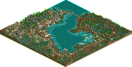
Park / Antiquita
-
 20-March 20
- Views 3,519
- Downloads 487
- Fans 5
- Comments 21
-

-
 72.00%(required: 70%) Gold
Faas 85% CedarPoint6 80% Kumba 80% RWE 80% posix 75% CoasterCreator9 70% Cocoa 70% robbie92 70% G Force 65% Liampie 65% pierrot 65% csw 60% 72.00% -
Description
Welcome to Antiquita!
-
5 fans Fans of this park
-
Full-Size Map
-
Download Park
487
-
Objects
279
-
Tags
Sweet macro.
One of the greatest things about this park is how clearly comfortable you are mixing in empty space, and it's wonderful. I love how massive and sprawling Wydah is to contrast the much more conservative coaster designs in the rest of the park. If I had to complain, I think maybe the ride density is a little low and you've re-used a couple rides. A massive stand-out custom flat where the giant pyramid is, or in the back of the jungle area could have balanced things out a bit. And maybe it is a little weird that you bring this water all the way into the Roman area just to dump it onto the path.
Foliage pretty much everywhere is a masterclass. People will be ripping this off for a long time.
This is my favourite release of this year. That has a lot to do with the fact that it is also one of the most ballsy releases. Tons of open spaces, unconventional layout and foliage choices, and it all works. You made stuff that shouldn't normally work, work like a charm and for that only you deserve a lot of credit.
Highlights for me were the aquaduct, the waterfront and the hypercoaster (especially the station area), although I would have liked to see you try another colour for that coaster.
This submission shows a huge amount of talent and I will be coming back to it a lot in later instances.
85% from me.
Good submission, but I don't think it's much of a step up from Karlkurla Canyon. Things I like:
- The rapids ride, woodie, and suspended coaster are all nice. Good layouts, good interactions, good theming, good colors.
- The Lost Civilization area (even though it's a direct take from BGSS)
- The buildings in general are quite good - not groundbreaking but still solid.
- The entrance building complex. Flower usage here is great. Flower usage throughout the park is good, but I don't like some of the colors (really just the dark purple)
Things I don't like:
- Many of the layouts, especially Anaconda, Canarinha, and the log flume, are pretty uncreative and boring.
- The patches of empty grass look good in some places but I think you overdid it. I'm not crazy about the foliage in general - Amazonia is the worst offender (samey tree colors, bush choices, see my comments on the Amazonia screen for more on that). I really wouldn't describe it as a masterclass.
- All of the railroad bridges are green, which is nice, except for one...which is red, inexplicably.
- I would've liked to see more theming elements like the little Roman ruins in the countryside - outside of Pirateland, the theming is nonexistent. Adding in some dino or bone objects or something in amazonia would've gone a long way. You had a great idea with the aqueduct, but it just kinda...stops.
I think it's a solid park, and there are pockets that I really like, but it seemed like there was a lot of filler in between the highlights. I'm generally a fan of your stuff but I don't think this one lived up to the hype. Excited to see where you go next
Im excited to dive into this
Here's my biggest issue with the foliage - the bush/undergrowth placement. You used pretty much every single bush object in the game in every part of the park, so there's no variation from area to area. The same spiky jungle bush object appears everywhere, and in this instance in particular, there are so many of them that all I can focus on is this weird, dark green, jagged bush by the water. The other bush types are also placed pretty haphazardly, but since their shape isn't as noticeable, they get away without drawing as much attention.
And this little section just looks bad to me - a large dirt area with some clumps just sort of sitting on top of it. I think if it was grass, it would work better.
I guess my main complaint is the lack of organization in the undergrowth. It makes it look really messy and I think more care would've made it look much better. I think I've spent enough time thinking about RCT bushes now to last me the rest of the year.
Whydah is possibly one of my favorite things in this park; there's something about the layout combined with the interaction it has that I just love. Let me post some examples below.
This is just really pleasant to look at and really cool. I need more time to think about the rest of the park, but I can say that the pirate and lost civilization themed areas are definitely standouts - the other two areas don't feel as impactful as those do.
Quick comment.. the aqueduct ends at a castellum.. a building that is a giant resevoir for water. And in Ancient Rome castellum usually had a constant tap for people to drink or collect water from! Just figured I'd add context to Ling's comment.
I ADORE this park. I know my opinion ain't worth that much but this seriously might be my favorite park I've ever seen on here, obviously no offense to all the other incredible work but I'm just that blown away. I'm not even all that sure what to comment on, I just love all of it. The foliage is spectacular, everything is so picturesque and it does such a good job of being colorful and serene (I feel that a lot of high-level nsco work tends to end up very tan, brown and square throughout thanks to the nature of the objects you have to work with, but I think this park somehow gets past that). And I love the emphasis on retro-style coaster designs, I'm sure that everything in this park hurts like hell to ride. Especially the standup.
I know I was one of the people who was pushing you to experiment more with open grass, and I think you succeeded in adding an extra level of dimension by keeping it open and letting the foliage around it shape it. Rome and the Lost Civ really stand out as strong landscapes, as Rome's periwinkle borders gracefully define what becomes the most powerful grass in the park. The rock formations on that side of the park are the kind of macro every NCSO builder hopes to achieve.
I think one of the strongest recurring themes here is the ride interaction. Every tracked ride in this park interacts with something around it, whether it be the path, another ride, or one of the many distinctive buildings that populate (architectulate?) this fine map. Whydah takes this phenomenon a step further by interacting with all of those things in three different areas! We could use a few more boundary-busting whydes like Ridah in the RCT world.
Architecturally, this park varies considerably by area. If each quarter were as nice as the Lost Civ, this would be a strong Spotlight contender. That is legitimately some of the best large-scale NCSO architecture I can recall ever seeing. Rome also has a couple standout structures, with that aqueduct being this park's signature landmark. The pirate area is hit-and-miss for me, but I think every building that's within a 10-square radius of Raid! (Raidius?) had very solid form and details in all the right places.
Compared to the other three areas, Amazonia is definitely the odd one out; a few fewer 2x2 towers and about half as many wooden fences as building trims would have given it a more polished look. Still, there are a couple sections that are definitely successful endeavors. This little corner, for example, displays not only a pleasing shape but also a lively atmosphere:
You even managed to make the stalls look natural without adding anything to them. That's something I've yet to see more than a handful of builders do.
Now there is one unfortunate aspect about this park that I can't overlook: the angular nature of the terrain. There are right angles around every corner of this map (I couldn't resist), and they need to be addressed because there are just too many of them, and it's giving the terrain an unnecessarily blocky appearance.
If you can keep your terrain at a consistently natural level throughout the park (and never ever ever use the mountain tool except in the event of an emergency), your parkmaking will be at the next level, and you will have a Spotlight on your hands before you know it, NCSO or otherwise.
Really enjoyed this park. It has some of the best NCSO architecture I've seen and the best I've seen in game that I remember. The roller coasters all have good layouts and good pacing, no slow spots that I recall. The hyper coaster is my personal favorite of the coasters. I like how you can travel across the central lake on boats. That, along with the general macro layout make this park especially fun. I'm used to much more boring layouts for this sort of semi-realist park and I hope that this inspires others to push boundaries in this sort of release. Good work and I can't wait to see what you make next!
What a quaint park! Loved the relaxed, classic feeling it has throughout. My main points below (+/-) :
+ Wydah is awesome, the expansiveness of it coupled with that perfect deep purple color and an interesting layout using a more unusual coaster type really makes this the stand-out feature in this park.
+ Also liked Smuggler's Run and Pegasus Turbo
+ Some of the individual buildings are great, especially the bath house in the Roman area.
- The themes maybe felt a bit "underdone", even though I understand there are clear limits for how far you can take it with NCSO. This adds to the classic feel in one way, and I'm not saying subtleness is bad, however, I think there should have been at least one more unique, stand-out feature in each area (except for maybe the Roman area which seems to have a few more specific ideas).
- As Terry Inferno already pointed out in a clear manner, landscaping felt a bit lazy, and the lake seemed especially under-detailed, taking up such a large part of the map without appearing to have been given a lot of attention. The slopes from land into the lake seem a bit artificial in many places, and why is there such a big area in the middle with no elevation changes whatsoever? I also wonder why you didn't throw in any underwater vegetation, I think that would have added a lot.
- Didn't care much for Canarinha and Anaconda, they seemed decidedly plain in their layouts without any interesting features and also looked quite similar to each other.
Sorry that the the negative points turned out quite a bit more comprehensive than the positives haha, despite that I did enjoy this a lot overall, and it is a solid 75-er for me.
I loved the bridge where the train passes
The boat with the sails looked great
Those barrels in ROW BOATS became a charm
Few Roman objects limit our imagination, you used the available objects well creating a very cool scenario, it was excelente
This is a really tough call for me. I enjoy this style of parkmaking quite a bit. I think because I enjoy it so much, I'm a little critical of it.
Let me start by saying I think you did a fantastic job here, and it's a definite evolution in your style as a builder. There's a lot to love with this park.
Aside from what I said above about my favorite bits, I really like your NCSO attempt at a pirate ship. Thank you for not going to small or too tall with it! The proportions are on par. I still think the pirate and ancient civilization/egypt? areas are the big winners here. They feel well thought out and nicely composed. Additionally, you have a nice ride selection and I can always appreciate a park train system tying things together. I'm also a big fan of the open spaces you've included.
First off, I definitely agree with Terry's points above. Some of the landscaping could use more refinement in places - he's gone over that very well in detail.
In accomplishing so much with the first areas I mentioned, I had some big expectations for the final two and a half. I was a little underwhelmed. The roman-esque area feels a little sparse. You have some lovely architecture in the bath house and Parthenon, but compared to the intricacies and activity of the adjacent area, I think this area fell a little flat for me.
Amazonia - the area and a half! I just say this because of the stark contrast (in my eyes) between the waterfront festival area and the deep jungle themed interior. Not a plus or a minus, just an observation. My favorite part of this area is the landscaping and foliage, but I kind of think this is the spot you should have avoided so much bare land in. It's the Amazon! The architecture comes off as an interesting LL mixed with RCT2 style here...which can be both a hit and a miss depending on the structure I'm looking at. Again, largely agree with Terry here. A little bit much on the "wood poles and 2x2 towers are the theme" for my tastes, but very lovely landscaping.
I ended up voting 70%, which is a very admirable score (it took me 12 years to break that mark; and you're improving at an exponential rate!). Overall, this is a huge step up for you. This review was challenging to write; I want to give you as much to work with as I can give, and while it may seem negative I absolutely think this is an excellent park. A lot of small things with a couple bigger issues here and there added up for me. I think you're right on the edge of something absolutely incredible, and I really hope you continue to hone this style of building that you're latching onto.
This is a masterclass in NCSO. It feels like it belongs in the same universe as Veteris Shores.
The things I liked:
- The different execution of all the themes. Rome isn't all white and clean, the pirates aren't just spamming barrels everywhere... They're nicely done.
- The open space has been touched upon before. While it might be bordering the edge of sometimes a little too empty, I applaud you for fighting the urge of filling every litle inch of park with stuff. It has given this park a nice breezy feeling and a sense of grandeur.
- The interaction of the rides with the landscape is one of my favorite things in this park. Like the little peninsulas with Smuggler's Run and Canarinha on. They just work.
The things I like less:
- I'm not so sure the foliage mix has been that succesful. It's an interesting experiment in trying something new but cutting some trees out would've helped.
- I know you're trying to call back to an older style, but perhaps there's a little too much 2x2 going on. Not really a criticism, but more of an observation perhaps.
- I'm with Ling that a few extra rides would've given the viewer something more to look at.
All in all a great release! I'm wondering what the panel wih give this...
Notable things: Cicero, the little docks near the pirate ship, the peninsula near Rome with the railway on it...
Hell yeah, awesome stuff and you built this super fast. I think your NEDC is probably a tad higher in quality but I know that you learned how to do that from building this! Just really lovely, calm atmosphere and vibes.
If anything, its actually a bit too clean for my tastes- I would love a little more grit and variety. Things like the foliage edges or path structure or building variety. A bit of overgrown in places, a bit of crumble, some single wide paths in cool locations could add a tiny bit of spice and variety to keep it really dynamic. For next time though!
solid stuff and a well deserved gold.
I think Smuggler's Run is probably my favorite Wooden coaster in ages. So simple but absolutely stunning. I hope it goes up for award selection next year (even if it's extremely early to say).
Brilliant park, I really loved some of the atmosphere! The area around Whydah and The Lost Civilization was also insane. I'm almost sorry to throw around such big words for a macro oriented ncso park. But honestly this was extremely refreshing.
It's been a minute since this came out so I figured I'd respond to a few comments here/elsewhere. I first want to say I had a lot of fun building this. I tried to build quickly and with a focus on "macro" because that was a mindset I've never had while building a park. So to achieve a gold accolade without much attention to minor details I'm beyond thrilled! Even if the % spread was large, that just means I have a lot more to improve on and I am excited by that.
Glad everyone liked the Hypercoaster. Wasn't meant to be the centerpiece.. I was more proud of Smuggler's Run! So thank you Fisch for liking that layout!
The foliage was definitely hit or miss. I overdid it with underbrush in spots. I'll work on that.
@Faas: I'm glad you were such a fan! Much appreciated
@csw: Your honest feedback is welcome. There's definitely a lot of room for improvement and I'll take your comments to heart.
@Terry: Thank you for the screenshots of landscaping/terrain I need to improve on. I would definitely not say my work was "lazy" at all. Just at times I stuck to right angles for whatever reason.
Thanks again for the feedback guys.
i felt this was a silver, not because of any perceived "lack of quality" keeping it out from being a gold, but because stylistically, i feel as though you're wearing your influences too closely to you. everything here feels mostly like collage of all the stuff you liked from other people. there's a way of synthesizing things together to create something fresh and subjectively improve on its source material, and that's something in my opinion you've failed to do here.
it's good, it shows that you're definitely skilled, but it's been a prevalent problem in your work for a while now and it's time that you started budding into your own "style" confidently- whatever that may be
and because you're doing that,, the park doesn't feel cohesive at all.