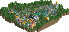
Park / Kongamato
-
 31-March 20
- Views 3,413
- Downloads 485
- Fans 3
- Comments 23
-

-
 73.00%(required: 65%) Design
SSSammy 85% Cocoa 80% bigshootergill 75% G Force 75% robbie92 75% RWE 75% Scoop 75% WhosLeon 75% CoasterCreator9 70% saxman1089 70% Faas 60% csw 55% 73.00% -
Description
Hello NE, for my birthday this year I present to you my first solo release :). (If this is released on the 31st of March) Enjoy!
Big thanks to RWE, Steve, G Force, Posix and Whosleon for testing this park and giving their feedback. -
3 fans Fans of this park
-
Full-Size Map
-
Download Park
485
-
Objects
331
-
Tags
Similar Parks
-
Goblins!
-
Destiny of Kalfou
-
Walkman Of My Brain
-
[H2H8 R1] All Coasters Go To Heaven
![park_4087 [H2H8 R1] All Coasters Go To Heaven](https://www.nedesigns.com/uploads/parks/4087/aerialt3818.png)
-
Ruby & Emerald
-
Last Days
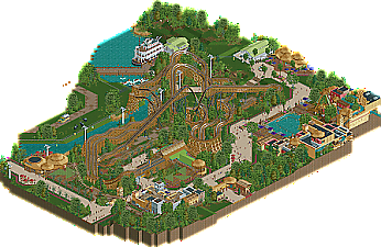
Let me be the first to congratulate you on a very nice release! Liked this a lot overall. Some specifics that I think stood out as extra nice:
This looks awesome with the chairlift interacting with this unique-looking arrangement of track elements:
Nice detail with a safari going on here, peeps taking photos from the car:
I thought archy was pretty solid throughout, this building/area in particular:
Everything here just looks great, composition, color choices, the way the coaster frames the path, foliage, all on point
As for the layout itself, I wasn't immediately sold based purely on the aesthetics of it, but it actually grew on me as I kept looking. Good to see something more unique like this, and duelers are always fun.
Can't find much if anything that I'm not keen on, so will definitely give this a solid rating! I'm a fan of your style and look forward to future releases from you.
Thanks for the kind words splitvision! Cheers.
Also I said this in the discord already but a huge thanks to Royr for making the logo. I absolutely love it!
Also a huge thanks to Posix and the admin team who made it possible for this to be released on my birthday. I appreciate it.
Good work! This one is exciting for me to see since I helped build the model you based this off of! So it's cool to see someone take on this theoretical layout.
The coaster follows the layout of the model pretty well. It's not the greatest or longest layout as it stands, but you made it look rather interesting here. The shaping of this ride was designed for the smaller trains-- no more than 6 cars, but for the purposes of RCT this doesn't matter super much. They're odd layouts, but you've done a nice job making them as aesthetically pleasing as they can be. The wrapped drop is cool and the unique lift supports are a good touch. The narrower mine train track seems to help here.
Station architecture is nice-- almost Gwazi-like. Architecture on the whole is quite nice, especially the area in the corner with the flume. The interior sections are my favorite part about that. If this area had one critique it would be that it seems so cramped and/or busy compared to the rest of the map which is very open.
I'm not a huge fan of the Disk-O. It has a sort of jerky layout compared to the real thing and what feels like far too much flat around the station. This sticks out to me as the one thing on the map that could really use improvement. Other than this, it's hard to complain because the quality is high across the board.
The paddleboat is one of the best structures on the whole map. Such great detail there. The safari vehicle is also really cool though I'm not sure that low fence is going to stop any elephants!
All in all a very nice looking map, Excellent architecture and composition, both of which are your strong suits. Looking forward to seeing more!
So I guess this is based on a real coaster concept...regardless of that, I didn't really like the layout - it lacked flow in spots, was quite short, and tried a bit too hard to shoehorn in certain elements (the 1st drop and barrel roll, mainly). I also thought most of the buildings were cramped - especially against the map edge. You have a really cool log flume ride, but then cut it off right against the map edge and squeeze in paths that I can't really see clearly. Same goes for the chairlift station and adjacent building. The buildings nearest the station were also quite cramped together. I did like some parts, such as the boat and the use of pink flowers. But while what's there is good, I think the general layout of the map (mainly things pressed up against the map edge) hurt it a lot.
Really great layout.. the interaction of the duelers was top notch. I sorta see what CP6 was mentioning in terms of train size.. seems a few cars too long, but thats just me!
I think what holds this back a bit is the cropping. The log flume is half off the map? But peepable? I'd say if you include 75% of the ride, show the rest of it.
Archy everywhere was lovely. Such great vibes. Reminds me a bit of Zula. I think archy is the best quality of this.. so I guess I don't see the cramped-ness. Seems appropriate to me.
I overall really enjoyed this. Figured I'd pepper in a few critiques amidst the praise.
I think this is going to be a layout people love or hate, I really like it. Its definitely short, but I love the interaction here. I enjoyed the archy as well, especially around the log flume. I agree you should have finished the log flume its a pretty interesting ride. Overall I really like it, and I'm glad I'm not a panelist. Its close to a design for me for sure.
something about this sits right with me. Its just so pleasant and fun. I love the layout, especially the classic NE phenomenon where people would have shit on it if it wasn't based on real GCI concept art. And rightfully so, its so fucking weird. But cool to see realized in rct.
The archy is pretty good- although you need to use 4 tile high LOTR texture pieces! I promise it will elevate the archy 10x- right now the 1 tile high quarter pices are making the texture repetitious and weird. The log flume structure is super cool though, and I liked the riverboat, although I wish there was more stuff going on down there to really sell that portion of the map.
I still went with a pretty high score, not sure why. Just felt right to me, all around good vibes and atmosphere and its nice to soak in.
I had a hard time voting this as design-worthy.
I like a lot of this design, but I just don't like the coaster(s) which I think should be the focus of whether a submission deserves design or not.
If this was bigger, and all the cool rides and surroundings weren't awkwardly cut off at the edge of the map, I would have voted this a lot higher, but I had to vote on it according to what it is.
Congrats on design though! Hope to see more from you soon!
Thanks for the comments everyone and the design win, the score is about what I expected it would be before I submitted it. It's nothing ridiculously high but still a nice score that I am proud off , exactly what I was going for.
To address some of the critiques that I got. I saw two main critiques both here and on discord:
1. The map is awkwardly cut off at places, and people wanted to see more of the log flume.
To me this critique literally makes 0 sense. The main attraction on the map here is the coaster. I already did a lot of theming for the log flume and if I would have made it even more elaborate the log flume would have truly become the focus of the map. It is not, the coaster is. That is why it is cut off. Also for those who did not notice there are two cut-away scenes in the log flume building which wouldn't really be possible if the whole thing was closed off. The other building which is cut-off is the restaurant near the chair lift, and I guess I could have made the map a little bigger here so this wasn't cut-off. So fair enough. However the vast majority of the buildings are completely contained within the map and I feel like most have quite a bit of breathing room. So I really don't agree with this critique at all.
2. The coaster layout sucks.
I guess this is a matter of taste. The coaster layout is actually based on a real layout concept by GCI:
https://www.youtube.com/watch?v=9I5BjD8sGKk
So nothing really much I could do here ¯\_(ツ)_/¯. I guess I could have translated it into RCT better than I did, but overall I am still quite satified by the way it turned out. However I could see how people are not really sold on the layout.
The other critiques that people gave were pretty solid and are things I will take into account in the future.
RaunchyRussell Offline
I'm so glad somebody brought this concept to life! I was honestly thinking about taking a stab at it myself, but am happy someone more seasoned took on the task! I love it.
The layouts are true to the concept, the archy/ theming was spot on, as well as the flume placement. If you would have done a full-scale flume ride, it would have definitely stole the show from the coasters being the focal point.
Anyway, congrats on the design! Excited to see what else you've got cooking up!
Clearly the coaster is the main ride since it's so big and it takes the most surface of the map. But imo the corner with the flume is the highlight, as in beste piece, of this submission! That looks really good, very atmospheric and you killed it with cutting that off awkwardly...
It wouldn't have distract at all to build the complete log flume. It would not make the coaster or the attention to the coaster any less. I'm sorry you see it this way.
You showed to be a builder to look out for in previous H2H8 and this submission takes on on that notice. Like I mentioned before, the corner with the log flume is really nice and vibey. A lot of fun archy too like the cut off restaurant and the coasters station. Gonna pull a Faas here and complain about the steel roofs there and the color of I think the thatch roofs would've fit even better. Or at least changed the green to tan.
The coaster itself is ok to me, decent. We've seen better GCI's here, we've seen worse. I do think it's dope you translated this new concept GCI presented into the game and you also did good on the dueling factor. It's not easy to get that right so you did well. Seeing the two trains take the zero-g-roll simultaneously is awesome!
Good job, looking forward to more Rec work. And please keep open for all feedback
This was fun to see. Feels like a carve out from a larger park, with reasonable sell that it's Africa. I love the racing/dueling nature of this, how it interacts, and are 2 different ride experiences, not just mirrors. Love the slight RMC feel without it being small and overdone, feels like a nice GCI that had a few special tricks added.
Great job - a wonderful present from you on your birthday! Thanks!
Love it !
I think what some people are saying is that it doesn't feel like one complete area, but rather a bunch of different areas coming to one plot of land of which the coaster sits on. If this is the case then i can see why it can be a complaint. Personally I don't really have much of an issue with it, but the ancillary rides and attractions do feel distanced. Still great work and congrats on the Design. Also correct me if I'm wrong with my interpretation on the criticism everyone else.
I didnt mean that I wanted this to be a bigger design submission. If the surroundings were expanded on and this would have been made into a park, I would have voted it higher is what I mean. Because my vote now is mostly based on the coaster(s). I get how my original comment is a bit confusing.
@RaunchyRussell
Thanks, glad you liked it!
@FredD
Thanks for the kind words. The thatch roof would indeed maybe have been better now that you mention it. How did I not think of that earlier. Ah well, it is what it is.
I see what you are saying about the log flume, but as you mention it has kind of become the highlight of the map while I did not want that to be the case. This was my reason for cutting it off and I still think that is a pretty valid reason. Could it have worked without the cut-off? Probably yes, so I guess it is a fair point.
@KaiBueno & Julow
Thanks man!
@Scoop
I do see what you are saying. The log flume area is more heavily/densly themed than the other areas. Then again, such transitions also exist in real life parks and its not like every area in each park has the same theming density. Was it smart to do something like this for a design submission? Maybe not.
@Faas
No worries Faas, I can see why someone would not like the layout and as you rightfully point out, designs are also for a large part about the layout/coaster. So I would say your vote and reasoning are completely understandable. No hard feelings.
Good work, I loved the layout of the roller coaster, fun to enjoy.
Thanks MrTycoonCoaster! Glad you liked it.
The log flume area is excellent, lovely colour scheme, forms and texture. And the circular roofs work well in breaking up the blockyness. The map cutoff isn't to my taste, but I understand its useful in showing a cross section with interiors, so fair enough.
I like the more low-key archy elsewhere too such as the chairlift station, although I maybe would have gone with brown wooden structures rather than white for the sake of a more cohesive, warm look. The steamboat looks awesome. So does the coaster station - I'm loving the colour accents.
The ride itself, not really my cup of tea I'm afraid - it's a bit sprawling and I don't find it particularly flowly. I think you could have made the banking transition better in a few places and there are some awkward dips ( like before the zero g's).
Kudos on tackling an unusual layout though, and it obviously resonated with others a lot more than me -congratulations on the design! Also happy belated birthday