Park / Walley's World
-
 02-April 20
- Views 4,800
- Downloads 535
- Fans 3
- Comments 20
-
-
 69.00%(required: 60%) Silver
bigshootergill 75% csw 75% Jaguar 75% Scoop 75% G Force 70% saxman1089 70% CoasterCreator9 65% Cocoa 65% Liampie 65% robbie92 65% RWE 65% WhosLeon 65% 69.00% -
Description
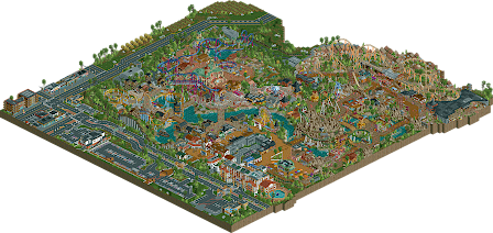
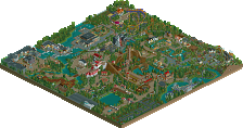
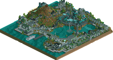
Wally’s World is the first full scale park I’ve made and it feels like quite an accomplishment to me. I think I’ve improved on a lot of things since I uploaded Point West Theme Park. The are 6 main areas of the park: Main Street, The Docks, The Temple, The Plaza, The Jungle, and The Wild West.
-
3 fans Fans of this park
-
Full-Size Map
-
Download Park
535
-
Objects
442
-
Tags
Similar Parks
-
Spayculowse Gardens
-
Lost Beasts Of Maharajah
-
[MM2014 R1] Europa Report
![park_3167 [MM2014 R1] Europa Report](https://www.nedesigns.com/uploads/parks/3167/aerialt2725.png)
-
Calatravas
-
Thrill Point: Worlds of Adventure
-
Euroscape
Congratulations on the full scale release! It's a big accomplishment and something to be proud of. It's certainly fun to see something this size in your style.
I'm starting out with the stuff I like, as usual! And there is quite a lot to like. You've definitely stepped up your layout game in my opinion, they're fun and very flow-y. It is a bit of a shame that Gold Rush requires an 11 mph lift hill, though. Voyager was also broken most of the time, even after I turned on "Disable Breakdowns" (?!). Whatever, Voyager is my favorite in the park and I love the maze beneath the station. The Great Vine is a really cool concept for a themed dive machine. Mustang was probably the weakest layout in my eyes, and it stands out as a lot more plain and pushed out to the sides compared to the rest of the rides.
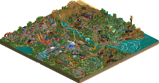
The jungle is probably one of the best overall areas in the park; the foliage fits, the architecture feels about right, and it's got an impressive cornerstone attraction.
You've got an interesting "small buildings" aesthetic going on through the park which kinda works, but then you've got this fantastic looking hotel next to it. I'm not 100% sure, but if I had to guess, I'd say that this was one of the later additions.
The park also struggles from some compositional and design choices that held it back a little for me. I have one good example right off the bat; this little area below is an odd dead end without a whole lot of interesting content or a major cornerstone ride to anchor it. The default-colored top spin didn't help with making this little nook feel a little out of place. You've also got a lot of different fencing options all over the place throughout the park within small areas. Others are better at describing composition and how to improve it than I am, but these are a few things I noticed.
While I love this cute mini golf, and appreciate some of the details you've put in - I think this area well exemplifies some foliage and landscaping issues I had. The foliage is all very green, especially the palm trees. Some of it is oddly purple? I don't know if this is an issue with the palette you used, but in general everything is just a little too green. Where you picked flowers to use as planters, I think you could have cut back a little on the "pick two colors" formula. Tiny pops of different colors in the form of flowers help a little bit, but even the desert wild west is the same basic green foliage selection. You did rotate your trees though!
I think the biggest thing for me is that the jungle looks almost exactly like the desert which looks almost exactly like everything else. The lack of foliage variety forces more reliance on the physical structures and other scenery for the "theme" - sadly, I think this hurt the western area quite a bit as it's sort of a vaguely western-generic style.
We've just had several insanely high quality parks in a row, and it's clear that the bar is rising (practically by the day, this year) rapidly. I think what I find super interesting is that this has a serious Riverland-inspired feel to it. With the current trend of stylized realism accelerating at such a rapid pace, I don't know if this held up as well when compared to similar and recent releases. I do think this is a clear evolution from your previous work, and I think you're on the right track. To me, this is an excellent high silver. 65%
thank you for the feedback, I'll take it into account
this is good stuff, and I think a clear improvement from you. your archy is getting better- more specific and with meaningful details. I think you still need to work a tad on really using architectural style and detailing to sell an explicit theme, and probably tone back a bit pastel colors which wash out atmosphere. but I'm seeing definitely improvement here. maybe I'd recommend finding an area in a theme park you want to emulate, and just for an experiment, trying to recreate the specific buildings and composure exactly? that can always help you get a hang for building details and also the wide uses of cso.
I was confused about the two versions until i noticed the line for the supermarket. I was thinking to myself, why is there a second save with no music or rides running? funny. (cries)
I think the diver was cool- an interesting color scheme and I like the idea of the mountainous terrain. Probably needed more of that terrain to make the mountain not feel like a random square in the area. The intamin was pretty solid though and I quite liked the western area with the corkscrew- I can see you took some inspiration from riverland here!
overall- lovely park and have been enjoying you around here, fresh off your newcomer award win!
My advice would be to exactly not do this barnNID. Your style is original and has a uniqueness that makes it immediately identifiable as yours, and that's what's strong about it for me. I like the quirkiness in your aesthetic, and your trademark pastels. I think it'd be much more exciting if you kept developing that, and followed your own vision, rather than copy a source material.
Anyway, this is a point of contention we've been arguing over for years, so take your pick.
This is a successful park and clear confirmation why you won "Most Promising" at the awards. Very curious to see more RCT from you.
I really enjoyed this. Your archy style is so cool. That entrance area is nuts, probably also the best composed area of this park. Invert and area is definitely by far the strongest part in this. Definite gold quality for me. The colors work very beautifully here and the coaster swooping over everything like that is just an awesome picture. This would be such a cool area in rl!
Gold rush and area were well done too, although i think they are squeezed a bit by the invert area. A bit more room to breath for that coaster and it could have been a lot better in my opinion.
The dive coaster mountain was a bit glitchy for me. Nevertheless it had some great viewing points too. Although i didn't really understood why the best angle of the mountain is on the opposite side than the park entrance. Might sound a bit nitpicky, but imagine this being rotated 180°, would have been pretty awesome!
The launch coaster area is the weakest one of the park for me. It is probably well built, don't get me wrong, but it just hasn't got me as a viewer as much as the other areas.
Surroundings have been great, although i think that your scaling is off a bit sometimes. I think building one unit higher would be a huge step forward for you.
To conclude congratulations to you on a great release to the site that - i agree with posix about that - shows, why you've won that award.
@cocoa: thank you for the feedback, I appreciate that you've given long reviews on all of the parks I've released. Each one has helped me in the following project. I've tried recreating buildings and stuff in the past with an attempt at making maverick, but I found that the fun gets lost for me when I cant use as much of my imagination. With that being said for my next project I plan to use an IRL pathing layout to make the composition better. And yes! definitely a lot of river land inspiration.
@posix: Thank you! Building stuff from my imagination is really why I love this game so I imagine II will continue to do so:)
@RWE: In hind sight I wish I spread out the area's a bit more. I'm glad so many people seem to like the invert, as that was one of my least favorite areas going into release. Thank you for the feedback (I wish I used that mountain idea btw haha)
Awesome job! And thanks for the 1% lol
I really like your style - your buildings always look clean and crisp without being overdetailed, and they're nice and colorful, which I like too. I also think you've got great creativity with ride layouts and ride design. It's pretty clear you have no shortage of ideas.
Things to improve on: landscaping and park layout. The landscaping throughout could've been better, especially around the outskirts. The dive coaster mountain is a bit over the top and glitchy. And as far as the park layout goes, everything is right on top of each other - I don't mind the tightness too much, but some emptier areas or more space around larger attractions would go a long way.
That being said I thought this was a great submission. Thanks for sending it in - I'm really impressed by how quickly you work. That matched with your style makes me think you'd do great building in an H2H.
@csw: thanks for the feedback, I'm deffinitely guna work on spacing and landscaping
I would definitely love to see more breathing room next time, and a more composed park layout. Put some space in between areas and allow for some natural transitions to take place. And of course, foliage definitely needs work. But regardless; this is a fantastic park.
I still love the Western area and the temple is fantastic. Really can't wait to see what you work on next!
Josh
@In:Cities: thanks man I appreciate the feedback. I already have an idea for my next release and hopefully I'll get the landscaping and foliage better!
I can't give you a long review right now, but I liked the park overall. The invert and the hotel both look great. I wish you differentiated the themes more though. Everything blends into 'barnNID' style and I wouldn't be able to guess what the themes are actually trying to represent.
I'm not saying copy theme park areas and buildings for the purposes of making that into an rct park, although thats certainly fine too. I'm saying its a valuable exercise to build your rct skills. just make some buildings and shit on empty maps to learn what sort of techniques allow you play with details and differentiating styles.
A good way to be inspired in that sense is by emulating things from real life, which is ultimately still our aesthetic source even in the wildest fantasy parks. so just pick something you're interested in- from iran or japan or germany or mexico, idk. can be theme parks or can be real life. And try and build them. Then, you can do nothing with that if you want! but you'll have learned a lot about what sort of techniques and architectural forms are used to sell different styles and aesthetics, which will dramatically improve your fantasy-based, imaginative parkmaking. I'd be surprised if this was a controversial suggestion...
@cocoa: I misunderstood what you were trying to say. What you're suggesting sounds like a good exercise to improve. thanks for the clarification, I will most certainly do that
In times we are heavily debating on the accolade system and complaining about the fact golds are given away too quick, this park shows to be a perfect example of a great silver. There were some really great parts but also some parts felt a bit on a lower level.
You had me with the 2 files. I first opened the 2020 file and thought immediately "no he pulled a FredD" seeing no peeps in the park. But then I noticed the rides were all closed and you had lines of peeps queuing at the grocery store... lol, the corona edition. Good one.
My favorite bits of this lovely little park were the hotel & the mountain with the diver and log flume in it. For the rest I agree with Liam. The themes aren't really coming over great so that's a working point right there.
The coasters weren't really convincing. The Intamin launch was the best one imo, seemed like a lay-out purely based on having fun and I think it would be a really fun ride to ride irl. I didn't quite like the colors of the diver and the launch, I think a more bright color like yellow or magenta would've been better for the diver. For the launch I think the color of the supports would've fit way better for the track and vice versa.
You've got a unique style so I'm curious to see some more BarnNID in the future.
@fred: thanks for the feedback, i appreciate it! hopefully ill release something over the summer cause i have nothing to do
Lol, I love the corona queue in front of the grocery store.
What I absolutely love with this is the dive coaster. I truly love EVERYTHING about it. Love the cobra roll, so awkward and unorthodox. It makes this park feel very chinese for some reasons.
Great archy and themes all around the park, some parts still need more refinement and work though.
https://www.youtube....h?v=SWO_UVcwXCI
Here is my review! Nicely done.