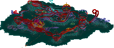
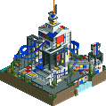
Park / [NEFC] Art Expo 2020
-
 14-April 20
- Views 1,648
- Downloads 357
- Fans 1
- Comments 17
![Park_4801 [NEFC] Art Expo 2020](https://www.nedesigns.com/uploads/parks/4801/aerialm4702.png)
-
 53.50%(required: 50%) Bronze
RWE 65% Camcorder22 60% WhosLeon 60% bigshootergill 55% CedarPoint6 55% CoasterCreator9 55% Jaguar 55% robbie92 55% ][ntamin22 55% Cocoa 45% Scoop 40% csw 25% 53.50% -
1 fan Fans of this park
-
Download Park
357
-
Objects
103
-
Tags
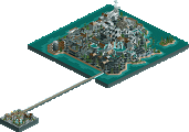
![park_4380 [MM3 R1] A Petty Squabble](https://www.nedesigns.com/uploads/parks/4380/aerialt4172.png)
I fear that I missed some deeper meaning here that has gone right over my head. Hedgehogs dilemma a sonic reference perhaps? Its cool to see a heart line coaster but the massive amount of metal bars over its queue didn't really do it for me. Favorite part was the two glass arrangements with an honorable mention to the curved sand walls sculptor.
Overall 5/10
Theme 3/10 - I didn't get it, might be my fault not yours
This is wild, and just the sort of thing I love. I wanted to do something similar with BITMAP, and it's really cool to see you do it! Outdoor sculpture / installations are awesome, and I think they translate well in game despite the limitations. I particularly love the corner with the waterfalls, and the entrance is very nice despite being small. Perfect use of elevation throughout the park. Only thing I dislike are the stupid jungle trees that look like they're made of clay. Horrible scenery item that should be deleted from the game in my opinion haha.
Happy to see something new from you! Great stuff.
Definitely seems similar to BITMAP in that it's out of the box and not grounded in realist parkmaking whatsoever. The art installations themselves for the most part translate well minus a few like Learn to Give. Person and Gravity was my favorite one I'd say.. just looked pleasing to me.
I'm curious if you have a meaning to each individual installation. I think it would help me as a viewer quite a bit.
Good to see you building again.
God be praised posix did a park (hahaha, just a little humor) it was a pleasant surprise when I saw your nickname.
I liked the idea ART EXPO 2020 and "THE PROTAGONIST", very nice. <3
Really loved this one, posix, it kept my interest longer than most. Though it can feel bare or unfinished, it was still fun to continuously look around see the intent behind each art installment. There was something intriguing about the saloon "floor", the open-air monorail stations and the abstract water features.
Really great stuff, I'm glad you built it.
Sorry Posix, this has gone completely over my head. I'm definitely not the target audience for this park. I like the idea, but the execution felt very empty for me. Glad to see other people very much enjoying it though.
Very unique entry. Really enjoyed it.
Is like a spoof parody of ne art styles or something. I thought this was insanely grey upon opening but found a g force entertainer awaiting me. The other 3 are appropriately named too as i feel they are represented here well also. Nice to see you actually play the game instead of talking about it.
While this will be difficult to evaluate in a traditional RCT park sense, I spent a lot of time looking at this entry and enjoyed it a lot. The park as a whole composition doesn't really come together for me but I don't think that was the intention. Each of the art pieces was exceptionally well done and I could see them being pieces in an actual real life art exhibit. Very creative uses of the objects to create each of the pieces, especially the sheriff roof. While the impulse coaster was a nice inclusion that felt vaguely artsy, the monorail and heartline coaster didn't add much and there was a bit too much of the six flags roof for me. Think I would want to see a coaster a little bit more integrated with an actual art piece. Very cool though to see some rct2 posix and I would be very down for a sequel to this.
+ I like how there's a staff member named Ivo... this is reminiscent of his abstract parks and in a good way, very creative.
+ For something so flat and covered in grey path, this is excellently composed, I love the minimalism.
~ Not sure if this is a joke park or not... on one hand, it's sparse, random, and hard to decipher any meaning from it but on the other hand, it's legitimately good.
Overall I really like this park, it's very agreeable and aesthetically pleasing, It's a definite plus that this is themed after a postmodern art installation in a garden as the RCT aesthetic almost fits that more than it does themeparks.
Very nice to read these reactions, thanks guys.
I've had to rush this pretty hard, which I suppose for an unusual concept like this hurts extra. I just knew that if I ever wanted to produce RCT again I'd have to do it now: now that there's the lockdown situation, that it's legitimated to play NCSO no-hacks for once, and that there was a foreseeable end to it due to the deadline.
I'm really in a very different place in life compared to myself back in the years trying to win accolades. I can't really see myself build more, as this is such a time investment I cannot justify now. I think I'm much much better for the community as an admin and site caretaker, anyway, which is already a time investment in the first place. I don't think I've ever been among the top talented players who would be important as RCT content creators.
For those who are interested, some background on the park: RCT had ended for me after 2005, and not long after geewhzz and I got super involved with creating NE4. I did make that 2010 design "Carnivore", and was then made to play again by Liam in 2012 for an area in Giari Palms, but these were mostly stints during windows of extra free time, or because it made me happy there were people like Liam who wanted to celebrate the good old days. However, the seriousness you need to win accolades at NE had left me for quite some time. I think the relationship we have with the game, through the community, is an intense one, and I didn't feel like I needed that back at all. Add my desire to admin, and I became even more removed from the "maker" side of things.
The distance however also allowed me to think in more liberated terms of RCT creation. RCT has always been about visuals and their aesthetics for me. The park itself as the content face we create never actually mattered too much to me. I just saw it as a vehicle to create nice atmospheres and looks. I did enjoy projecting it onto a park in some ways, but I could never in my life get excited for technical details of coasters or such. At the same time, the very rare attempts of people to build RCT for looks only are usually weird and gimmicky. I still found them very inspirational:
Julow
https://www.nedesign...-my-final-form/
shogo:
These try to be figurative though. I prefer abstract art because to me that removes things from the bounds of must-be-legible content. Abstract art is allowed to be more purely about emotions or thoughts materialising in some way. I find that exciting, even if things become extremely hit or miss, as some have already said.
shogo again:
https://www.nedesign.../boot-sqeuence/
And then the only actual release that I believe comes close to this idea is ivo's Taboo of course: https://www.nedesign...ark/2163/taboo/ . It is itself still a hybrid that's morphing, which is both a weakness and something honest and unique about it. But that's another conversation.
So I dabbled a bit with creating "looks" in RCT on sandbox benches. Sometimes liking it, oftentimes not, but eventually concluding RCT just doesn't make sense as a medium for this idea. (I've actually begun creating things I call "art" in real life). But so now there was this opportunity to connect with RCT more directly again, I felt in order to somehow realise this vision of art in RCT, it might work to "fill" things into various exhibits, thus reintroducing the park mantra, but keeping the looks. Therefore this park.
The keyword "connectivity" was meant to be represented in a purely social and romantic point of view, as that's such a typical thing for artist's to digest in their work. Thus the impulses were modelled after Schopenhauer's concept of people desiring each other but getting immediately hurt when they try. I also put the bank artwork on top intending to symbolise the feeling of helplessness you get from attraction, and thus called it "Person and Gravity". All of the other rides were types that are either a pendulum or have a "leaving and returning" character. I guess that's not terribly special though, as it applies to basically all coasters. But I wasn't really going to feature a water ride if you know what I mean. Another initial idea was to create a dam shape kind of big walkway in the middle of the park that you had to overcome to connect with the artworks, and thus yourself. That's why some of the paths are trying to be extra windy, almost like a handicap. Obviously didn't work out terribly well, but that's fine.
I'm impressed if you've read and cared this far. I'm glad I could partake in this side of NE again for once. For the time being though I look forward to supporting the site through admin jobs.
I know how rushed you were to finish this, and I think you did an admirable job despite the time crunch. It's a really cool look into abstract art from someone who understands it much better than I do. Nice references (impulse coasters) throughout, and some very creative object use. I know you had grander visions, and I would like to see something like this fully realized someday. 55%
Man this is amazing. I instantly got Osaka's 1970 World Expo vibes looking at this.
Just love the bank's roof in the middle of the map, it just fits so well here, on top of the two shuttle coasters.
This is so unique and so well executed.
Probably my favorite entry of this contest. ♥
I'm almost certainly going to be the low vote here so I'll go ahead and say why-
1. The sculptures are fine - it's art, it's subjective. The sea of gray path surrounding the sculptures was not so pleasant to look at though.
2. I appreciate the attempt to add some coasters to the map, but man, you picked the absolute worst coasters in the game.
3. The surrounding landscaping is truly awful. I think it would have looked better if you had left plain, flat grass. The few scattered plants give it a really sloppy feel. This was the biggest issue with the map.
Basically, it comes down to the fact that you obviously have a big appreciation for art and aesthetics that I just don't have. Good to see you submit something but it just doesn't stack up.
No worries csw. Most of what you say comes down to taste, and that's fine. The "landscaping" around the park was super rushed so I could meet the deadline. The coasters were chosen simply because I thought they best symbolised what I was after. Not intending to excuse anything, of course.
https://youtu.be/UvuseG4ZGdk
Really got a nice world's fair vibe. I enjoyed this a lot more than I expected to after initially seeing the sort of blank map. This was a sleeper hit for me.
Review at 1:13.
Posix, I can't believe you've got a bronze. Awesome though. I didn't get to vote but it would've been in the bronze range. Hope to give you a review sometime soon.