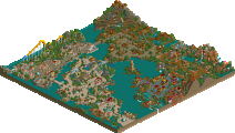
Park / The Cow Factory
-
 03-May 20
- Views 2,100
- Downloads 456
- Fans 3
- Comments 15
-
-
 65.00%(required: 65%) Design
bigshootergill 75% posix 70% robbie92 70% SSSammy 70% Cocoa 65% csw 65% RWE 65% saxman1089 65% CoasterCreator9 60% Faas 60% G Force 60% Scoop 60% 65.00% -
Description
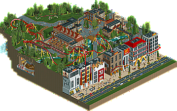
Coming from an idea that originates from 2018, this design submission is finally done. The Cow Factory shows the worst side of the fastfood industry. High commercial strategies, polluting industries and competition between companies form the unique style of this park.
Special thanks to Josh for making this logo and RWE for testing the final result of the park. -
3 fans Fans of this park
-
Full-Size Map
-
Download Park
456
-
Objects
422
-
Tags
![park_3117 [MM2014 R1] Candyland](https://www.nedesigns.com/uploads/parks/3117/aerialt2779.png)
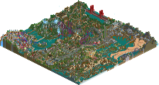
Very neat and unique design submission you made here. It's so full of clever and funny ideas: the Trump billboard, KFC on fire, the burger production line, etc...
Wasn't really a fan of the buildings on the main street, I found them pretty generic and a bit too bare. The archy on the upper level however was pretty good! The plaza where the coasters queue starts has a really great atmosphere to it.
The coaster itself is ok. It's not a realistic entry so I guess it's kinda normal some guidelines don't have to be followed. But for me, the coaster didn't do much really.
Enjoyed it a lot. The coaster itself could be a break point for the design accolade but I think all the ideas & the originality put in will put it over the line.
So much fun!!! Love this design MK, it's awesome to see guys doing something fresh and new. This has such a funky, creative flair to it.
I love opening up the park to the crazy street scene, with the protesters, the cops, the KFC building ablaze. the hustle and bustle of the traffic. Then moving into the background (which is the bulk of the park), the factory layout and buildings are very well done, with a balanced mixture of details, simplicity, trackitecture. To me it feels both serene and hectic at the same time. Mad props to using my Mario Kart cows! <3 <3 <3
The underground details are chalked full of fun too... burnt burger, poop vats... so good! The coaster itself is definitely a unique, don't remember seeing one quite like this before. Layout is fun in my opinion, but shouldn't be taken too seriously either. This design achieved exactly what you set out to accomplish, maybe even more than you planned! You have my stamp of approval! Great stuff!
Fun park MK, I liked finding those staff members underground. Archy on top is really strong, good atmosphere with the conveyor belt whizzing by. Layout wasn't really my thing but the supports and interlocking corks looked great. Like I said lots of fun, Going to go get me a couple of greasy Mcdoubles now.
hah, this is fun. obviously I'm ideologically on board but its a pretty good little design too. although i have to say despite my moral qualms fast food is still fukn tasty
anyway, the scale of the main street is massive. i would usually say its disconcerting but i think it successfully makes it feel imposing, and the whole thing is larger-than-life sort of fantasy anyway. I like the factory area. its a well-trodden theme, but pulled off nicely with lots of neat ideas and cutaways. the layout is fine- a bit short maybe, but with some interesting elements. for me, i think it can just scrape into design. cool stuff and very unique!
Interesting design full of humor and fun ideas. The architecture in the top area was fantastic and fun to explore. The bottom area felt more humorous and larger-than-life, but not as refined and skillful as the upper area.
The layout was a bit too whimsical and weird for me to really enjoy to it's fullest, and it felt a bit detached from the rest of the entry. I'm not sure I understand what it added to the map other than it needing a coaster to be a real design.
Overall this was a lot of fun to look and and explore, but I think your next works need to focus a bit more on planning and intentional decisions around things like interaction and storytelling to elevate it to the next level.
The "M" were great, I loved the buildings express reality well.
I loved the theme design
Congrats on the Design win, MK! I thought it was well deserved, you presented a really cool concept and executed it solidly. The coaster layout is a bit unconventional but the launch and drop are nice, though I think the MCBR is sort of unnecessary. The big stretch of buildings are very well done with some interesting moments such as the KFC burning and the protesting. I don't like the couple of bits where there's just a sheer land drop that's visible from the path, which sort of ruins the immersion. The upper section is really wonderful, with nice architecture and some excellent foliage I think. The cows pooping are a great detail too The underground tanks are quite a funny idea and well designed, but perhaps feel a bit disconnected from the rest of the map so I think it would have been cool to have some sort of ride down there. Nevertheless this is a great piece of work. Keep it up
Cool stuff MK. The 'park' area is very beautiful and atmospheric, so part of me thinks this is more like Mcdonalds propaganda rather than a critique - but maybe that is the idea? Show their fake version instead of metal sheds. I like that the tanks at the back looked like ketchup bottles.
Congratulations on the design!
Congratulations on the Design MK! Really fun and creative park. I liked the difference between the business of the street vs the calm and relaxing atmosphere of the park. Those mad-fast burgers are great too.
Fun park! Here's my review by video!
https://youtu.be/WnoS1EMz8No
Thanks for all the feedback guys I know the layout was a bit special, but I also don't think that's where my qualities are. I think it was decent enough to make a nice little area of it.
I'm glad you liked the story behind it. It's more of a fantasy and didn't want to take the realism part too seriously. It was a lot of fun coming up with good ideas and it really made me enjoy RCT again.
I like how you've found that kind of hybrid style for yourself MK98. Agree it helps making RCT more enjoyable.
You almost got ripped off of a design accolade, glad to see you squeaked through MK. Loved this design, great job!
Sorry that I'm incredibly delayed with my review - one of the last things I voted on before I was away.
I think you did a lot of things very well, and a few things held it back for me. This was a rather close decision for me between 60%-65%.
Defining a few things quick - Upper level = The bulk of the coaster and the factory theme around it (INCLUDING the underground features of the factory). Lower level = The street and buildings.
First off, the upper level is wonderful. It almost feels like a mini-H2H park with the underground scenes (and the quality of the work). Not many complaints from me here. The foliage might be a little hit or miss in places, but I think overall you did a really good job with this half of the park.
There are two things that held this back from the 65% mark for me.
First, I don't think the coaster itself is particularly strong or memorable - In the end, this is a Design submission and it's very much a focus of the submission. I'm a fan of the launch and the final quarter, but between those parts I'm less a fan of the ride. Overall, it becomes a little weird and less cohesive (more on that in a second). I don't mind at all that you're going in a less realistic direction, it's just not as appealing as I think it could have been given a few different choices layout-wise.
Second, I think your rather impressive execution on the upper level is a bit let down by the lower level. To me, it felt rather forced and not cohesive given the proximity. I don't think the juxtaposition of the different styles is a bad thing, but comparatively it does feel a little less refined. I actually don't mind the over-the-top golden arches everywhere here and there, but remove the branding and you kinda end up with some chunky buildings that are leagues beneath (in refinement/execution) some other buildings a few tiles away. It's also a little weird that it's just a row of huge buildings and there's a few tiles of grass on the other side, but I think I get why you did it that way.
In general, I do think this is actually a step up with just one or two things that really added up for me. I'm glad you got Design, but I'm also excited to see where you go next.