Park / Anaconda
-
 12-September 06
- Views 1,402
- Downloads 233
- Fans 0
- Comments 7
-
No fans of this park
-
Download Park
233
-
Objects
143
-
Tags
Similar Parks
-
Kukuana
-
CCCP
-
En Midvinternattsdröm
-
Fusion Survivor 2 - Ultimate Tribe
-
Attractiepark Kirkland
-
Rapa Nui
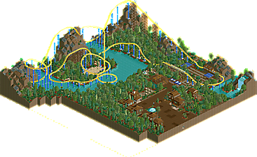
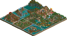
Without further ado: Anaconda by ZeRoSkIlL!
The feedback from Cork:
Anyway, no, this won't be a Design. It's a very simplistic work with some nice theming but not really a lot of quality. The roller coaster seems to meander through its layout in a lazy way (that second hill is way too slow) and it's rather short. You say it's a family coaster, but it's laid out like a regular "grown up" one, and either way, it doesn't really act consistent to what it seems to be.
The buildings are pretty plain, though not bad, and the station is minimalistic.
Overall, while this is by no means horrible work, it comes off as pretty forgettable. I think you need to work on incorporating more architecture and theming to make the park more immersible, and theme the coaster a little more. Right now, it's not much more than track going over some nice terrain (nice job on the landscaping, actually).
So sorry about the late late late response, but hopefully the feedback helps. Feel free to release this or send it to another site.
- Cork
I completely understand what he said. I mean, I need to improve on my stations, and the coaster didn't really interact with the buildings that much. All this time, I felt like something was missing, and that was it. Nonetheless, I gave ti my all, and I know that this was good work. It wasn't superior, but it was good. I hope you guys enjoy it.
Anaconda - By ZeRoSkIlL
P.S. I guess Turtle (I think) is right, it's much harder to impress the critics than the masses.
The coaster has a nice layout, but it's too short...if I had been you, I'd have done it longer. The architecture looks ok, so does te lascaping and foliage, you made a good job with that.
Hope you make it, next time.
Rhynos Offline
-JDP
Supports/Park ....................... Park
(left to right)