Park / Phototrophian
-
 14-August 20
- Views 4,075
- Downloads 460
- Fans 5
- Comments 26
-

-
 78.50%(required: 65%) Design
RWE 90% Scoop 90% CedarPoint6 80% Dr_Dude 80% G Force 80% posix 80% chorkiel 75% CoasterCreator9 75% Cocoa 75% csw 75% geewhzz 75% Liampie 70% 78.50% -
5 fans Fans of this park
-
Full-Size Map
-
Download Park
460
-
Objects
448
-
Tags
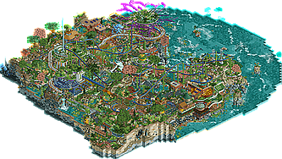
![park_4821 [NEFC] Nile River Delta](https://www.nedesigns.com/uploads/parks/4821/aerialt5006.png)
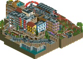
This is so detail rich and unique. Chock full of good ideas and cool executions. I like the chairlift stations as gears, all the curved terraces, the sculptures, and the general theme of the submission.
It's also an incredibly crunchy design. There's detail and contrast everywhere you look. Unfortunately that means some things get lost in the noise, so to speak. I had a hard time following the coaster, even though I've seen it a dozen times already, because so much of it was covered by other things or there were other ideas catching my attention instead. Some things like the busy rockwork might have been better toned down a bit, to let other, more important aspects shine.
Compositionally, it's also very maximalist, which I'm not personally a fan of, but i can appreciate. I like to see space where things can breath and have a flow of ideas from one point of interest to the next, whereas here, there's something to consume everywhere.
Overall I think this is a really cool design, and I love the attention to detail in establishing a setting and building a coaster and environment that feels grounded and lived-in within that. The reclaimed materials and renewable energy details throughout really help to cement the environment you've made as a believable thing.
Man, I still think of you as jaguarkid140 from all those years ago. Back then I thought your work was messy, inharmonious, but with a unique identity behind it that let it stand out. Admittedly I didn't pay much attention to it, but it certainly stood out on whatever page it appeared on.
Cut to years later, and it's quite amazing to see you turn out something to this caliber. It still has the unique jaguarkid140 appeal that was always there, but with layers of skill and thought the former merely had a fraction of. The progression is truly impressive, really.
The design itself doesn't appeal to me much as a theme, but it has the abundance of imagination and thought that I wish we would see more of. You're building with idea first and it's created something very unique that we as a community again need more of.
Keep going, Jaguar.
You know I think this is amazing Jag, glad to see it finally released. One thing I reacted to when I was checking it out is that it is so packed with detail that I actually tried several times to zoom in when I was already zoomed in all the way - it just felt like there'd be another step for the zoom to go, as the level of detail is so high throughout the park. I love this style and I love the theme - keep the good stuff coming!
Wow, didn't see this coming! Very cool release, a lot of great stuff in there. This is stacked with details everywhere, the color usage is great and there are a loot cool structures in here.
But... it's biggest pro, the great amount of details, is also the biggest contra. There's too much to see which makes it hard to read. This map really needed some breathing space. You overshot yourself with all the details, like you built a rocket that can fly to every planet in our solar system but only used to visit the Moon.
You obviously have a thing for original and unique ideas. If you can translate them with a bit better distribution, you'll be golden.
I don't know how to feel about this release. There's certainly a lot of high quality CSO here, and the theme you wanted to express certainly exudes from the actual map.
But I can't help shake the feeling that is too much chaos even for me. I usually play really up-close at 1.5x or 2x scaling, but even then, there's just not enough tied together to rest my attention in one place.
One thing it really needed for me was some harmony in land texture-work and foliage. Architecture can remain exotic and complicated, and I do love it whenever executed so well like here, but those things required some simpler tree selection, less quarter-tiled landscaping, etc. to allow it to breathe. I can't have both be highly textured and complicated for me, and this kind-of shows why I think that. I respect the effort regardless. It's a great feat.
I usually don't have this experience, and I do apologize if I don't 'get it' right now but it's just not my thing at all sadly. Though, that's not to say I didn't find stuff to love. All the archy in isolation is mesmerizing. A blend of many completely different styles coming together to make a sci-fi utopia of clean, sustainable entertainment with remnants of the old world hiding here and there.
That said, for obvious reasons I am sure to come back to this many times in the future for all that the map does well. A lot of ideas that maybe I'm not ready yet to digest in such a dense package.
So creative. Loved seeing the progress screens on discord. Did you change the palette with the final save? Seems brighter than I thought it would be. Anywho..
Amazing work. The layout as inthemanual said sorta his hidden/obscured by the maximalist architecture and rockwork, but I think it was done very tastefully here. My eyes wanted more negative space to take some breaks. Easiest fix would've been less 1k rocks.
Your architecture here was really well done, and the station buildings for both Phototrophian and Pollinators were great. Loved the use of all the glass on the Pollinator building.. gave a very strong beehive vibe. Even the porch below the station/ride was nice.. really liked clean that area looked next to the carousel. I mentioned on discord a few weeks ago, the colorful recycled plastic fences around the supertree was a nice touch. Learning that detail from you helped me view this park and try and figure out the sustainability angle to everything.
Lastly, I want to repeat what nin said, your creativity/imagination is something our community needs more of!
I thought this was brilliant and rated it as such. The atmosphere, the world you've built, and the rendering of that world are all excellent. The detail in rockwork, even the different layers or rock along the side of the map, are excellent. This feels like an ultra-contrast, ultra-crunch moment of expression and concept, and that should be highly commended.
For me, the intense amount of detail, the chaos of the composition at times, and even the rough edges are not a problem. I just don't think this creation was asking for polish and fine-tuned moments, because it was too full of colorful, textural expression. And that is what lifts it up, a sense that the world inside this release is guided by your artistic expression and exploration of a theme.
There were a few moments with some odd choices. I'm not sure why you included a few of the WW pieces that I didn't think added a lot. In places, I felt that your approach felt a bit more chaotic than the theme would suggest of this society/culture. But, personally, i'd rather see the ideas and creativity flow then holding back for a theme or the perception that something isn't realistic for this world.
By far my favorite thing is your textural treatments on the water and the exposed rock around the sides of the map. You have so much gradient and texture and translucency that is moving this away from the very color-block foundation of rct to something more surreal and ethereal. Between this and some of the brilliant moments and ideas, I think this release really pushes the boundaries by serving up some truly unique rct parkmaking. Other things I loved:
-The decaying ship
-The post-modernist looking buildings above the ship
-The monorails integrated with land-blocks by the carousel, such a cool affect
-The little mushroom cave
-The coaster station and the architecture below it
Congrats on completing this Jaguar, a really inspiring piece of rct. I'm very excited to see what you do next, particularly pushing further with this style and exploring how it can exist in other contexts.
I do think this is probably a bit too busy and overdone on the detail and texture, but I see that is what you were going for. It's definitely an impressive project, perhaps not really aesthetically appealing to me but definitely appreciate the work gone into this. Music was dank.
I really enjoyed the entire map despite having a hard time knowing where to look next. The park is very texture heavy but I think that's a good thing here as there's so much to takeaway and revisit.
A few favourites for me were:
- Your mushroom caves, which I would have missed if I hadn't thought to rotate the map to try and get better angles at other texture heavy areas! It was a fun idea to look at and nothing too crazy.
- The building where the roof is a grassy mound texture, this was super cool to me, as it blended so seamlessly with the surrounding area that I didn't notice at first there was more underneath, this is definitely something I would like to see in other parks.
- The wooden coaster as an elevated walkway was super nice and clear to see as well. Nothing too complicated but it just suited the whole idea really well.
Overall I think the whole idea is very impressive. It reminds me a lot of Singapore's gardens by the bay with the amount of large impressive/slightly weird structures along with some dense foliage and buildings that blend into the environment. I wonder if something like this provided any inspiration to you?
I will admit this is one of the few parks where I didn't really even bother to look at the rides (my bad), but the suspended coaster did a good job of integrating into the terrain which to me was far more interesting.
Great stuff, no doubt one of the cooler RCT ideas for a little while.
I'll echo the majority of feedback. This is very liberated and creative, the stuff NE needs more of. It's extremely cool in many place if looked at individually, but as a whole it's also very messy and illegible. I think you've clearly overshot on detail in most cases.
If you manage to channel this better with future projects, I think you'll have big things in store.
wtf dude this is insane. congrats on finishing something this wild
this is awesome. there's so much going on that its hard to see sometimes, but I love it anyway. its just a hot mess of awesome surreal shit. I particularly love the giant purple tree thing, the covered grassy green roof area, the final brake run, the elevated path, the round structure where the observation tower is, and the little cable car being the elevator lift mechanism. but theres heaps of details everywhere to love, even if i can't make out half of it unless I squint. probably could lower the 1k rock usage a little bit to improve sightlines but its fine. overall, just crazy and wonderful.
dang congratulations. I was hoping to see that green name, but still an achievement none the less.
Congrats on the design Jag! I have to agree with Scoop, the final percentage is way off from the 95% I gave this. Still happy it got the design, very deserving work and I hope this will inspire others to think outside the box in terms of style.
I do enjoy this, I think pretty much a lot of what I would have said has already been said! I think that the concept is super interesting and there's a huge load of detail and content; in that sense I agree with cocoa. As an overall piece I enjoy it greatly, I just found it hard to make out certain parts either due to vertical layers or an overabundance of textures muddling sightlines or the form of the landscape. Congratulations on Design!
I think this was more than the sum of its parts. The parts were very mixed in quality. Some great stuff (the rock work), and pretty mediocre stuff like some of the architecture and ugly objects. Your vision and consistently dense and crazy aesthetic carries this to the next level, which in my opinion is the 70% level. Closer to 75 than to 65, for sure.
I'm in the green camp, I think this was in contention with Josh and Steve, albeit not on time. Thus I'd have given it an 80 or 85. Love the layering, the integration. Still think the path as tan would be slightly better, but that's nitpicking.
Congrats on an excellent Design, close call, and especially sticking with it all these months later and not quitting it. Well worth it the wait!
Curious but what about the architecture is mediocre? Most of it breaks away from the grid, uses organic forms, and follows the rule of thirds in a way that I don't see in 65% parks. Perhaps it wouldn't hurt to be a little more open-minded.
I took a few screens.
Screen 1: I think the weakest part of the map. The archy here is just quite poor I think, and it doesn't seem to match the futuristic and modernist vibes of the rest of the map.
Screen 2: this is almost good but I struggle to make sense of it, and when I focus on details I don't really find it rewarding. The jagged roof, the random golden roof below, grass in ten colours and a random WWTT truck just scream random to me.
Screen 3: not an example of poor content, but more of an illustration how the map is hard to read, and I think that nothing here rhymes.
I sound very negative, but that's also because these are examples of why I thought it wasn't more than 70%. If we rephrased the question, I could say stuff about why I thought this map was so good that it deserved 70% in my opinion - because 70% is still very good. Screen 3 I actually have been starting at for a good while. I wish it was easier to digest and make sense of, but it's still a ton of fun to explore the nooks and crannies.