Park / Caer Hywel
-
 29-August 20
- Views 3,438
- Downloads 437
- Fans 4
- Comments 22
-
 78.50%(required: 70%) Gold
csw 85% In:Cities 85% ][ntamin22 85% CedarPoint6 80% chorkiel 80% CoasterCreator9 80% Xtreme97 80% Faas 75% RWE 75% Scoop 75% geewhzz 70% Liampie 70% 78.50% -
Description
Welcome to the fantastical land of Caer Hywel. Explore the park full of rides and attractions themed to Welsh and British folklore and mythology.
-
4 fans Fans of this park
-
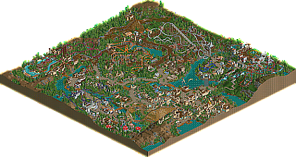
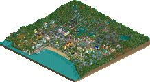
Full-Size Map
-
Download Park
437
-
Objects
328
-
Tags
That's a really pretty overview. First impression of the park itself is good too, with the entrance area definitely being the highlight - although not the only one. I don't think your last park was a gold, but a few minutes in and this surely feels like a gold, with a comfortable margin. Can't wait to see what's next, although of course I have yet to fully consume this park!
Looks awesome! I enjoy a lot of the buildings around the park. Very well shaped and not too repetitive. I don't know if you used the zero clearance cheat, but my only recommendation is to play around with pushing some trees into the ground to use as bushes and foliage.
Excellent work, always great to see some NCSO magic.
Congrats on this release Otter. Overall, I think this park shows a great deal of skill in developing shapes and forms to build some incredible atmosphere in the park. The composition felt very on point and captured a sense of classic mid-2000's parkmaking that was really strong.
There were a few instances where the composition felt a bit odd, like the positioning of the suspended coaster. Overall, I actually liked the impact, but it felt unusual in a park that was largely more traditional in it's layout to request peeps to take an elevator up that hill, heh.
I liked the layouts for Angelystora, Warhammer, and Wyvern best. Y Diawl had a nice layout but I can't stand that it barely made it into the MBR. For me, a great design can be ruined by something like that.
I won't lie, i'm not as well versed with some of the subject material, so i'm sure there are some things that I missed. That being said, I think the park has some great details and some wonderful NCSO creativity. Personally, i'd put this in the low gold or probably high silver range. Congrats again on finishing something this big!
This is a heartwarming and beautiful release. In places a little too bare and low in content perhaps. Like you wanted to wrap it up to move on, and didn't fully develop your theme.
The forte with your parkmaking remains your ability to translate oldschool stylistic parkmaking language to the present day. Really special to see. Sorry I didn't actually build more on the map.
Very nice, very NCSO
Very enjoyable park. Your themes were clearly legible, and while related still very different.
Your improvement as a builder is remarkable. This is a huge step up from Antiquita. The forms, theming, colors, coasters, atmosphere, everything is better. Every single building on the map looks great, every bunch of trees looks perfectly placed. The entrance area is a clear highlight, as are the big open hillsides and the multiple castles throughout the map. I think the Warhammer area is the weakest, but really, that's only because the rest of the map is so strong. I also think you could have done without the more whimsical details, like the Loch Ness Monster and the giant mushrooms - without those, I really see this park as pretty realistic.
This is really great stuff otter. I think it's as good or even better than Ancient Worlds. Spotlight call will be tough for me, but this is an easy 80-85. Thanks for submitting.
I love seeing high quality ncso such as this, as I am an ncso-heavy player. Lots of nice details all over. The only thing I wasn't a fan of was the pacing on the invert. Was it supposed to be really slow? That's just a nitpick though, I love it!
Good stuff!
I'm not sure how the quality of the buildings ranks with other NCSO builds but for me it seemed some buildings were very very good and some were more as filler, although I didn't think this very often and understand that of course I shouldn't be directly comparing the build style with other parks using CS, as you are limited quite significantly. Some of the work here is outstanding for NCSO such as the entrance and that tasty diagonal bridge forking to the right from the entrance.
Overall I loved the building style, you have a very clear skill for building just the right amount of stuff without completely overwhelming the park, and I would say I looked past a lot of the buildings because your use of terrain and scenery was very very good. The detailing on the terrain seems really micro and I just got a sense that the park was bigger than it was because of this, it's an excellent skill to have.
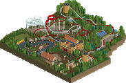
Speaking of the building style for me there were some clear stand out areas of building including the station for wyvern, the main entrance area, and the bits around dragon slayer. For me these were seriously impressive NCSO.
All of the coasters were fun to look at and in general the coaster building was done very well. I like your use of empty space to accompany some coasters whilst with others (orange looping one in the middle - dragon something perhaps?) you make use of the terrain and interactions with the paths such as the tunnel underneath. Perhaps my one critique is that the white invert appeared to be boxed in an area where you only view it from the outside, it would have been nice to see more interaction for peeps aside from the cobra roll but this is just me nitpicking.
There's so much cool stuff going on in the park and so many subtle changes in the theming that I think this will easily score highly with the accolade panel. Well done!
I'll go through the park starting at the entrance, going clockwise!
First of all, the entrance is glorious. Mentioned it numerous times before but it reminds me of Loopy's IoA Rome entrance. Orange flowers and teal awnings, with yellow accents, is a great colour scheme. It's a bit disappointing that you established a great aesthetic here, but it fizzles out into small building sprawl, visual path bottlenecks and stuff that simply doesn't fit into the scheme. Looking at all the elements separately, there's a lot of good stuff again. Dragon Slayer is nice, and a nice homage to posix's coaster. The other coaster, the powered one, looks very undercooked.
Going into the next area, there's the wonderful mushroom corner. Again, great flower choice, and the single wide paths look great. Archy sadly is uncohesive and generic. I'm also not sure what the green terraces are supposed to be (name your rides!), but they don't bother me much. Oh, there are rides too. Good rides. Not running a lot due to the rides waiting for full load, which takes a while - maybe that's why I didn't notice them at first.
Wyvern is not a perfect coaster, but I really like the station and the beautiful, undersupported drop over the waterfall. Pseudo-cobra roll is also beautifully positioned. After Wyvern there's the little plaza with the white architecture. This place looks great, but also orphaned. Why is it there? Was it part of some larger area that got scrapped? Landscaping here is very pretty and quaint, by the way. In general I like the low density in this park, mostly in the areas I haven't discussed yet!
Alright, next area. This area looks distinct, but what is it? Whatever it is, lots of flowers in the right colour again. Magenta is great. Aquatopia feels like it's in the wrong park but I love how it interacts with the coaster. Coaster is cool, but most of the layout feels a bit remote from the park. Could've used some interaction and/or sightlines. Archy in this area ranges from nice and distinct to generic ncso.
Dragon is one of the best coasters in the park, with one of the worst names - especially since we already had a Wyvern. Love the layout and how it sits in the middle of the park. Angelystor is again a nice coaster. Not a fan of the many pointy bumps but as a whole it looks great. I like how around the station, the red flowers, orange awnings and yellow flowers under the windows form a gradient. Confusing I find the blue flowers in the back. You've done a good job with picking flower colours in this park but there's no escaping from the constant lines of flowers everywhere, with often some sudden transitions.
Y Diawl. Looks amazing. And then it hits the MCBR and the pacing becomes absolutely terrible. The stream under the cobra roll: cool. Are the sheep real, or animatronics? Queue area is great. Architecture around this coaster is generally uncohesive again; white and red colours in general are succesful though.
Battle of the Trees is a difficult one. With such a large map, it's unfortunate that you had to cut off this area. I also dislike the way this area is connected to the main park, with an angular single wide path, as well a giant lift building that only goes half the way and keeps the castle from getting from looking like a castle on top of a grassy green hill. It's in the worst spot imaginable. That said, I love the pizza stall roofs here. The more cohesive your architecture is, the more I like it, clearly. I like the coaster and the open landscape. The ruins are a great touch. I wish the coaster used more of the hill (since it goes much further down), but that's hardly a flaw and I like how it stays around the top of the hill as well.
There's some stuff in the middle left: Lost Coaster of Superstition, which is alright but also a bit unnecessary. The Grand Carousel is quite not grand. Countryside Drive is neat. Josh is a great touch. Merlin's Railroad is my favourite ride in the central area, I love it when people use miniature coasters as compact tracked rides rather than purely for transportation. Lastly, nice custom swinging ship!
Summarised in pros and cons:
+ Rides are generally great
+ Some great looking areas, with great colours
+ Focus on aesthetics over realism in general
+ Low density, good park layout
+ Landscaping
- Lack of cohesion in 75% of the park
- You went with a super cool specific theme (Wales), but then you add some shallow or not-Wales stuff like the Loch Ness Monster and Aquatopia
- Flower overload
- Planning around the suspended coaster castle
There's not enough consistently great areas to make this a gold as comfortably as I thought upon first viewing (see previous comment), but I still think this park deserved the gold accolade. Going with a firm 70%. Congratulations on finishing another park, and showing yet again more improvement and promise. Can't wait to see what's next!
Thank you for the review Liampie, really enjoyed reading it and appreciate the amount of time you spent writing it. I’ll respond more in-depth to all comments when the score is finalized. In the future I’ll use less flowers!
I liked this a lot, but not as much as your other park.
The focus on aesthetics and how pleasing everything is on the eye is still one of your strong points. Another great thing was how you integrated all the queues in the surroundings. Take notes people!
The thing that bothered me was how the theming wasn't very consistent. The most obvious example was how you have a coaster named dragon, a coaster named dragon slayer, and a dragon statue, yet neither of them interact.
Really a stupendous submission. It has a fantastic light touch with a lot of elegant and picturesque landscape & ride scenes.
I think these days a park should represent more than just "great classic NE-style parkmaking" to merit a spotlight, but I scored this one highly anyway because I enjoyed a lot of it and can certainly see myself coming back to re-view and reference some of it. There's an impressive range of themes on display for NCSO and it's juuust about all believable and distinguishable, certainly enough variety for me to not feel like they were bleeding together because of repeat assets.
I guess what impresses me is that it's all pretty to look at and is well-composed. Although there's nothing exceptional about the "realism" or "technical achievement" of Dragonslayer, Dragon, and Angelystor - they're such clean throwback turtle/steve style rides and they just look nice.
Moreover, there's a lot of character in here. Stuff like the little sunken round tower flyby scene for Dragon at the turn between the loops, the stable tour, my goodness is the henge and the long way up to the castle a scene. The sheep farm is perfect and a skillful way to use the space under Y Diawl. IMHO this is what semi-realism is about and what it does best - everything is there to look as good as possible and the backstage stuff would just be distracting. For example, where there's custom supports they just blend in smoothly and don't steal the show.
What I wasn't as much a fan of isn't parts that were bad, since the whole park is pretty solid - it's more that I don't think it's a stretch to say that while something like the entry or castle hill is a really skillful piece of throwback NE work that not everybody can pull off, something like the Pikajunya/Deluge chunk is pleasant but not impressive.
I don't think parks have to be incredible hacking achievements, superstar architecture showcases, packed with "little things", and basically a collection of perfect screenshot scenes to be enjoyable, but this is a nice example park for as far as I think just being one thing without some of the others can take you. Caer Hywel is picturesque and a lovingly classic park and that's enjoyable enough for me to score it highly.
As mentioned on Discord, original review was lost due to an unfortunate accident involving a baby and a power button that's unfortunately just within reach.
I believe this park showcases a lot of technical skill, strong micro composition, and a definite show of growth. It's by far my favorite work from you and I think it's absolutely lovely work. However, I think it falls flat in a couple respects as well, namely at a macro-compositional level, and with respect to attention to detail, and these are significant enough to me to hold me back from voting for gold.
The first thing that I think keeps this from excelling is the attention to detail. It honestly felt a bit rushed, or slapped together for a submission in a lot of places. Aside from the issues with conflicting, awkward ride naming that has already been mentioned, there were rides not running because guests couldn't find them (Truffle hunt); entire areas that felt dead due to a lack of peeps, despite wide open paths; lots of unnamed trackitecture, which always feels unfinished to me; a huge gap in the cars on Dragon Air; and inconsistent supporting on coasters (primarily Y Diawl) with places that were both under- and over-supported.
The other thing that held this back a bit for me was the macro-composition. A lot of the coasters felt like they were just set in "path islands", mostly away from view, with maybe one or two interactions that frequently felt a bit forced. I think Dragon is the only coaster that really feels like a natural and well-composed fit for it's location and pathing. Other things like the massive lift hill for Dragon Slayer towering over the gates as you approach from the harbor, or can see from the main entrance **should** be really cool moments, but are blocked off by a huge cliff and wall. There's also sections of path that don't really go anywhere, or connect major areas -- which are fine to have -- but they shouldn't be 3-4 tiles wide and feeling like dead areas. Smaller, quaint, adventurous paths fit those areas much better and provide a change of density that can help highlight the right parts of your park instead of drawing attention to spots that are weaker or less exciting.
All that said, I don't mean to sound too harsh. I really enjoyed this park, all the atmosphere it has, and the ability to literally randomly mouse around and end up somewhere you can certainly take a beautiful screenshot, regardless of where you end up. It's really a great showcase of the skills you've developed since H2H, and I can't wait for your next release. I think the score you've got here is fair and well-earned as well, just higher than I would have personally placed it. Congrats!
First off, thank you everyone who voted. Very happy to have hit 78.5%. I’d like to carry over my comment on discord to here and then respond to a few comments. I set out to make a picturesque park that pushed my limits on doing architecture and focusing on macro. Took some inspiration from LL parks, sloB, Shogo, Steve, nin to name a few. The rides were meant to be pretty realistic, but also adding some elements that were a bit out of the ordinary. Many have pointed out that it looks rushed at the end of the park, and I fully agree. Last minute I changed a few ride names for whatever reason, and thus ended up with a couple dragon themed rides. Oops!
@FK: The suspended coaster and Carreg Cennen area was a bit wild. Wanted the castle to be situated on top of a plateau that wasn’t exactly accessible and was looming in the distance from the park entrance. Lift should’ve gone higher.
@Posix: definitely love combing through old parks. Been fun to focus on aesthetics and landscaping.
@csw: Glad you were a fan. The Warhammer area oddly might’ve been my favorite. But I can see how it was the weakest area.
@Liam: rides not running was due to removing the 6,000 guests and letting new guests recycle the park before submitting the park. The white plaza was supposed to be next to a large castle where Warhammer sits, but I scrapped the castle and kept the village since I thought it looked cute.
@][ntamin: Glad you enjoyed it! You hit it on the head, I made a park to “just look nice”!
Inthemanual: more adventurous and single wide paths could’ve added a lot.
Mission accomplished.
Really excited to get into this park, being a welshman. Don't often see this as a theme
Starting with the entrance and wow, stellar piece of work with this, and after a couple looks it's certainly one of the highlights of the park. It sets the tone beautifully with the lush orange flowers and the gold/red window motif which is peppered elsewhere in the park which I love, tying the themes together softly. There's a strong LL aesthetic to the entrance, as has been noted, and it really works with the rest of the park to produce a classic vibe.
The choice of Welsh and British folklore as the underlying central theme is a solid one, and you've differentiated the branches of it throughout the park nicely. After the entrance I agree that it would have been nice to see the buildings more closely connected style-wise. The Deluge is a lovely introductory ride and its setting among the lush landscape is great.
Intriuged by what's across the metal bridge to the right of the entrance, and the castle at the top of the hill is stunning, with the landscape providing a perfect backdrop for the coaster. The way it dives down the mountain around the henge is brilliant! The castle itself is a lovely tribute to the real Carreg Cennen too (on my list to visit), I adore the way the station is integrated into the castle with the golden glass feature. I also really love the sharp contrast of the red against the grey in this area, very comfortable but not overpowering.
Moving on, and over the "devil's bridge" which is a lovely little nod. The coaster Y Diawl is superb, one of the smoothest inverts I've seen and you've matched it with this lovely rustic theme utilising the brick and rusty wall textures nicely. The seating area just in front of the waterfall is a great little spot as well and adds a great touch of atmosphere. Oh and the sheep! I think the only point of criticism I would have here would be that the coaster feels divorced from the setting in a way, though there are admittedly some lovely points of interaction such as the loop and cobra roll. I kind of understand the intention here and I think the stretch of path behind the coaster is making it look less integrated with the setting.
Angelystor has a jumpy, fun layout and though the setting is perhaps quite plain, at the same time the naturalistic hill landscape seems fitting. I'm enjoying the little hints of the entrance style cropping up around here too with the subtle ruins. Dragon appropriately dominates its area with its bold colours demanding your attention. This area feels like a bit of an in-between zone, and sort of lacks a strong visual identity as such, though I really love the compact woody you've built there - very unique layout. I'd also like to add that one of my favourite parts of the map is that small castle bit peeking out behind the lift hill of Dragon, which feels like it could fit perfectly in a classic LL park.
I'm not the biggest fan of Warhammer unfortunately, and it's hard to pin down the theme here. I do love the use of the orange flowers with the pink/red awnings however, really lush colours here which complement the water nicely. The old white and brown styled market town is another highlight of the map to me, and feels unique among the rest of the park and rather fresh.
Moving onto the last stretch of park with Wyvern, the first drop and funky cobra roll are very well placed and overall the area has a strong atmosphere. The funky little mushroom area is pretty cute, perhaps a bit more chaotic than elsewhere. One thing that stood out here was the small seating area on the water just adjacent to the wooden coaster.
Lastly Dragon Slayer, which seems a nice homage. I found the little attention to detail with the mechanics of the chairswing a unique touch as well. The harbour is a really special area too and would have made for a fantastic area all by itself, being a bit overshadowed by the entrance just next door. All in all a fantastic park, otter. It shows a big step forward in your parkmaking skills and style progression from Antiquita and is well deserving of its high score.
Congratulations on this park Otter! You really seem to have found your stride with these NCSO parks. This is some great work you can be proud of. Fitting in the same realm as Veteris Shores imo. Some notes:
- Love the entrane. You almost have to look twice to see that it's RCT2 and not LL!
- The area around Truffle Hunt is my favorite in this park. Love the underused ride type, the colours, composition and interaction here.
- Great use of negative space in the entire park!
Pretty short review, but there isn't that much that hasn't been said yet. Great park!
NE user opens park and sees buildings made with the brown castle texture.
"Wow, this looks just like LL!"