Park / Witchtopia
-
 15-February 21
- Views 2,314
- Downloads 362
- Fans 1
- Comments 15
-
 59.50%(required: 50%) Bronze
In:Cities 70% robbie92 65% bigshootergill 60% CoasterCreator9 60% inthemanual 60% Jappy 60% posix 60% Scoop 60% WhosLeon 60% chorkiel 55% RWE 55% Liampie 50% 59.50% -
Description
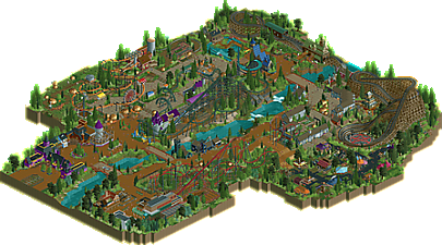
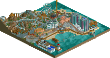
Witchtopia is themed to several spooky and kooky things with many references to classical music. Along with the rides, Witchtopia includes a seasonal festival with plots rented out to various vendors! Each booth was built by a different member on New Element and has an accompanying entertainer to identify each booth. This park was started on January 8th 2021 for RCTClub’s single rail contest with just the rides Witches Sabbath and Spider and was finished on February 4th 2021. Witchtopia is my first big project with CSO!
-
1 fan Fans of this park
-
Full-Size Map
-
Download Park
362
-
Objects
406
-
Tags
Park Tools
Similar Parks
-
Marlin Gardens Thrill Park
-
V1's Fort Fun Abenteuerland
-
Garden of Light
-
Alumwell Bay
-
Worlds of Amusement - Berlin
-
Vernon Disney's Magic Realm - An Alternate Universe Park
I enjoyed watching the progress of this park and am glad to see that more "NCSO" players are branching off and trying both! This park is very cute and has a unique aesthetic that we haven't really seen before. I do kind of wish you had kept the log flume that you had for your contest entry, but I understand why it need to go. Hopefully people will pick you up for h2h because you would be a valuable workhorse. I'm floating between 55 and 60% right now. We'll see what I'm feeling when it's time to vote.
First of all, what a cool concept for a park. Love the unique theme.
I really appreciate the almost cartoony feel to the entrance; it feels just right for the theme. The tower associated with Witchy Wheel is unfortunately a very plain and underdeveloped structure while also being a major focal point in the area. That was a bit disappointing, especially compared to Sorcerer's station right across the path.
The little dock scene next to Ghost Ship was fantastic, would have loved for that to have been a whole area along the coast.
The ride layouts in general are a pretty strong point in my opinion. A bit unfortunate you're missing footers on the Raptor, but that's a minor complaint as far as ride design. The traveling camp was also an excellent area in the park.
Really I think your foliage and rides are the high points of this park, with the architecture being a bit of a mixed bag of quality. I love unique themes, and I'm excited to see you polish your style further. This park definitely shows a lot of promise.
Can't tell if it's poor timing or big dick energy to release a witch-themed park in February and not October. but either way I love the dedication to a theme. The result is something real original with some great bold color choices and plenty of fresh ideas.
For one of your first forays into the world of CSO, I think this is a great step. There are obvious tells that you're still getting your footing, but there is also a lot to love and a lot of incredible details and ideas. I think that's a huge indicator of great things to come as you get more experience with CSO. It's a lot easier to learn CSO execution then to learn creativity I think. I particularly loved the pentagram with the wooden coaster, the single rail coaster, sorcerer's apprentice, and the bold colors throughout. I do think there are some areas that you had great ride names that could have been heightened with a bit more themeing, but nothing egregious.
The size of this park is a little odd, because for a single themed area it has too many big rides, but it's too small for a full park. That being said, I don't get the impression you were going for a full park so much as a manageable size to build out a full CSO creation. I think that is really smart, because it afforded you space to experiment without restricting you to a really lengthy build. When you're first starting in CSO chances are you'll learn a lot by the time you finish even a small section, and sometimes I think it's better to push through and finish a project and take what you learned to the next.
All that being said, I'm very excited to see what comes next. Oh, also, I think it was a really smart idea to ask people to do little guest stalls in the park, great way to do some, ahem, rct networking. Was very excited to contribute something!
Congrats again!
Awesome to see this released, was pretty fun watching it develop over the last few weeks. Definitely a big step up from your previous work, and really unique compared to what we typically see here.
This was nice, definitely a good first CSO release. The entrance area was really great, might have been my favorite area in this. It definitely also looks like its the one where the most thought was put into. I think the other areas of the park lack a little bit of direction and composition, but im sure that will come with time looking at the amount of good ideas and details youre already having.
The market area is another highlight for me. I assume those stalls are all guest spots? Definitely a cool idea. I also agree with CC9 that the foliage work was not bad in this one.
To conclude i think that this is an enjoyable release, a bit unrefined and underdeveloped here and there, but definitely not bad.
I loved this.
I always enjoy parks with a clear scope and theme a lot, and this one fits that bill.
Keep building parks like this!
Man what an awesome little park. So many great ideas and great execution. I love a well thought out theme, and you've nailed it. Glad you're here!
This was a lovely park! The dedication to one theme works really great and brings in a lot of atmosphere.
Stuff I liked:
- The tents camp
- Custom carroussel
- All coaster lay-outs were really good. I really loved the turn after the first drop being covered by another turn on the woodie and also the last helix of the woodie is fire!
- All the pumpkins around
Stuff I didn't like so much:
- Wish you went with the swinging trains on the junior inverted
- Archy could be done a bit cleaner and more detailed in some places
Congrats with this lovely park, I'd love to see more stuff like this
This was an incredibly pleasant park to view, loads of unique character and charm and a great approach to the theme. The entrance is very striking and immediately sets the tone for the park, and reminded me a lot of Zippo's with its texture and roof choices. Loved the broom valet idea, and I think you did a great job of applying the notes that were given to improve the shape of the path.
There was a nice variety to the coasters in the park, notably the launched-lift RMC raptor and the Vlad themed woodie which were both very well designed. I've mentioned before that I adore the final bowl element on Vlad, and the rest of the layout is superb as well. Loved the shape of the station with its steep spiry roof, and the skulls on spikes dotted around the queue too.
I'm a bit less keen on the white wooden buildings but I can see the theme you're going for. I think having some more of the black wall detail would have helped perhaps. Baba Yaga is a fun execution, bold to use the standard haunted house but it kinda works. The market stalls turned out really excellent too, loads of variety here and a nice way to have guest spots.
I think where the park excels is in its depth of ideas, and with more refinement and practice you could get really good at pushing them to the next level. Also shout out to the DRUK references!
What a great release! I loved the indea and setting of the park, though I'm not sure what exactly the context is. It seems like a theme park meant for wizards and witches, but if that's the case I'm a little disappointed to see that you didn't go all out with the strange and magical ideas and played it sort of safe.
Nonetheless, what's there is really good! Some things I loved were the pumpkin patch, the gothic circus and travelling fair, the helixes with the pentagram in the wooden coaster and the haunted house on chicken legs. Such good use of an in-game ride, but expanded upon.
Some things to mind in the next park would be perhaps architecture. You've played it safe here and the buildings are quite sober in some areas and could've used a bit more detaii. On the other hand, there seems to be a bit of an overabundance of trims. What I suggest is to learn from other parks what functional detail is, to make a building look great but also make sure the additional details are there for a specific reason.
All in all, it's great to see you expand into cso and I'm excited to see you venture more into this world!
witchtopia 60%
creative genius
layouts well designed but short
- shame. quick build, more please
Really neat and pleasant little park. Some creative ideas with the theme which was refreshing. The little fair area with the various vendor tents was a genius idea. The rides were overall not bad.. but some odd choices, mostly using the suspended swinging trains on a suspended swinging track. Also, it seemed the bridge over the water on Vlad seemed a tad undersupported.. but I enjoyed that layout quite a bit. Also it seemed the Raptor was missing some footers, most notably on the bridge. Lastly, the station for Jack O Lantern was well done, I'm a sucker for red/white barn vibes.
Really loved watching you build this. It's crazy to me how good this is for a first CSO project, especially the stuff you built last, towards the back of the park (favorite is the blue roofed building). The fair was such a great idea and turned out so well. Layouts are great, especially the woodie- very unique elements, that flow well. The Arrow was also a highlight- standard elements, but in a great order and position. still think the RMC is a little fast. To me this is solid silver- main thing that holds it back from being even higher to me is just your lack of experience with CSO, but that's understandable and I'm sure your next project will be even better. AJ for most promising.
Congratulations on the bronze win! I was the low vote on this because I thought the park was a bit too inconsistent and incohesive, but I definitely thought this was a bronze. Great theme (worth revisiting later in your hopefully long career) and lots of fun stuff. Highlight for me was the market, although for understandable reasons the quality here was a bit inconsistent.
I was on the fence whith Bronze or Silver, but in the end went with Silver because I thought the ideas were all really convincing. You could see it in stuff like the sign on the ground, or all the naming throughout being very inspired.
I think what's holding it back for me was just the overall execution. The level of refinement and success in your design skills I think can take a few more steps up. But I think this will happen quite automatically if you keep playing. Would love to see.