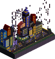
Park / Take On Me
-
 30-March 21
- Views 2,708
- Downloads 363
- Fans 3
- Comments 16
-
 73.50%(required: 65%) Design
CedarPoint6 80% Liampie 80% chorkiel 75% Cocoa 75% In:Cities 75% RWE 75% Xtreme97 75% bigshootergill 70% Camcorder22 70% CoasterCreator9 70% Scoop 70% posix 60% 73.50% -
Description
We're talking away
I don't know what I'm to say
I'll say it anyway
Today's another day to find you
Shying away
I'll be coming for your love, okay? -
3 fans Fans of this park
-
Full-Size Map 1
-
Download Park
363
-
Objects
261
-
Tags
Similar Parks
-
Walt Disney Studios Park
-
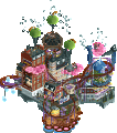
The Fool
-
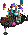
Raining Men
-
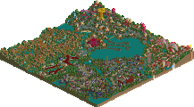
Last Hurrah
-
Mechanical Style - Bubbsy Remix
-
Walkman Of My Brain
Holy shit! I love Take On Me! Super excited to check this out.
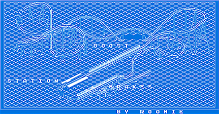
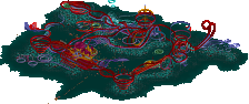
The opening moment with the letters scrolling down blew me away. Another innovative mindfuck from the king of innovative mindfucks. I adore this. I'm sure someone will call it a gimmick but not everything different and unique is a gimmick. For me, it's this kind of creativity that gets me most excited in rct, exploring the full range of things we can do with a game that was meant for rudimentary theme park simulation. While small, I honestly think the design stands on its own without the Take On Me overlay, but the black and white sketchy look, the red letters, the music, and the opening scene all have me shook. And the fucking blueprint. It's like you are playing a different game then the rest of us, lol.
Thank you again Roomie! This and Virus have been an absolute treat, so excited to see what you create in H2H.
Other than the fact I can't seem to exit (and yes, I read the doc - must be a me thing...) THIS IS crazy. Simple in execution for the core, ridiculously awesome in the white out effect.
If I ever exit the game I'll load blueprint...and if I ever learn how to load custom music I'll try that too.
...but I'm old, older than this song...so it's stuck in my head anyway.
Congrats on another MindF...as if Virus wasn't enough.
fuck yeah, take on me is a top-10-all-time song in my books.
when the letters scrolled i died. fucking amazing. I've been hoping for letter trains in the game for a while so I can't wait to see what else is in the future of your hacking books.... that blueprint was absurd and maybe even cooler than the regular design!
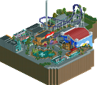
the village/ride itself is perfectly lovely and fine, but doesn't quite compare to the fun of the effect. looking forward to h2h...
Very unique idea and pushing the limit of what palettes are capable of. The moving letters are a good niche innovation that I think will be a nice touch to parks in the future. The coaster and surrounding area was nice, but it does feel like the palette does the majority of the heavy lifting here. Regardless, nice and innovative design.
Roomie's creativity has no bounds. I had to watch the music video to understand what you were going for here, well I watched like 30 seconds of it. Anything you release shows you had fun doing it, this white out park is great. Archy etc isn't overly strong, but it's sufficient and helped you accomplish your ultimate target. Great job!
I replaced the music file Custom 2 with yours but I still can't hear the music. All I could see was the title.
Is music enabled in the settings for you? Check the sound volume levels...
Take on me is one of my favorite songs as well. Thought the tricks in this design were stellar examples of how palettes can be used to push boundaries. After the party tricks were done it felt a bit empty though. The palette did not really allow for a nice in-depth viewing as it was a bit tough on the eyes. However it was all still very design-worthy. The blueprint was my favorite aspect of this. Can see people repeat this for large projects or designs where the layout is difficult to discern.
I can hear the guests and I tried another park and I tried another park, Julburi Bazaar or something, and I could hear the music there. Is it because I put the sound file in the Open RCT2 music section instead of the base game?
Hasn't that always been the case?
you're ridiculous, i'm calling the police
I got that sorted out. It was a fun experience. I didn't know you could have the whole screen flooded in white. I'm eager to see what you make next.
Sorry to be the low vote Roomie. Don't need to tell you how impressive this was, but if I'm very honest, I'm not keen on parks where gimmick is everything. I think it wears off very quickly, at least for me. What I could see of the park looked interesting, but the palette hid all of it. I understand that was conceptually wanted, but it also didn't make me enjoy this more. I'm genuinely happy for you though that this won design.
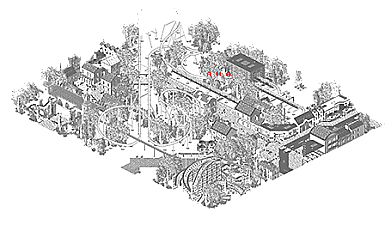
This park was very much a happy accident that occurred when I was playing around with pallete.
I accidently opened this palette on Virus and thought... Well that looks cool.. Especially with the flickering trees in that design.
So I set about building something small and simple to go with the palette and the obvious theme was the world famous video for Take On Me.
In terms of the technical side of things for those who haven't managed to turn the palette off (sorry about that, the menus being white is an unwanted side effect) everything you can see on the map was built using the colour red as that was the one colour that was originally switched to grey while everything else was white. A bit later in I switched some of the water colours to grey as well so water became visible.
Building everything in red certainly takes some of the complexity out of building
The letters were something I had the idea for very early on but didn't implement untill the end. Originally they were purple but I decided to switch to red last minute. This meant I had the weird situation where everything in the map was built in red except the letters which were the only thing that would show up as red.
Anyway I never really expected this to get a design so I'm pretty chuffed it did.