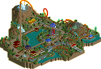
Park / Migou
-
 20-March 09
- Views 3,463
- Downloads 514
- Fans 0
- Comments 13
-

-
 74.23%(required: 65%) Design
RCTFAN 85% Xcoaster 85% Evil WME 80% nin 80% zodiac 80% chapelz 75% geewhzz 75% Magnus 75% Steve 75% CedarPoint6 70% Fr3ak 70% posix 70% FullMetal 65% Milo 65% 5dave 60% 74.23% -
No fans of this park
-
Full-Size Map
-
Download Park
514
-
Tags
Similar Parks
-
[H2H8 R2] Tubiao Action Park
![park_4091 [H2H8 R2] Tubiao Action Park](https://www.nedesigns.com/uploads/parks/4091/aerialt3830.png)
-
Ancient Worlds
-
China Charms
-
[H2H8 R2] Forgotten Mekong
![park_4093 [H2H8 R2] Forgotten Mekong](https://www.nedesigns.com/uploads/parks/4093/aerialt3831.png)
-
The Masterpiece
-
Ascension
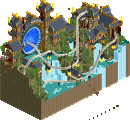
About 4 months ago, a relatively unknown member, Bacchus, won a design accolade titled Chamois. It was an unconventional forwards/backwards launched coaster on B&M style track. The design just squeaked by the 13.00 score minimum, but put him on the radar as one to watch. As Head-2-Head 5 rolled around, Bacchus’ name came up once again when he was drafted 26th overall to the Whzz Kids. But before he heads off to a summer of Head-2-Head competition, we release Migou, a B&M floorless coaster. Read On...
The swinging ship is.......stellar. Now, I'm really looking forward to working with you in H2H5 (not that I wasn't before)
Great work and a well-deserved accolade.
congrats!
I havent seen such a nice layout a long time.
And then with really lovely theming...impressing!
The landscaping was good done.
Wanna see more stuff like that.
Congrats on accolade.
Oh, I forgot to say, that the logo was excellent, too.
Edited by Yannik, 21 March 2009 - 03:15 AM.
its way better than it looked in the ad.
the swinging ship was awesome.
not the best layout ive ever seen, but it sure was impressive.
accolade five!
Edited by SSSammy, 21 March 2009 - 04:49 AM.
First, I really liked the whole design, but there were parts I didn't like.
I wasn't fan of the layout itself in the first place and I still don't like it. It's too spread out and it's 'caging' the area in. The inversions were also a bit generic and predictable. Also I thought the queue was a bit too short for such a major ride. Try integrate it more with other rides and the main ride itself!
I like ideas like the dragon (but as Turtle said, going into the mouth rather than out would have been much cooler) and the aesthetics of the whole design are top notch.
Your strong points still are definately landscaping and foliage. And your archy keeps getting better and better. Just work a bit on the layouts and you're set.
Keep it up!
"MFG"
And dave: I can understand your low vote, you told me in the majesty forums that you didn't like the layout, and I agree with you on the points you didn't like.
I can tell you i've practiced my layouts, so you know what to expect in the H2H
Edited by Bacchus, 22 March 2009 - 01:03 PM.
I agree with Dave & Turtle that it would have been nice going in, then it benefits the peeps watching & riding, where as it coming out only benefits the watchers.
Also you know that I didnt like the layout that much, a felt, like Dave, that the lift took the coaster too far away. However element placement was quite nice.
Overall I would have scored this a 14 but yeah.
Congrats on Design #2!
That being said, congrats on your second Design.
James
On the subject of the dragon's head - which is really cool - I actually like how the train comes out of the head, whereas a lot of people seem to be complaining that it should actually be going in. Ok, perhaps if you had done the train going in, it would have improved the experience for the riders, but I feel that you might have had to forced this scenario and overall, I feel the way you've done it has far more pros. From a non-riders' point of view, (and an RCT viewer's) it looks really awesome, and I think if this coaster existed in real-life, the feature would give the ride a real defining point which characterises the coaster.
I liked the colours used throughout the section, especially on the ride itself. I thought the landscaping was decent, and the foliage very very strong. The custom flat looked a little odd, but was still cool. The splash-boats seemed a tad forced, and added in for the hell of it... but still sort of worked, and I could see that this ride may have been installed in real life too.
Liked the archy overall - nothing too over-the-top, but still nice, and did the job, conveying the theme well. The main gripe with the design is I felt the Migou entrance area, queue-line and station all should have been made more of - this is a main attraction, and it's not given very much space or magnitude. The ride deserved a much more spectacular, suped-up entrance area and station. That aside, I think this is one of the strongest designs for a while.
it's always good to hear people's opinions, so I know on which points I can improve.