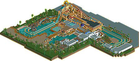
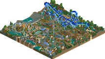
Park / Journey To Atlantis

12 Comments

  • geewhzz%s's Photo


    Despite being a member for longer than most remaining members of the New Element community, Ripsaw didn't start advertising until 2007. Since then, however, he has proven himself to be a fast builder and frequent advertiser with many other projects including the parks Thorpe Gardens and Thorpe Gardens 2, a King's Island's Diamondback pre-creation, a B&M Flyer design, and even a full-scale theme park: Thorpe Point, which is nearing completion. Even with so many projects on his plate, Ripsaw has managed to build yet another that is being presented now as a New Element Design, Journey to Atlantis. Read On...

  • Roomie%s's Photo
    cant look at this in game till tuesday but from the park overview it looks pretty awesome. i've been on the Florida version of this and it looks like a pretty good version of that ride.

    Congrats on the design.
  • SSSammy%s's Photo
    been waiting ages for this!
    aweeessssooooome
    i would have voted it a little higher tbh :)
    much deserved accolade anyway.
    nice one ripsaw : D
  • posix%s's Photo
    sammy, i agree with you. i gave it a 16.

    ripsaw, this was very good in many ways. you have a strong talent to transfer real life inspiration to the game. i am eagerly anticipating your next release.
  • Magnus%s's Photo
    As the lowest vote came from me it seems like I need to explain this.

    I somewhat liked this submission and as posix said you have quite some talent.
    What held this one back for me is the fact that is all seemed rather sterile. I am not talking about details here, but about the overall impression.
    When I am judging a realistic park I am looking if I want to visit this park and in real life and this one didn't look like it would guarantee a fun day.

    Whatsoever, I think we can see some great work from you in the future.
  • RRP%s's Photo

    As the lowest vote came from me it seems like I need to explain this.

    I somewhat liked this submission and as posix said you have quite some talent.
    What held this one back for me is the fact that is all seemed rather sterile. I am not talking about details here, but about the overall impression.
    When I am judging a realistic park I am looking if I want to visit this park and in real life and this one didn't look like it would guarantee a fun day.

    Whatsoever, I think we can see some great work from you in the future.


    I agree with the low vote.There were too many flat roofs of a single texture and the foliage did nothing to immerse me into the experience.I think the first and last screens from the design page pretty much sum up the whole piece as theres nothing else really worth looking at.More 'interesting' details would have helped a lot especially around and in the pools
  • J K%s's Photo
    I like the work but I don't believe it should be a design. The building was nice but a few things just bothered me like the brown blocks with the maroon roof colour. I just felt alot more things could be added to give it the wow factor it deserved. That's just my opinion though, congrats on the release.

    JK
  • geewhzz%s's Photo
    I have to agree with RRP. Although it's a nice first release and shows a LOT of potential, there is still a lot of stuff you can improve on, mainly foliage. The foliage was seriously lacking and left a lot to be desired. The building and ride was for the most part nice, but the surroundings didn't really immerse me in the setting. Looking forward to your work when you're a bit more developed. Another thing that bothered me was the fencing. It seems like it was just put in to be put in, and didn't serve a purpose. It really took away the feel that there could be more past the map boundaries.

    Congrats though.
  • Milo%s's Photo
    Yeah have to pretty much say what has been said above sums up my low score. The building was mainly good although the white ones surrounding the que didn't really do much for me and the foliage was really lacking. And the ride was nice but the elements of its surrounding have to be working pretty hard for a ride of that type to really impress me.

    It did show a lot of potential and from what I can tell you are making some major improvments.
  • RCTNW%s's Photo
    I'm pretty much in agreement her with what others have stated however just like with cocoa's release, you need to look at the finishing details only yours are different. I know it may seem over the top ut name your staff. It adds to the overall feel. If the park is set in france, use french names as it adds to the overall concept of that park.

    Other than that, I enjoyed it and look forward to seeing more.

    Congrats and keep it up.

    James
  • turbin3%s's Photo
    First: Congrats for accolade.

    Secondly: I have to agree with the others. I dont like all the flat roofs and your foliage.
    But I like the idea + your architecture!
    Im sure that we'll see some great parks of you in the future :D

    Congrats!

    Yannik
  • eyeamthu1%s's Photo
    Sorry once more for a late comment (it's been a busy month) - but I have to echo everyone else's thoughts. This was decent and worth a download, but probably not worthy of a Design Spot in my opinion. There wasn't quite enough to it - both in terms of content and execution of what was there. The word 'sterile' has been used, and that is quite a good description. It's all pretty nice, but it just needs that something more. The main building itself is just a bit dull and boring; it's plain, blocky and needs some major sprucing up to make it more interesting - some better textures, archy, foliage, I don't know. An example of what was good on the building was the small section where you have the diagonal lift hill - this gave the structure some depth and added interest to the viewer. If the rest of the building had similar detailing or variation, then I would have liked this a whole lot more.
  • DrummaBoi%s's Photo
    This makes me miss sea world more than i ever did :( but it looks GREAT