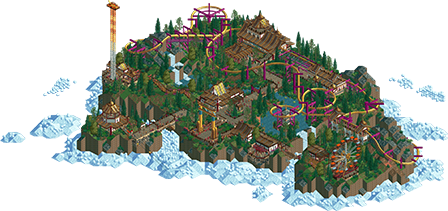
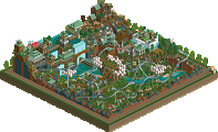
Park / Golden Eagle
-
 18-December 21
- Views 1,365
- Downloads 237
- Fans 0
- Comments 8
-
 60.50%(required: 65%)
Design Submission
60.50%(required: 65%)
Design Submission
In:Cities 75% saxman1089 65% Scoop 65% Terry Inferno 65% chorkiel 60% CoasterCreator9 60% Jappy 60% posix 60% Xtreme97 60% Liampie 55% ottersalad 55% RWE 55% 60.50% -
Description
A coaster in a hidden sanctum high in the clouds. Came in 2nd place in the RCTClub Suspended Coaster Contest in September 2021.
-
No fans of this park
-
Download Park
237
-
Objects
143
-
Tags
Similar Parks
-
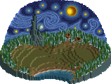
The Starry Night
-
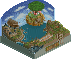
LAPUTA, Castle in the Sky
-
Home Away From Home

-
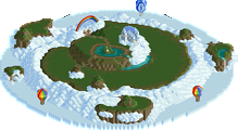
Over the Rainbow
-
Cloud Breaker
-
FANTASIA
Dude this is amazing. The setting and scenery are gorgeous, the coaster layout flows so well (although the second half could have been a tad bit longer), and the shoestringed flat rides are executed very well. I see you nabbed the rotating freefall drop from Deurklink himself. I also love the skyride that descends through the clouds. It's also really cool seeing those WWTT roof pieces being used as path blocks. As awful as it is at times, I love how you and the rest of DKMP use the WWTT scenery. The palette is beautiful with those purple and golds, but I can't help but feel you could have reduced the amount of blue in the cloud/ice colors a la Mount Haystack. Having the black be changed to a sky blue in the palette to change the background color could have really brought this one over the top, although I imagine it would have been tough to work with otherwise. Overall a beautiful submission and absolutely worthy of a design.
EDIT- Just to practice making palettes, I decided to try out the palette changes I thought of in this comment. The blue background definitely messes up some of the rides, as the vertical drop and suspended coaster cars now have blue bits which can't be recolored. While it's possible to just have the blue replace the blacktile land texture, this would mean there would be a big black void surrounding the blue sky which would break the illusion. I don't imagine using those recolorable backgrounds would work in a NCSO submission either. This is nothing against your palette which I think turned out very well, but I couldn't help but see what this park would look like with a blue sky below.
Neat vibes. Color of the coaster added a nice pop of color. Archy was pleasant and I liked your use of WWTT objects, but I know a lot of the community doesnt. I think here it was a creative use of objects... namely the pathing like Gustav pointed out. I'm less of a fan of the foliage.. very spotty and not very thought out.. seems a bit random to me.
The coaster was fun to watch.. nice and swoopy. I liked the steep drop out of the MCBR, but the last section of the ride was super short. Maybe it's just me, but the entire layout seems to go by very quickly. The final brake run is massive in comparison!
Park in the clouds is a very common theme in NE.. maybe not lately but it was definitely a meme when I first joined here. I think with more refined foliage and a bit longer of a layout, this would be a design. Just not enough here for me. Solid 55-60% for me.
Kyphii Offline
Had no idea he made one of those
I did consider the sky color when I was making the palette, but IMO it messes with too much stuff that uses the normal black. It does look nice with a different color overall though. If the game used a separate palette slot for the background I probably would have done it. Maybe someday that could be a thing.
The coaster is based off Big Bad Wolf so the finale is intentionally a bit short. I feel like it might have overstayed its welcome a bit if it was longer but maybe that's just me
And yeah, the foliage isn't the greatest in hindsight.
Thanks for the feedback!
Definitely gorgeous looking! The coaster colours are stunning, and for someone who hates wooden coaster roofs, I think it looked quite alright here. Struck me as somewhat Thai. It's hard to figure out what the theme/setting is supposed to be though, I'd say you can do better there. Also gotta admit the coaster pacing was off, too slow. The trains barely swung at all. I thought that maybe it would go somewhere after the MCBR, seeing as there's a big (great looking) drop, but it was basically a slow S-bend.
Despite my complaints, this is very nice, and above all very promising! Keep at it!
It's pretty trackitecture heavy which is a bit of a sore point for me, but I understand why you did it and don't see any other way to pull of what you were trying to accomplish here.
Now for the things I do like: the muted colours, the landscaping, the little mountain top buildings, the onteraction, the foliage... You've made the snow and gum drops believable as clouds, so kudos to that!
Quite the neat little submission. Thought the cloud features were well done in the NCSO context. I agree with Liam and Otter about the coaster and foliage; you're certainly on the right track. I think Eldritch was potentially a bit higher quality in general, but you're also showing promise with NCSO.
You're definitely one of the most underrated players here. This is so great. Beautiful attention to detail and interactions with the landscape and architecture. Great work!
darn, miffed this one missed. its way more interesting to me than 90% of the samey ncso designs that seem to win these days. the cloud thing is a bit of a trope, but the landscaping is lovely, layout is flowy, and the architecture is very good---some lovely detailing that i hadn't seen before.