Park / Atlantean Adventure
-
 31-December 21
- Views 1,129
- Downloads 228
- Fans 0
- Comments 5
-
 62.50%(required: 65%)
Design Submission
62.50%(required: 65%)
Design Submission
CoasterCreator9 70% In:Cities 70% Jaguar 70% G Force 65% Terry Inferno 65% Xtreme97 65% ottersalad 60% posix 60% saxman1089 60% Liampie 55% RWE 55% Scoop 50% 62.50% -
Description
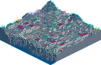
Another one of my old DKMP entries, this one is from December 2020. Came in 6th place if I recall correctly. It's very blue, probably too blue. Sorry bout that
-
No fans of this park
-
Download Park
228
-
Objects
194
-
Tags
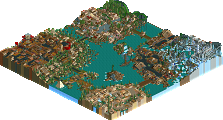
Honestly rather impressed by this. You mentioned my main complaint; the palette makes everything feel washed out. Once you get past that; there's a lot of unique elements here that are rather fun. I personally enjoy the Dueling Dragons style multi-dimension coaster.
The palette was definitely the first thing I noticed in this. I think it's a decent effort to achieve the underwater vibe you were going for but it unfortunately does have the drawback of washing out a lot of the colours. Anyway, I thought this was a pretty nice park, the idea of racing multi-dim coasters is cool and there are some great moments such as the double raven turns. The architectural style is fairly cohesive, though the crazy path gets a bit lost in places. I also enjoyed the shark and eel swimming about, more of those would have been cool.
Quite decent. Not sure I've ever seen duelling 4Ds. Fun to look at.
Indeed the 4Ds were really fun to look at, super tough layouts to build and make look nice which you achieved here. Not sure I totally dig the palette but definitely get what you were going for, guess its just one of those things you like or you dont.
Also, I always marvel at how your DKMP players make the map edges look nice, this one is no exception.
This one really could have gone either way, and the panel votes reinforce the idea that it was borderline Design-quality. I see why it ultimately did not cross the threshold, but I also would not have been surprised had it just kissed the 65 mark. A classic concept with a nice layout, this one could have been executed better, but seeing as you built it over a year ago and have improved significantly since then, you probably already realize this.
The palette itself did not bother me--it acts more as a filter here--but the beige walls and beige roofs over beige path caused the buildings to blend in with the path, though the red and green roofs definitely helped. This is not a knock on beige specifically (Steve); purple paths, walls and roofs would have created the same over-blending effect. A different path color would have provided some necessary contrast to allow the buildings to pop more. It is unfortunately monotonous even when viewed with the default palette; I do not believe that removing the "underwater" filter would have positively impacted the score for this reason.
Underwater landscaping is surprisingly difficult to get right, and you've nailed it here. More landscape interaction, especially within the city portions, would have broken up some of the squareness here. The bright pink and yellow coral provide a nice contrast to the earthy infrastructure, while the rock formation in the corner might be my favorite piece of landscaping I've seen since last H2H. Though a bit unclear at first, the sea goddess makes for a lovely centerpiece.
Very strange that nobody has brought up the cutaway dark ride yet. It took me a little while to find it, but it's a nice little hidden treasure that adds an extra layer of depth. Reminds me a bit of Riverland's car ride through the miniature city.
I'm looking forward to seeing some post-Eldritch work from you! Your worldbuilding now is miles ahead of where it was in 2020.