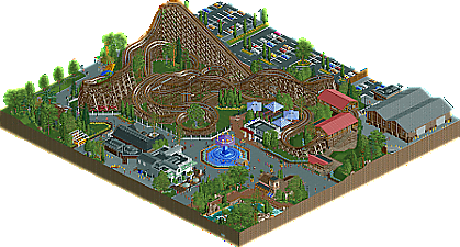
Park / Splinter
-
 07-February 22
- Views 2,635
- Downloads 290
- Fans 0
- Comments 9
-
-
 68.00%(required: 65%) Design
RWE 75% bigshootergill 70% In:Cities 70% ottersalad 70% saxman1089 70% Terry Inferno 70% Xtreme97 70% CoasterCreator9 65% G Force 65% Liampie 65% posix 65% Scoop 65% 68.00% -
No fans of this park
-
Download Park
290
-
Objects
1
-
Tags
Similar Parks
-
Smooch Hour
-
Tropicool Waterpark
-
Adventure Time
-
The Duck Festival of Trifouilly-les-Oies
-
80s Anemoia
-
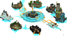
[H2H7 R3] Meizhou Rising
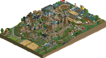
![park_3350 [H2H7 R3] Meizhou Rising](https://www.nedesigns.com/uploads/parks/3350/aerialt3056.png)
This is a great design entry! Strong layout and the surroundings look top-tier NE-realism. The foliage is also a strongpoint. I'm not a fan of the track underneath the swinger. I think it looks better without it. I thought some small parts of the coaster maybe didn't need the banking. But those are nitpicks. It's all very good, but maybe also very 'by the NE-rules', if you understand what I'm saying. Maybe that was what you were going for on this project. I just hope it doesn't mean you're breaking away from your own style completely.
Solid work MK. While I'm not really a fan of the swinger still, almost feels out of place compared to everything else in terms of scale and style, this was nice. The SFWoD inspiration is very clear (probably a little too much), almost to the point where this transports me back in time a few years to when everything felt like it was inspired by Starpointe or SFC and parks like that. You definitely added some of your own flair here, with the archy and other attractions. The little kiddie ride section was definitely a highlight for me along with many of the other "little things" you've done to add atmosphere (the queue for the mens restroom definitely made me chuckle). Simply the amount of effort put into those details combined with the overall quality of things makes me like this quite a bit.
However I do think there are some flaws. First, I think some of the more realistic details I'd like to see in a submission like this sorta feel a little awkard perhaps, mostly to do with the station and transfer track area (really not a fan of those two structures at all).
Layout wise, the pre-lift was definitely a little strange, and I think overall the coaster feels heavily inspired but a few things, but doesn't quite hit the mark for me to really put it at the level of a strong design. I guess it turns out to be just a little boring and the realistic detailing/execution of the ride itself isn't strong enough for me to give it a pass.
Overall, some nice work here, like to see you did something a little different and developed your style a bit. Perhaps not the best design in my eyes, but in the end worthy of a 65% since the surroundings do have a good amount of charm things we're done well enough for me to want to come back to this again in the future.
Congrats on the release MK. Really enjoyed getting a chance to see you build this. My apologies for not helping with the surroundings, I was quite honestly burned out with doing collaborations after H2H. Not that you needed my help anyways! What you made here was quite enjoyable.
The layout was a bit slow in spots.. would've benefitted from an extra bit of height on the lift hill. I think the compactness of it all though is a positive. While I agree with most of what G Force said, I do tend to like the pre-lift. I think it's definitely unique. The station and transfer shed seem a bit undercooked though. If it were in a larger park, I'd understand the plain-ness, but if it is a design submission I want to see more!
Queue is nestled nicely and I think the queue awnings are great. Definitely see the inspo here.
Surroundings are solid. The little building next to the rapids is ace. Love it. The little games in the corner are very nice as well. Adds a nice pop of color to an otherwise quiet corner.
Look forward to what you got coming next. I think this was a great project for you to do more realism, but I'd be curious what sort of fantasy/less grounded theme you could pull off. Your Cuba entry and H2H work was very atmospheric.
Lovely piece of work, MK. Your designs often remind me of past realism designs in the pre-openrct2 era with a focus on tighter maps, though the content is still very modern in style. It's more than a little reminiscent of Roar from SFWoD, especially in its station design and first layout elements. I agree with G that there's enough of your own character, but it's something to keep in mind. The coaster itself has a good layout overall, and it's well paced. A few kinks in the flow could have been smoothed out perhaps, but on the whole it feels like a realistic design. I agree also with the critique of the swinger platform, feels over cluttered with the track and deleting it entirely looks a lot cleaner and reads better to me. The actual swinger structure is very nice however, and I find a lot of the smaller details like the kiddie rides and games on the path elevate the atmosphere.
This is good work MK, good realism in the tradition of Pac and G Force, reminiscent of the realism meta from ~5 years ago. Some buildings and things are obviously derivative, but you've put it all together nicely.
The coaster layout is mostly good. Some weird tight turns halfway through, but in your defence, GCI comes up with weird things sometimes. And this does feel like a GCI alright, so that's a job well done! Wish you had more context around the first drop and helix, to establish better sight lines.
Swinger is terrible, sorry. Rapids are a bit unnecessary and over the top, sorry. Also think the amount of path here is too much, or rather not broken up in an effective way, sorry.
Back to the positives. I like how the park is landscaped. Modest but tidy flower beds, black iron fences that give it a touch of class, and plenty of greenery in general including the parking lot. It helps! It's a pleasant little map to spend a little time with. Not groundbreaking, but pleasant, and pleasant enough for a little accolade in my eyes.
This is a good design. I think except for the a bit weirdly looking swinger you showed off some good realism here. It definitely follows the tradition of a lot of other realism parks and its not like i see much stuff in here we havent seen before, but i think its on the point of the scale where its totally fine to call this an inspiration and not a rip off.
The layout definitely has some unique moments: some uniquely odd and some uniquely good. Wish you played a bit more with viewing points or framed that first drop a bit better, despite probably the hacking effort put into them, the kiddie rides on the side felt a bit unnecessary.
All in all a solid design.
Man, stop reading my mind.
Enjoyed this in general. I don't wanna keep reiterating the same points of others - I think this is good work. Your composition and ride design are both improving.
You have an eye for the GCI, and this is my favorite layout from you yet. This coaster is aesthetically pleasing from all angles, and it flows naturally through every twist and turn. The scenery and landscaping are all nicely coordinated, and the details you've added (including a custom-built animated pee dance guest) really bring the scene to life.
I consider this to be a step above a borderline Design, and I believe that even though much of this is still very "by the book" (which is not an inherently good or bad quality), your ability to paint everything into a cohesive atmosphere has certainly reached a new high. I do wish you would build a full-size park, as this could easily be a snippet of a mid-level Gold.
Finally getting around to commenting on releases from earlier this year..
This was really nice! Super clean but very effective in a proven style. Loved the little snippet of rapids, +++ for the peepee peeps in line for the bathrooms (love your objects!). The word I kept saying in my head while looking around was "clean": your souvenir racks, the climbing game, the parking lot, the fences (particularly the security gate). Some parts didn't quite live up to that (I thought the swinger was a bit messy), but overall a solid submission. Congrats on the design!