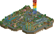
Park / Taxi 2.0
-
 02-May 22
- Views 2,228
- Downloads 214
- Fans 2
- Comments 10
-
 70.00%(required: 65%) Design
ottersalad 80% In:Cities 75% saxman1089 75% Scoop 75% Xtreme97 75% bigshootergill 70% Cocoa 70% RWE 70% G Force 65% Liampie 65% Jappy 60% posix 60% 70.00% -
Description
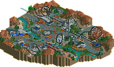
Premier Rides meets Crazy Taxi
Winner of the RE 1up Challenge ("video game" prompt) -
2 fans Fans of this park
-
Full-Size Map
-
Download Park
214
-
Objects
193
-
Tags
Similar Parks
-
Busch Gardens Egypt
-
[MM2014 R1] The Janitor's Jinx
![park_3130 [MM2014 R1] The Janitor's Jinx](https://www.nedesigns.com/uploads/parks/3130/aerialt2776.png)
-
Southwinds
-
Warlock
-
Flags Fiesta
-
Six Flags over Texas by Mek & Swag
Solid stuff, dude! I always enjoy your relatively simlistic approach. It works quite well over here. The NCSO stuff is not the most mindblowing stuff weve seen here, but it definitely does the trick. I'm not sure if i love or hate the orange colors.
The coaster layout is fun and it features a lot of picturesque moments. Also i want to point out your supporting work here, well done!
All in all a well done release. Glad to see something from you again!
Layout is definitely excellent! The pretzel loop thingy is a great setpiece. Also liking the yellow car motif in the rides. Yellow cars everywhere. Theming was very nice, but I thought the the flat surfaces were confusing. Flat roofs, paths, racing track, it all kind of blended. Would benefit from a tighter texture regime. Double layer bridge was another cool thing. Just a cool piece overall.
How many entries were there in this contest? Yours, Gamma's, ?
Love seeing a Crazy Taxi themed park. And I like the clean NCSO look of this, especially the support work.
Carrying over my review here:
Love it. Great NCSO style on display here. The coaster kicked ass and carried so much speed, it was quite a joy to watch. Great layout overall as well, would be fun to ride. The go kart track was great as well. Loved the levels the bridge work along the hillside. The scenic cruise car ride reminded a lot of the Wedway Peoplemover.. which was cool. Congrats on a solid entry!
hey, this is sweet. love the layout, it feels like what full throttle at sfmm should be. nice clean pretty ncso with a good cast of supporting rides. the car ride is cute, and I love the go karts on the roof. thats a nice twist for a fresh theme.
Congrats on the release, really loved this. The aesthetic was top notch and really allowed the macro elements to shine. Not just macro elements as in 'map design' but also the macro of how you've shaped the different buildings and structures. The coaster was excellent, particularly loved the way you did the supports. I said it elsewhere, but these supports are so pleasing and interesting in a way that really adds, I think this kind of aesthetic should be carried over to cso more often, using supports as a feature rather than just a requirement. The gokart and car ride were also awesome, loved the way you did the car ride in particular and the interaction between those and the coaster.
Overall, felt like a really smart and well crafted project, definitely a design in my eyes and certainly the signs of an established parkmaker. Congrats on the release and what I think should be an easy design win!
Quite the fun release! I have no idea about the game it was based upon, and I'm not sure if that is a good thing or not. Mainly because if I can blame my points on the adaptation, or not.
My main point that I have is that the landscape at certain points feels pretty barren.and underdetailed. Some buildings as well seem pretty bare bones.
But the layout is fantastic and I love following the car ride and go karts around. Fun park, but I have seen better from you. Again, I do not know if something is lost in adaptation here or the game is that barren.
Might as well give myself a review since I'm already here.
As a viewer, the limited color scheme drowning in gray does not detract, but there is definitely room for two or three more accent colors within the architecture even if none of them are yellow. Gold and pink are completely absent from the map, while red only showed up in one corner and purple only in the flowers. Nonetheless, the orange and blue accents never seemed out of place, and keeping the color scheme simple does help sell the idea that this is one large area even when the theme may otherwise be dubious. Orange and blue do not scream "taxi", but if their purpose is to allow the yellow to pop, it seems to be working reasonably well.
Ride design may have been the strongest part of the map, as all three tracked rides complement each other nicely and fit together without any forced moments. The shoestrung ride seems to be a bit of an afterthought, almost as if it were included solely for the purpose of giving each of the four original drivers their own ride. The foliage and landscaping choices suggest this is somewhere either in the American Southwest, the Rocky Mountains, or perhaps even in an area in which the two regions converge (New Mexico or Colorado). It does seem a bit odd to throw thick, green foliage in next to a dry, rocky desert, but such landscapes do exist, and I believe this interpretation is an improvement over Moonbeam (set specifically in NM). American deserts do not mix well with the vanilla scenery set, and thus improvements must be made to the detailing if one were to attempt to build, for example, a Six Flags park near Las Vegas without any custom scenery.
Overall, not groundbreaking, but a hearty exercise in neo-NCSO fundamentals. Definitely not my best or most interesting work even within the NCSO realm, but for a 60-year build with a deadline (and loose theme criteria) imposed, I am certainly not displeased with the results. I found that this old game lent itself well to RCT ride design, but the world in which it is set was largely uninspiring aesthetically, so I opted for themed realism so I would have an excuse to build a more vivid landscape to contrast the concrete. Despite being largely gray, under-detailed and somewhat repetitive, both this map and Crazy Taxi itself are fun to explore (at least for a little while), so I believe it is as fitting a tribute as any for a decent arcade game from our youth.
The coaster design is superb. Each element is purposeful and highlighted well by the surroundings.
The support work is very impressive, especially around the first helix.
I like the section of Go-Karts by the rest room. Fun to get a peek at the ride in a bit of an unexpected area.
I always enjoy your stuff. I hope to see more soon. Perhaps a Six Flags park near Las Vegas without any custom scenery.
Still getting around to commenting on releases..
Lovely little submission Terry, congrats on winning design. Highlight for me was definitely the support work, I thought your combination of single rails, towers, and default supports worked really well. Landscaping was also quite nice, simple but timeless (reminded me a bit of Cars Land from H2H6)