Park / Dagda Derga
-
 24-July 22
- Views 1,693
- Downloads 202
- Fans 0
- Comments 9
-
 71.50%(required: 65%) Design
chorkiel 75% RWE 75% Scoop 75% Xtreme97 75% CoasterCreator9 70% Cocoa 70% In:Cities 70% Jappy 70% ottersalad 70% posix 70% saxman1089 70% Terry Inferno 70% 71.50% -
Description
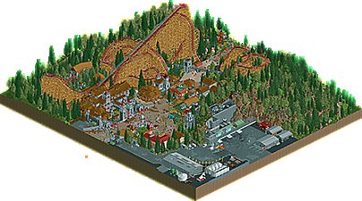
The Red God
Celtic/Irish Inspired themed area. Red, the land at the end of the rainbow. Fantastic creatures, fairies and fauna. Under the tree of life, the Druid sleeps in meditation.
Credits to SpaceK for doing the layout, general macro/landscape planning and feedback; Gustav for theming inspiration and feedback; and x7123 for the source of the layout, but also for making the RMC Hybrid Model a reality. -
No fans of this park
-
Full-Size Map
-
Download Park
202
-
Objects
1
-
Tags
![park_4230 [H2H8/8] Celtic Legends](https://www.nedesigns.com/uploads/parks/4230/aerialt3992.png)
Really enjoyed this, Ethan! I'm not sure if the architecture reads as entirely Irish to me but overall it feels so full, lively and theme park-y. Your work overflows with ideas and detail which sometimes works beautifully, like the thatch roof details, but can sometimes verge into messiness, like the overabundance of path details. With some editing and refinement it could be something really iconic.
All that being said, I'm always excited to see your work and am highly anticipating your future projects, especially those made without the time constraints of challenges!
This is kind of a lot of such a small map to dedicate to Dirty American Realism^TM but that station and rockwork is incredible.
What a delightfully weird little park. The incredibly dense custom supports, manically detailed station architecture and path garnish, overly crunched-out parking lot. With fast metal playing over the top it feels like the whole thing was cranked out in a 9 hour adderall-fueled binge and I kinda love it. It feels unfocused and doesn't really come together very well for me but the underlying skill is hard to deny
I love me some major attractions nestled among impressive landscapes. I'm not terribly familiar with the source material when it comes to the architecture, but it's certainly quite visually impressive. As Ling said, it's quite a lot to take in for such a small map, but what's there is certainly lovely. Layout is very nice and those custom supports are...well, wow.
lol this is fun. we may be actually approaching levels of just too much texture... that parking lot is a lot haha. It feels not sober
coaster is lovely though, especially those first drops which go under the path to the other side and back. Nice work and good rct all around
Cool stuff Ethan.
I loved the station roof, very well done!
Not sure if the layout fits the spirit of the contest but whatever, I enjoyed this submission a lot.
Edit: I agree there was a bit too much texture in here in general. Something a bit more calming to the eyes would be preferable for me personally.
Given where this project began, I think the end result is a great design with lots of charm. I do agree that this is kinda the odd one out of the bunch, as it wasn't an OG came-with-the-game preset (I mean, I honestly forgot this was part of that till I came to post). The overall skill level being displayed is impressive. The composition of this little area and the incredible level of detail show why you are definitely one to watch in the coming years. My only gripe at a macro level is that the backlot area seemed to kinda overwhelm the actual 'park' area. That may be because of the overall size of the design, but I think extending the park area thru the backlot might have given everything a bit more space to breathe.
Regarding the textures, I have to agree that this felt really texturally heavy. And I'm certainly not one to talk, as I've been accused of overstuffing parks in recent years. What I think could be a cause is that, as a newer player, you already have access to this wide array of tools and objects and techniques that many of us had to slowly amass over the years as they were developed. So while we had more time to process and consider how something fit into a park, you had to sort that out for everything all at once. The result is, this design has tons of rich texture and path elements and micro-level details, but together it becomes a little overwhelming (particularly on a smaller map). As you move forward, I think editing will become your best friend. You've got the details sorted, but now the challenge is to figure out how can you implement those details and compose them to be more balanced for the viewer. I'm certainly no expert, my parks are still often heavy I feel, but keeping it in mind and thinking about how you can be purposeful with the details will go a long way. I think of it as the difference between adding objects simply for the sake of crunch versus layering those objects to build depth and a more specific sense of texture.
Congrats on the release, I continue to be excited for more Ethan work.
So first thing I noticed was metal blasting out of my speakers! Call me suprised!
It is clear there is massive skill in here. Great examples are the detailing and layout. But I was a bit disappointed to see a massive backstage area. I feel this would've worked better as a full on fantasy design.
I agree with what has been said above regarding the textures. Crunch is great and all, but it seems to be texture now just for texture's sake. A balance needs to be struck and I felt it was a little overbearing in places.
That said, the station is wonderfully done, and I really like its composition with the massive gate. Also, that little patch with flowers and the little house next to the first drop is so fantastically atmospheric, it adds a lot!
Also well made use of half diagonals here. This is a good case of where they're used effectively and not as a gimmic.