Park / Skogsrå
-
 15-September 22
- Views 2,275
- Downloads 304
- Fans 2
- Comments 11
-
 73.00%(required: 65%) Design
G Force 80% Liampie 80% CoasterCreator9 75% posix 75% SSSammy 75% Xtreme97 75% bigshootergill 70% chorkiel 70% ottersalad 70% Scoop 70% Terry Inferno 70% RWE 65% 73.00% -
2 fans Fans of this park
-
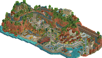
Full-Size Map
-
Download Park
304
-
Objects
1
-
Tags
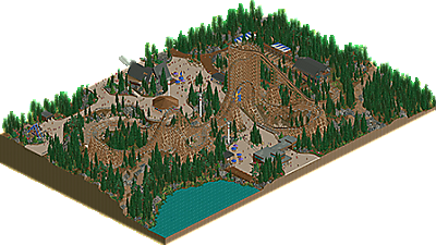
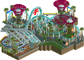
![park_4103 [H2H8 R3] E.V.I.L.](https://www.nedesigns.com/uploads/parks/4103/aerialt3847.png)
I sure do enjoy landscape heavy Scandinavian Designs. Very nice work, I think. Seems a bit experimental perhaps? The layout is nice, the architecture is nice - nothing is really particularly outstanding. All in all, very solid work from you. Leaves me excited for your other projects, I admit.
OddmentsAlchemyLab Offline
I love the architecture in this. The station structure is particularly cool with the open, angled beams. I really like the use of the thick beams on the front entrance building. The custom supports fall short for me, but the colors are forgiving and an excellent choice with the architecture style.
This is really good. Cool coaster layout, though it seems too fast to me. A lot of coasters seem to go very fast lately... Is it just me? Anyway, it looks good. The landscaping worked better in game than on screen for me, very atmospheric stuff, combined with the moody Scandinavian architecture. Yeah, this is looking so Swedish. The shapes, the materials, it's on point. Some highlights:
This architecture: effective sharp lines.
This area is so nice!
Great job on the support here. Looks intimidating.
More Swedish looking architecture.
All in all obviously not an instant classic, but it's a great addition to your parkography nonetheless! Very enjoyable.
Finally some time to open up this park. Been loving all of your past work and this is no exception.

+Atmosphere. Might feel cold, but somehow it still feels very inviting.
+Really like how the Swedish flag is perfectly visible from peep´s perspective and not from the viewer. Clever detail.
+dont think the supports are lacking anything. Top helix is supported from the inside, which is accurate, and it got the extra bulks where it needs it.
+Architecture is not complicated, but works very well. Top chairlift station in particular looks great on top of the rockwork.
+Foliage and landscaping in general is something I can learn from. You kept the amount of objects to a minimum but they work damn well together.
-Path around the triple medusa sign could have maybe had a bit more detail. There is seating nearby but a planter or IDK, something on there could have maybe helped.
-Not entirely sure about the pacing between the first two inversions. I know RMCs are fast, but that double up/bank hill/steep down seems a tad too much.
-I want to see more. Where do the paths go? What's in the rest of the park? I know this is not a negative bullet point, but I am just curious to see more
Great work Alex!
I definitely think the understated architecture and foliage is a strong point in this design, instead of holding it back.
Like a clean envelope bringing the good news.
Great job!
I kind of agree with CC9 here. I think the layout is pretty good and i also really like the architecture and landscaping. My favorite little moment in this is the ride entrance, which is compositionally very well made.
But somehow this missed anything special for me. It was clean, but maybe a bit too clean, if you know what i mean. I can definitely relate to Ulvenwood wanting to see more. I get the modernist approach, but i think you could definitely incorporate more into it.
Despite all that a solid design. Looking forward to your next work!
Thanks a lot for the comments and reviews guys.
Regarding wanting “more”, it’s certainly a fair comment as my goal here was to do almost the bare minimum. I built a layout that I liked and I just wanted to give it some nice placemaking without doing anything too strenuous or having to do too much architecture or narrative details. I just wanted to focus on what I see as the core of a 'Design': making the ride look good.
Very happy this can and did win design accolade though and hope it sets a positive precedent for others.
Very nice design. The coaster lay-out looked fun allthough I got the feeling it was actually a bit short.
Everything felt a bit to "sterile" for me. It looked like it was brand new and nobody had touched it at all. The foiliage looked a bit more lifelike but kind of the same, it all felt a bit to perfect. So that would be my tip for the next time try to make it a bit less perfect and add a bit of fun here and there.
Besides that I think the swinging ship was dragging it down a bit too, the colors looked a bit out of place and it felt a bit empty in general.
I also think a bit more interaction with the water would have been nice, something like a small waterfall from a spring in the center of the circle which is made by the coaster or something like that. It would make the water feel less like just some map filling and more like a integral piece of the whole design.
All in all a nice design and good job on it! Looking forward to your next release(s).
This is a great example of a less-celebrated (but underrated) building style I refer to as "functional realism"--every artificial structure serves a purpose, and the natural environment, serving as the backdrop, warrants no additional themeing. It celebrates exactly where it is rather than trying to create a separate world--the immersive themeing is courtesy of Mother Earth--and there is beauty in that even if it is understated. Oregon's Palisade is another Design in this category, and I had a similar mindset to yours based on your above comment, so I see where you're coming from with focusing on the core. Xophe's Canyoneer is also in this vein. None of these Designs would qualify as "dirty" or "gritty" realism; it is a related but distinctly different recreationalist offshoot.
As is requisite for functional realism, no building exists simply for the sake of existing, thus none of them seem even a little bit out of place. I prefer modern architectural styles in general, therefore I always appreciate seeing them incorporated into RCT. Keeping everything black and brown works well here to tie it altogether and allow it to blend in with the landscape just enough without actually hiding anything. Brighter colors are rightfully used sparingly, but there are certainly enough sprinkled throughout to give it that necessary hyperrealistic edge. The paths are masterfully shaped... the curves and half-diags work well in harmony to break this away from the grid, and the brick texture complements the light brown concrete perfectly. And somehow, you even managed to make broken Medusa signs look right at home outside of NCSO.
Could this have been taken further without sacrificing what you were going for? Absolutely. The landscape is realistically natural, and the coaster and its surroundings use it to their advantage, but there is more that could have been done to really make the landscape sing. We catch glimpses of the powerful rocks and dramatic cliffs, but most of the time, they are obscured by the thick wall of trees. It is, of course, set in the middle of a thick Swedish forest, but in some areas, the trees seem as though they are used to fill space rather than to create it, particularly on the side of the map with the station. The height in particular gets lost in these corners. It does not detract from the overall setting--you still absolutely nailed the forest atmosphere--but it would have elevated the macro to have created a few more large breaks between the ocean of dark forest green. For a landscape-oriented map, this sort of thing is especially important. 90% of my feedback for improvement these days is "more grass", so this comment is in no way unique to this map.
With your attention to detail, thematic prowess, and superhuman spatial abilities, I am certain that functional realism is yet another genre that you will blow out of the water and into orbit. If this is the "bare minimum", we are on the edge of our seats anticipating what the next level will look like.
The overall architecture/landscape architecture here kind of gives off like a Lloyd Wright but perhaps less "composite" in both the materials and shaping while maintaining the functionality of his kind of stuff. The buildings have such nice subtle irregularities that make them interesting form one another while staying sleak. I enjoy overall path flow a lot too, especially in relation to the elkephant in the room I had not adressed being the coaster. It is epic, the placement of it is brilliant with your composition as there are incredible sight lines for guests, from the viewer's POV nothing is being obstructed and it is nested in a gorgeous landscaping. It ticks a lot of boxes in terms of your macro but I guess that's kind of your thing huh. Really great job, I probably would've rated this higher.
this is excellent. soft and warm for sure. the layout is flowing af, and you have an eye for architecture that I'm very jealous of. in particular, the roofwork here is phenomenal. effortless for sure.