Park / Zephyr
-
 14-October 22
- Views 1,862
- Downloads 208
- Fans 0
- Comments 12
-

-
 72.00%(required: 65%) Design
ottersalad 80% In:Cities 75% Jappy 75% Terry Inferno 75% wheres_walto 75% Camcorder22 70% chorkiel 70% G Force 70% Magnus 70% Scoop 70% Xtreme97 70% RWE 65% 72.00% -
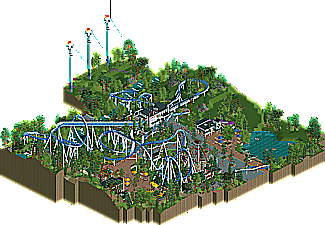
Description
A design themed to the wind.
----
Thanks to Scoop for the logo. -
No fans of this park
-
Full-Size Map
-
Download Park
208
-
Objects
1
-
Tags
cute
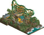
This is great! I'm really impressed with the coaster layout - it has a nice overall shape, flow and character. The ending especially is very elegant - and I tend to find this the most difficult part of coaster building.
In general I liked the unique theme and the architectural style you adopted. The only thing I'm not such a fan of is the 'warmer' coloured area - I get that this is intentional but on a small themed area like this I just prefer a consistent palette and mood.
Super clean. I think the layout is quite good. Saw someone on discord articulate my thought well.. the first drop is so deceiving in that it has large drop, but the way it hugs and swoops down the terrain is a great moment.
As always your foliage work is great too.
Lastly, the layout of the area I think was superb.. so many interaction points for peeps to see the coaster. Every bit of track is viewable from the path and kudos for that.
This trend of modern architectural styles paired with fluid layouts is one I hope continues indefinitely. Flat roofs work extremely well, and you've created lovely shapes whilst avoiding slanted roofs at all costs... there is not a single steel or tile roof on this map, and committing to that style has allowed the architecture to develop its own identity. Clean and streamlined, just like a wind turbine.
With all the B&Ms that pass through here (or blow through in this case), it is nice to see one with some fresh elements. The first drop is appropriately praised for its deceptive elevation trick--I built something similar on a Schwarzkopf in one of my unfinished parks earlier this year, and it translates just as well on a beemer. This is a true terrain coaster, and though it would look just as nice on a flat surface, it would certainly not be as exciting as it is now.
The only change I would make on this map would be to invert the blade configuration on the middle turbine so that it it would create the illusion of past motion. Regardless, they are still the best non-rotating wind turbines I can recall seeing in RCT.
Like Otter said, the design it's super clean. What's nice is there is enough life to prevent it from tipping over into sterile. The compass-like path patterns, invisible sign details, and excellent foliage breathe life into it all.
I like the take on modern architecture. I also want to note the perfect pacing of Zephyr. There is zero wasted speed or track. The same can really be said for the map layout as well. Efficient is the word that comes to mind.
Nitpicks: Wind turbines are too close to one another. Lack of transfer-track / maintenance area in an otherwise realistic design.
A lovely park, super clean and enjoyable to view throughout. I think this achieves exactly what you intended
Fun design! The naming after different winds and weather phenomenons is very clever.
Layout is great, love the sort of retro 80's modern archy you used. Also again very typical you. I think you now must be the NE member with the most amound of windmills in your parks as well. There's a trivia for an NE pop quizz....
Very pleasant, clean and well done design. Love the modern architecture and nature setting/theme.
I'm glad you appreciated how clean it was. See this as a response to all the 'crunch' we are seeing lately.
A really lovely release, and a very good clean atmosphere. Some of the touches you've added are really njce, and the shapes of architecture are pretty cool. Great release here Faas.
I know you dont always like it when people call your work cute but i guess its the best describtion for this design and it was the adjective i had in my mind all the time when viewing this. I also agree with others that i liked the crunchless approach.
I also am a huge fan of the wind turbines. Want to include some in my personal project now
this is such a classic NEDesigns NE design. reminds me of that mid 2000s era of like firebird and whatever bullshit steve was doing. layout is superb, great interactions, and the modern style archi is pretty knockout. good shit fab