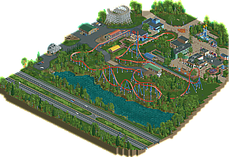
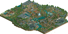
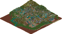
Park / Superman: Final Flight
-
 18-February 23
- Views 2,082
- Downloads 230
- Fans 2
- Comments 11
-
 72.00%(required: 65%) Design
CedarPoint6 80% CoasterCreator9 75% Liampie 75% SSSammy 75% Terry Inferno 75% wheres_walto 75% Xtreme97 75% G Force 70% posix 70% ottersalad 65% RWE 65% Scoop 65% 72.00% -
Description
This Intamin multi-launch rollercoaster is the standout attraction at this northeastern Six Flags park.
Note: Many of the interiors are built out. Cut-away view is your friend. -
2 fans Fans of this park
-
Full-Size Map
-
Download Park
230
-
Objects
1
-
Tags
Similar Parks
-
Charybdis and Scylla
-
Mato
-
Batman Gotham City Escape
-
DisneyEarth Vancouver
-
Arrowhead Creek (unfinished)
Congrats on getting this done! Really lovely layout and overall feels very lived in and realistic. Path textures are top notch - honestly loved the blocky path and the gravel trimmed service roads. Layout is very nice too.
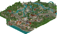
Really solid work here! This feels like one of the better realistic designs we've seen recently, down to the little details from cubbies and row-designated railings inside the station to uncovered awnings in the overflow queue (highly recommend cutaway view to everyone to get a little more realism into this park). The layout is really good, especially that dive loop and hill next to the river: that provides such a great view from the interstate. Oh, and the barrel roll over the queue provides that great exciting feeling before a coaster. The interaction with everything around it is phenomenal. After the corkscrew, it does seem to meander back with no real purpose, except to return to the station. I think another element instead of a few bunny hills would've helped.
The rest of the design feels like gold-level work. Architecture and foliage are excellent for realism. Everything feels very grounded in a polished Six Flags style, as if this was recently opened so it still has a nice shiny, new look to it in a sea of normal Six Flags-y environment. That's a long way of saying that you nailed the atmosphere. I especially like the gift shop and arcade. Only complaint is that I feel like the view of the launch and top hat feels wasted by placing a picnic area next to it. Compared to the rest of the snippet from the park, that part feels underwhelming.
Overall, I loved it! I'll definitely be coming back to this to scratch a Six Flags itch. Congrats on a phenomenal submission!
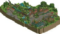
This was really nice! Included all the elements you'd like to see in something like this, bits of surroundings, portion of a park, supporting rides, even a little hint at other things off the map. Definitely seems like you took some great care in the details and all the content in the park, so I really enjoyed looking around the little bits that where here, definitely would like to see more of this park!
For me the coaster was solid but not extraordinary, layout was good but a bit bland for a stand alone design, and I kinda wish there was a little more theming around the layout itself. I'm not quite as familiar with these style coasters as others, but some of the infrastructure and backstage of the ride seemed a little undercooked compared to the level of the rest of the park which was a little disappointing.
Overall, a very nice slice of parkmaking, you've really begun to develop your own style and hopefully this is just a taste of more things to come. As a design it's maybe a little lacking but for me it's still deserving of a 65%+
This seems quite accurate to Six Flags, it has the right atmosphere. A nice coaster layout, I especially like the elements next to the lake. Texture work, pathing and small details (Like everything around the queue) are all solid. And there's a arcade interior, which is pretty cool.
Before I read the other reviews, I had initially thought that this was a recreation of an existing coaster. That alone should speak to the quality of realism you've reached with this.
In addition to the coaster itself, all of these buildings could be straight out of a Six Flags park. The Daily Planet gift shop is the architectural high point, but in each structure, you've successfully captured the subtleties of mainstream American theme park themeing without forcing anything to be over-the-top or difficult to believe within the context of the setting. The shed near Comet looks to be strongly influenced by the backstage buildings in Louis's Scream recreation, which actually works if you're selling the idea that the two coasters exist in the same Six Flags universe. The building interiors are lovely, and I only wish you had allowed yourself the time to flesh out the Johnny Rockets interior as well, as I know it would have been just as marvelous as that of the arcade and the gift shop. The backstage behind it is one of my favorite gritty realism backstage areas I've seen thus far!
The way you put the trees and grass together is both realistic and picturesque, as you've provided ample amounts of mowed grass to offset the diverse collection of taller foliage. The one way you could have pushed it further would be by adding a few more wildflowers, maybe some more/different yellow ones near the coaster to provide that missing yellow element that is swapped out for brown on the track itself. The light blue ones complement the seas of green around them, and it's a nice subtle touch. Overall, a nice combination of overgrown and regularly manicured.
The strength of your realistic parkmaking abilities shines through with this build, and I believe it will really shine brightly when applied to a full park format. We are due for another hyperrealistic Six Flags build, whether it be a recreation or one that's entirely fictitious, so if you are the one to provide us with the next one (that isn't NCSO and set in Las Vegas), I know we are in for something very special. As someone who is currently building a Six Flags park, I will be returning to this for a greater understanding of the details present in such environments.
This was lovely. Enjoyed the unusual path choice and the crunch everywhere. The architecture was well done and includes a lot of nice details. I think one can really see a lot of improvement from you here.
I agree with G Force about the coaster. Its definitely a good coaster, but ironically apart from the halfpipe it probably was the part of this that got the least attention from me. Wished you would have done more with the actual coaster area and probably also played more with the viewpoints between the coaster area and the actual park. That little area with the benches and tables next to the launch felt nice, but probably a bit weak compared to the rest of the park.
All in all a solid design and a very nice release showing some promising improvement. Looking forward to your future stuff!
Loved this. Your level of execution for everything around you map is very impressive. Care, attention and thought has gone into everything you've placed on the map.
Coming from a semi-realism perspective, I found the coaster awesome, slightly slow in some places but I know i'm the minority here.
I would be very excited to see a full scale park from you, it feels like you've built this in no time, and you'd easily bag spotlight with the level you're building at.
I really enjoyed this ACE, thank you.
Edit: Voted 80%
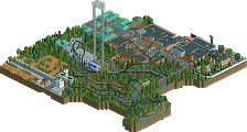
Really great design! The atmosphere is probably the best part for me, enhanced by the foliage, ground textures, interiors, and general park layout. The attention to detail is obvious, and all of the elements come together really well. The games and micro elements are really incredible as well and really help bring the park to life.
The one thing a bit lacking for me is the architecture. The forms are great, but there's too much of the deco block texture for my taste. It tends to cause the different features of each building to blend together a bit and not stand out as much.
All in all, well done and congrats on the accolade!
its funny to imagine six flags building a ride this good today lol. i particularly love the architecture and shop detailing at the top of the map---very good, small scale detail realism. reminds me of six flags america or something maybe
Congratulations on design, and (WTF) your first accolade. It scored 72% but it reeks of 85%+, you just need to make it bigger and less mundane, though the mundane ugliness is fitting here. Suits the SF setting. An example: the entrance building is quite nice looking from the front side. Peeps in the queue are in for a rude awakening when they exit on the back side, which is were SF's theming budget stopped. I'm surprised they managed to mow the grass. Sheds, awkwardly placed queue, endless grass that quickly turns to mud.
Anyway, this map is pretty much perfect on a technical level, you've got a really pleasant style that is detailed yet clean, much like G Force and wheres_walto. Not overly crunchy. Can't wait to see more.
Bump
Honestly, surprised this didn't score a bit higher, I thought this was easily 75%+ work throughout, higher in some places. I can understand why some people might say this felt 'mundane' but it was correct for the theme and intent of the design. I really enjoyed the coaster, great layout with excellent support and track work. The buildings were perhaps boxy, but that felt correct for the style and setting of a six flags park. I don't think this design lacks for content, unless you limit the concept of content to exclusively 'park stuff.' When you take into consideration the highway, the landscaping, the back of house, there is plenty to see and explore here that I think more than provides context for the ride.
I do agree that there maybe have been some texture choices that could have improved this. Particularly the abundance of arc deco texture and personally I'm not a huge fan of the color/texture of the pathway you used. But, for me, those are minor compared to some of the great details and soft crunchy elements that really breathe life into this for me. Excited to see what you do next, would definitely love to see a larger release in this style, or you playing with more uniquely themed work.
Congrats on the design!