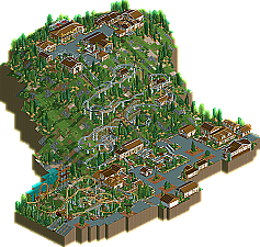
Park / Alpelynia

14 Comments

  • posix%s's Photo


    Alpelynia Logo
    (click logo to go to page)


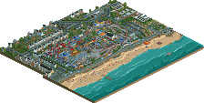
    Since joining New Element in early 2007, DelLagos has proven to be quite the parkmaking force. With his unique style that is a hit-or-miss with most people, he has managed to earn two NE Designs with Toxicity and Yggadrasil. DelLagos also boasts quite a few "Honorable Mentions" as well as what seems to be an innumerable amount of projects in the Ad District. He has been advertising one project in particular over the past few months, one that has finally culminated as DelLagos’ third NE Design Alpelynia.

  • Gwazi%s's Photo
    i would think this would be a park, with two coasters and all, but not my decision.

    i must say, though, that this is the first work from you i've really liked. i haven't downloaded it yet, but i'll be sure to.
  • ][ntamin22%s's Photo
    wait, this is a design how?

    Edited by ][ntamin22, 18 December 2008 - 07:21 PM.

  • nin%s's Photo
    One main coaster, then a smaller one...

    Props to the logo-maker, it's fantastic. About the ride itself, well, i thought it was great. I thought that the theme was pulled off very well, nice surroundings, etc. I'm still waiting for a solo from you, I adore your style, it'd look great if it was applied to an entire park. ;).
  • Brent%s's Photo
    Don't really get the custom made supports for the skyway, since they'd essentially interfere with the wheels as the cars would pass under them. There's no way around it...


    But the coasters were fun (to look at.... meh)
  • CoasterForce%s's Photo
    eh. there are so many mediocre designs flowing in now that the accolade loses its value. sure, it's fine, but to post such small parks on NE, it's not worth it unless the quality more than makes up for the quantity. what happened to spending a long period of time to produce quality designs that can hold your attention for more than two minutes - arch angel, fire dragon, musette?

    ugh.
  • Fisch%s's Photo
    I see a major problem in the architecture in this park. The buildings look nice from the structure but they are neither realistic nor detailed to a good point. They are overdetailed. The problem that I have with the realism is that (I have no idea how this kind of buildings is called in English but in German it's called "Fachwerk") Fachwerk-houses do not randomly have these would poles everywhere over the wall. They are needed as supports for the buildings and to hold the structure up. So what you really would need would be a kind of a wooden square for every floor on each side of the building and a wooden square around windows and doors. But this looks as if it was just randomly placed what it probably actually was and there is by far too much of the wood. I know that you could also consider it realistic because it's just meant to be for the looks but in this case I just don't agree with that. The overuse of the wood bothers me. The layouts of the coasters are well done besides that one part in the lifthill of the grey coaster where it gets steep. I really don't like that. Just leave it how it is. I'm glad that you put that chairlift in as people suggested but I wouldn't make the chairlift the only possibility to get up there. What if there was something wrong with the chairlift? The visitors would have to stay on the hill until the chairlift is fixed. Also I don't like the supports for the chairlift. You should have just modified the old ones a little bit but as said before these ones would actually stop the chairlift from working and it just doesn't look very realistic because normally you don't see too many chairlifts that have supports without changing the vertical angle and that is what is happening here. I mean it happens but only if there is an incredibly long piece of unsupported chairlifttrack and that usually has to be a bit longer than this. All in all this area is well done though with two solid coasters. It's a nice design and I'd say that this is worth giving it the design status! Congratulations mate!

    Edited by Fisch, 18 December 2008 - 09:39 PM.

  • Katapultable%s's Photo
    Congratulations DelLagos! I like your alternative on the bobsled rollercoaster. As with the Euro-Fighter. Your the first to not only use the B&M track. I also like the huge elevation difference. And the look and atmosphere of the entire design really brings me back. Awesome design, reminds me of the great times I had in Austria! Keep it up!
  • Midnight Aurora%s's Photo
    http://forums.nedesi...w...=19063&st=0


    "Definition: A spotlight submission roughly follows a park creation concept, no matter what style of building is applied."

    This submission is only one themed area and does not have any park entrance/exit area. I think it can be assumed and argued that this is one chunk of a larger park.

    "Definition: A design submission follows the concept of a coaster design. Or, it's a coaster cut out of a full park with its surroundings (those may include flat rides, restaurants, shops, etc...)"

    Looks like this definition fits quite a bit better to me.
  • CedarPoint6%s's Photo
    No matter what it falls under, I thought it was a very nice map. I'll be honest in that I've never been a huge fan of your work. But this one is different. Sure, the buildings are over-detailed. But for all it's worth-- they look cool... especially those down at the bottom. My main complaints before were layouts which just didn't work whatsoever. But these are a lot better. The alpine slide is pretty darn convincing with the hacking and fences and all that. It's always hard to make a Eurofighter look nice with that ugly thick B&M track, but I think you've done a pretty good job. I think I would've one floorless just to not have that thing in the front. But either way, it all comes together pretty well and it's pretty apparent you're improving. Nice job.
  • Milo%s's Photo
    the main issue with this is that both coasters have equal standing and one doesn't really stand out as the actual Design layout. I thought this was a step up from your past work though and showed improvement in many aspects of the game which is good to see. I enjoyed the unique coaster choices and it was fun to look around.

    Congrats on the Design and I hope to see another project from you soon.
  • Xcoaster%s's Photo
    My favorite thing about this entry was the focus on the landscaping as the most interesting feature of the map, particularly being able to look down from the top of the hill all the way to the bottom.
  • RRP%s's Photo
    Congrats on the design.A definate improvment over your previous submissions.I did enjoy most of this entry however i think the fact that i'd seen just about everything in screens spoiled it for me.There were also numerous things that irritated me such as the overly glitchy bobsled track which wasn't helped by having 2 different colour tracks,the steep part of the bobsled lift,the over use of fences and general over detailing.I did really like being able to look down the mountain as Xcoaster also pointed out and the general idea behind the design.Nice to see someone trying something a little different
  • eyeamthu1%s's Photo
    This was one of those 'almost' designs for me... it was 'almost' great, but it didn't quite do it for me, and I don't really know why. I really liked the concept and the excellent use of landscaping - it was a really interesting map to look at, and definitely different from the norm.

    I think something that really detracted from the Design was the fact that there were 2 main coasters on the map. There's been a bit of discussion about this already - Milo touched on it. Ok, it's clear that the Bobsled/Alpine Slide is meant to be THE design, but I think the Eurofighter is actually the much better, more prominent and better executed ride. I loved the Eurofighter; thought it had a nice layout and other than being a bit slow at the end, had perfect pacing. However, the fact that it was good actually took something away from the Bobsled, which wasn't as well executed IMO.

    I'm trying to put my thoughts into words here (and struggling): the fact that the smaller coaster (the Eurofighter) is actually the better coaster, detracts from the appeal of the main coaster (the Bobsled) - the one you are actually submitting as THE design. Get me?

    The Bobsled was just... I dunno if you could have pulled it off much better in RCT - I'm not sure - but there were just some things I didn't dig with it. The lift-hill, with the kink (the random steep bit).. I really hated. It just seems to show a lack of care with planning the design/layout. (I think the chairlift had a similar kink too.) I thought the cars picked up way too much speed by the end of the ride - I imagined the ride to be quite dangerous for the rider. Glitches were an issue - again, perhaps tricky to avoid and not your fault, but they didn't help things.

    I liked the archy and atmosphere - it never entered my mind that it was over-detailed. Thought it conveyed the theme quite nicely, without ever being too imposing.

    I'm a big fan of parks/designs having 'write-ups' - some context to the park/ride and the designer's thoughts when they built the thing in RCT (that's why I included a massive brochure with my Magic Realms park - it hopefully explains why I made some of my design choices when I built the park). Often, it's not needed. Here, I actually would have really liked some sort of 'context' to the park - some background - is this part of a bigger theme park? Or is this meant to be like the traditional, generally stand-alone Alpine Slides? etc. etc.

    So yeh - all in all - I thought it was good, but maybe not great. Really nice to see a very different map, with great landscaping, and as mentioned, some unique coaster choices... but for one reason or another, it didn't quite capture me as I hoped it would.
  • Cocoa%s's Photo
    This would have worked much better as a CC or bronze/silver or something but not design. There wasn't even a coaster named Alpenyia.

    The landscaping was nice though and so was the architecture although it was a little similar and boring. The main problem was that it didn't hold my attention for very long.