Screenshot / Dropzone II
-
 18-July 14
- Views 2,081
- Fans 0
- Comments 11
-
Description
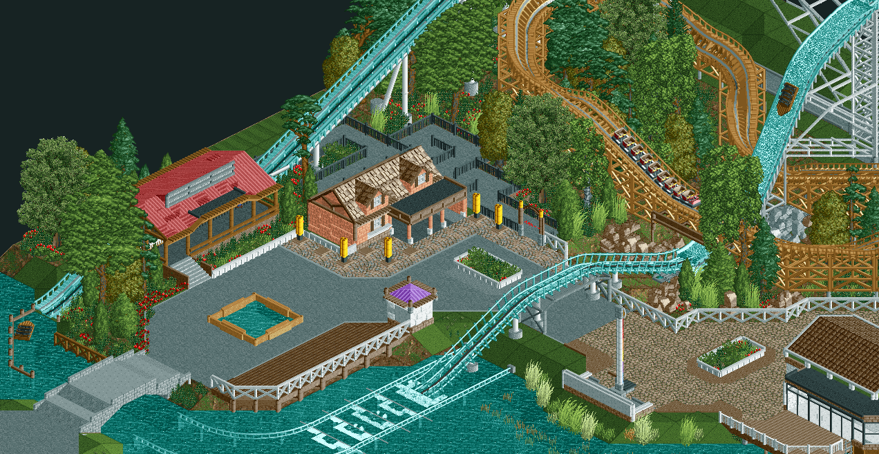
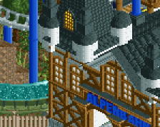
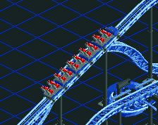
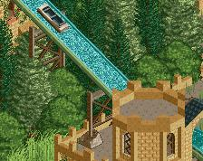
i'm going to make some major changes in the other areas, but in this area i'm pretty happy how it is now. for those wondering what the grey lines are, that is a special braking system made by the park to slow the boats down enough to get them to comfortably make the turn into the nearby body of water into the station. (no let's not mention about it, shhh... accept it... sshhh...)
as for the setting of this park, the park is in a forest nearby maastricht. this location is very central in europe with large cities nearby to allow for a thriving theme park. also it location nearby the maas allows for easy access to water -
Full-Size
-
No fans of this screenshot
-
Tags
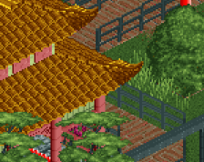
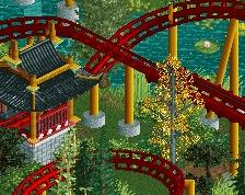
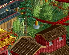
The umbrellas are one unit too tall. Structures are great but I'm not sure I like the glitching red roofs.
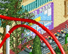
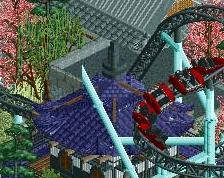
fences and bridge need some love, also the switch in the cdrop to different track is stupid tbh, it's either an all track drop or an all splash drop... you're using the right trach though for this but try to add another layer under it, like bobsled or in this case with the steep parts dingy track or even woody to make it look better and more so a little thicker...
@Ling : i adjusted the umbrellas, i personally like the glitched roof though, it makes it look imperfect which sometimes is exactly what's needed. i might make it less glitched though
@BelgianGuy: what would you suggest i do with the fences? i tried to stay away from the fences i always use and i think it turned out better than it was before, but ofcourse making them even better would be great. as for the coaster i can always make it an all track drop, but in the ride i used for inspiration it was done the same as it is right now
It's a shame this is so close to the map edge. Would love to see you expand on this.
Intrigued to see the support work on that
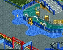
i still think the splash area is too short, the photo looks better then the rct2 work
the fences have something uninspired about them, try looking at themed stuff... I suggest this is a viking theme coming from the inspiration for this is wodan... try using a more stick-ish fence, something that was hashed together by the people who built it, it's too organised in a way for this
Agreed (this was before Wodan)
@csw: honestly i'm not that bothered by it, making a gold course there or just a normal grass wild surrounded by thick foliage would've been nice though, but i can make that elsewhere in the park
@ that guy, just look at park edda , they pretty much have the same support structure that i'm going for.
@ BG: i'll see what i can do about the fences, i'm not sure about making it a viking area though, park edda did that and i don't want my park to look like edda too much as it already has the same interaction between the woodie and watercoaster
@ zxbiohazardzx & Version !: you guys get what you want
i would make the small hill after the drop smaller if it weren't for the bridge, but i like it better that way. splashzone is now 3 tiles longer.
This is a really lovely setting. Great interaction.
Excellent... that's a million times better.