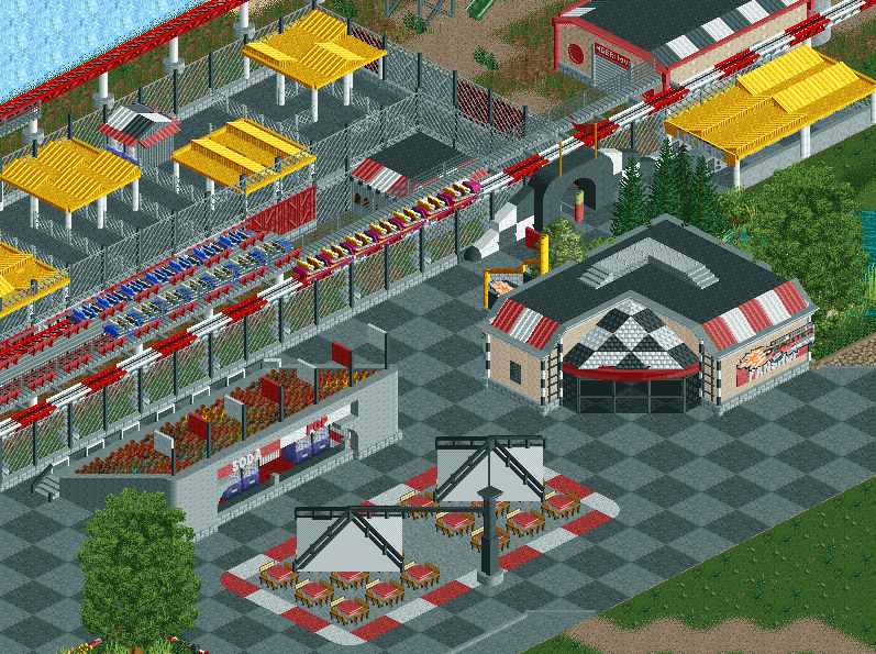
Screenshot / Top Thrill Area
-
 21-July 14
-
Fred's Ultimate Coaster Kingdom
-
5 of 36
- Views 2,639
- Fans 0
- Comments 17
-
Description
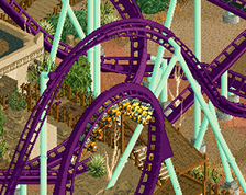
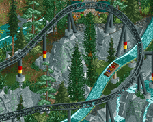
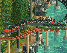
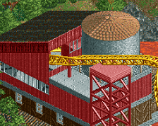
In the race for pure adrenaline thrills, there is one winner: Top Thrill Dragster. Nothing else compares to this high-horsepower shot into the sky. From a standing start you’re launched forward, then straight up, then straight down and back to the finish line. The ride may be over in 17 seconds, but it’ll stay with you forever.
-
Full-Size
-
No fans of this screenshot
-
Tags
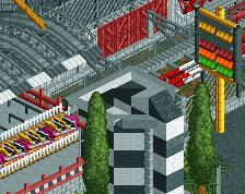
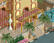
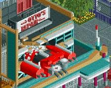
Chaotic, but I think it works. It got a unique atmosphere too, which is a great achievement for such a relatively generic area. I got a few suggestions to make it better.
- Maybe use another texture for the yellow roofs, I assume it's supposed to be a different material than the actual roofs in the area
- I don't like the soda pop sign as it is. Delete the concrete arches underneath or make the concrete frame the sign complete. It's weird how it just stops.
- Maybe give the parasols each their own support, this one looks out of balance a bit too much.
- Black+white/red roofs for the vending machines in the queue is a bit too much. Pick one colour scheme (I'd go with a single colour here, so probably red).
This has a lot of potential, but I think you over-patterned this area. You need to find a better balance in this chaos.
Why not just make a recreation?
This is a good suggestion.
I'm not going for a recreation, I find it way more fun to build freely than getting every detail right so it looks like the real one
Can't move the shop too far to the right or I have way too much path... Maybe I can move it 2 or 3 tiles so at least the entrance statue is more visible.
RCTER2 Offline
lol build a cookie shop and name it oreo
the way it looks here is honestly better than the real-life version lol:P good work!
^ ha, I completely disagree, no offense to Fredd. But if Fredd gets more enjoyment out of the game by not wanting to make a recreation, can't really argue with that.
How it looks like after some retouches:
That made a huge difference. Much better.
tdub96 Offline
"FUCK07.jpg" is looking pretty good, I really love the gift shop.
Very rough on my eyes.