Screenshot / Park Entrance
-
 13-September 14
- Views 1,475
- Fans 0
- Comments 8
-
Description
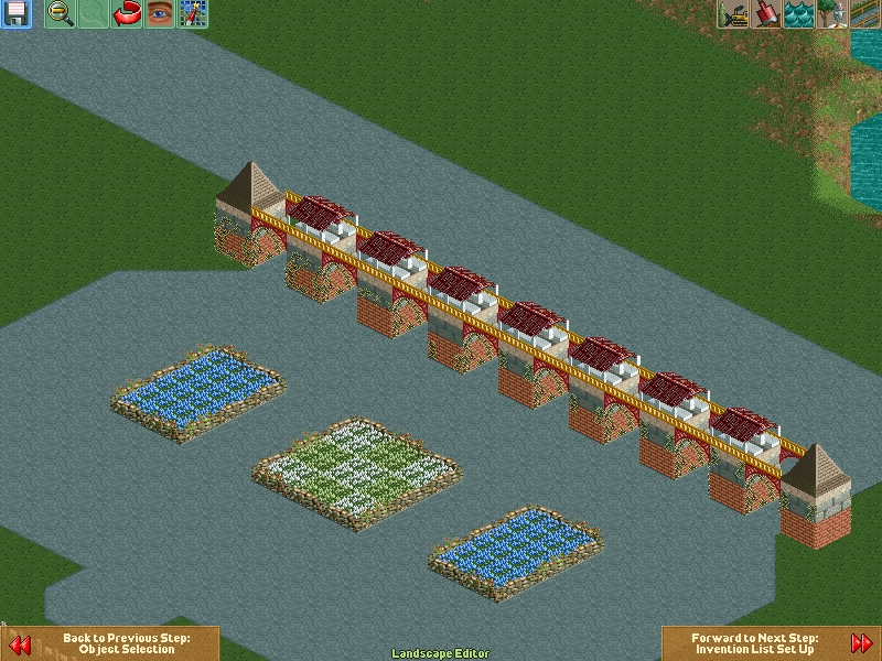
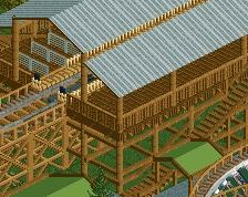
Beginning of a new park entrance. I plan on adding buildings to the solid green area behind the entrance. The whole idea of this park is that it's a small family-owned park in a wooded area. No real flashy rides nor buildings. The main focus of the park is going to be how the rides and paths interact with the landscape.
-
Full-Size
-
No fans of this screenshot
-
Tags
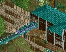
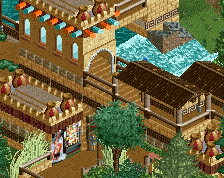
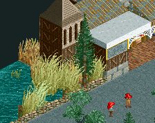
First off, SO MUCH PAVEMENT, its gonna drain the park to have so much flat grey. The forms aren't bad, could use a bit of differentiation. Main problem with ur main structure is there are too many textures. You have a brick wall, a stone wall, a stucco wall, a wooden roof, and vines. You gotta determine a style or look from your theme (maybe more wooden, back country look) and match textures to a single, cohesive look. I usually start with the basic form of the walls, then add further details like different textures, ornamentation, foliage effects, windows, doors.
Alright I see what you mean. I'll try and get a good cohesive look to it. Thanks!
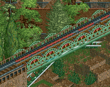
Is this still too much?
imo it lack some landscapeing, but you have improved
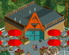
It's movement in the right direction. Try to think through these buildings. What are their uses, their purpose. Are they ticket booths, or just a built "gateway" to the park. Do they have interiors, or are they just solid.
Also helps to think through their construction. Would an architect plan a building with 5 feet of bricks, then 5 more feet of wooden wall? would it make more sense they either the whole wall be wooden, or whole wall be brick? Or if there is both, it might be a 1 foot brick base to support the wooden walls, or a clear break between first and second stories where the brick changes to a wooden structure.
In all honesty, i'm given you some really advanced concepts, the kind of things Robbie92 thinks through, but learning these things from the beginning helps. Knowing what ur building is, what its supposed to look like in your head, this helps you match textures and colors to make it in the game.
FK
The second screen is definitely better imo, but the building lacks purpose, or is at least too wide for a decorative structure. For a small family park, I think a single modest entrance arch or building would be more suitable. I also think there's a few too many textures on this structure, with no definitive style. If you focussed on one material/texture as the basis, with perhaps stone or brick as footers as FK said, I think this will give your buildings a more refined look.
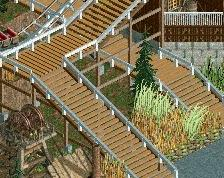
The flowers and stone walls are a nice touch though, and are very in-keeping with the low budget decoration that a family park would have. I'd like to see more of these dotted around the park, occasionally asymmetric, to break up large sections of path or otherwise as gardens in front of buildings.
Keep experimenting!
Try to remember that perfectly symmetric isn't always the most inviting and atmospherical way of building.