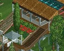
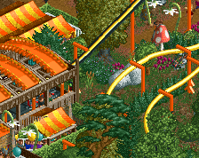
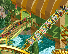
Whow, vey nice! I love the "interaction" with the station, very nicely done. The colour of the coaster pops out nicely and there's a lot of stuff going on at the queue, very lively and everything. There are however a few corner bricks missing at a few spots, you should fix that. Also i don't like the path block you used, it looks very metallic and seeing as this is more of a castle themed coaster, it doesn't fit. Maybe try some wood for the queue. There's also a LOT of brown, but i can definitely excuse that because besides that, it's an awesome screen!
I like the blue personally, would be nice if the name of the coaster contrasted with the colours a little. There are some lovely touches here such as the netting under the station roof, the height marker, and what I interpret to be a queue line TV.
Not sure I completely agree with the almost overuse of the corrugated steel roofing, especially with it all being the same colour and not really portraying the castle theme of the station. On the station; the base seems quite blocky and a little boring as it just uses the stone block texture. I would like to see some integration of the normal brick texture (as you used on the pillars on the side) and perhaps even some ruins at the bottom. Just to make it more interesting to look at; at the moment it's basically a giant box underneath the station.
The entrance to the queue could be a little more grand as well. It's currently hidden under the red roof and that's not really great for viewers. I'd consider being a little more consistent with the queue line path as well; not sure I like the alternating textures.
Overall, great screen but just needs a little refinement.
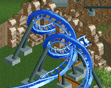
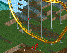
I somehow like the pathing, it looks cool. But I think it will be benificial for the flow of the coaster if the twist after the half loop went the other way.
But it's a really cool screen, well done!
Stoksy: Yeah I agree about the roofs somewhat. I might tinker a bit to cut down on the big expanses of roof. I definitely have some finishing touches to do on the station too. I do think I'll go back and work on the queue entrance some more though, it was pretty quickly conceived.
posix: I'm super glad you noticed the inspiration. While building I keep telling myself to think macro, like you said. It's been going well so far!
Faas: I made it go in this way on purpose because B&M immelmans always twist less than 180 degrees in the direction that they exit. RCT makes it look a little weird but I prefer this way for accuracy.
This is really good, man! Unlikely colours (red and blue and green), but they work. Cool interactions. Interesting textures. Natural diagonals. I love the blue flowers on the right. Is that a tv screen in the queue? Fucking brilliant.
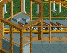
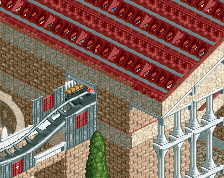
Room for improvement: - Maybe make the track rails dark blue. Making the rails one shade darker than the backbone often looks better. - The small building near the exit is a mess of glitches and textures. - The tower looks too light. I'd go with something heavy, for some contrast with the lighter roof structures. - The flat texture in the station doesn't look very good. Too dark and too glitchy. Can't you go with the same pattern as the queue?
The first thing that jumped out to me is the queue TV. I absolutely love that... great idea. I actually love the queue as a whole... it has kind of a Kumba vibe to it (the coaster not the player).
Liam: Thanks a bunch, you pretty much hit all of my favorite parts as well, haha. Yeah it's a flat screen TV but idk why everyone is so impressed by it? It's just 2 diagonal wall pieces and 4 corner posts...lol.
I'll try out the darker rails. The exit building (On-ride photo shop) does look pretty bad from this angle, I think I need to change the object from wall to building block. I built the station before the queue so I didn't even think to do go back and redo it until you mentioned it! The tower is the only thing I don't know what to do with. I've rebuilt it twice and it won't turn out how I'm seeing it haha. I'll give it another shot though!
Coasterbill: thanks for the comments! I can definitely see the Kumba vibe, I'm pretty sure the corrugated roofs came from it? Anyways, besides the Busch Gardens influence in my building, it wasn't intentional.
Chocotopian: Yeah I stumbled across those flowers in the dat previewer, and I was like, "THANK YOU, A FLOWERS WITH A BUSH UNDERNEATH!!!" I have no idea where they came from lol.
Things are progressing with this project! Some of it is rather uninspired, but I'm having a lot of fun and I'm just trying to focus on finishing something for once.
 13-September 14
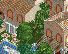
i love it, very clean and natural
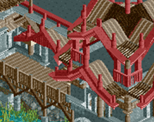
That's actually a really cool element. I too love it.
Whow, vey nice! I love the "interaction" with the station, very nicely done. The colour of the coaster pops out nicely and there's a lot of stuff going on at the queue, very lively and everything. There are however a few corner bricks missing at a few spots, you should fix that. Also i don't like the path block you used, it looks very metallic and seeing as this is more of a castle themed coaster, it doesn't fit. Maybe try some wood for the queue. There's also a LOT of brown, but i can definitely excuse that because besides that, it's an awesome screen!
I love the paths. They're fresh, but still look natural and organic.
So many screens titled "Entrance" or "Station"...I can't keep them all straight
I like the blue personally, would be nice if the name of the coaster contrasted with the colours a little. There are some lovely touches here such as the netting under the station roof, the height marker, and what I interpret to be a queue line TV.
Not sure I completely agree with the almost overuse of the corrugated steel roofing, especially with it all being the same colour and not really portraying the castle theme of the station. On the station; the base seems quite blocky and a little boring as it just uses the stone block texture. I would like to see some integration of the normal brick texture (as you used on the pillars on the side) and perhaps even some ruins at the bottom. Just to make it more interesting to look at; at the moment it's basically a giant box underneath the station.
The entrance to the queue could be a little more grand as well. It's currently hidden under the red roof and that's not really great for viewers. I'd consider being a little more consistent with the queue line path as well; not sure I like the alternating textures.
Overall, great screen but just needs a little refinement.
Wonderful. What gdb said: clean and natural. Reminds me of slob. Hoping to see more.
I somehow like the pathing, it looks cool. But I think it will be benificial for the flow of the coaster if the twist after the half loop went the other way.
But it's a really cool screen, well done!
Thanks for the comments everyone!
Stoksy: Yeah I agree about the roofs somewhat. I might tinker a bit to cut down on the big expanses of roof. I definitely have some finishing touches to do on the station too. I do think I'll go back and work on the queue entrance some more though, it was pretty quickly conceived.
posix: I'm super glad you noticed the inspiration. While building I keep telling myself to think macro, like you said. It's been going well so far!
Faas: I made it go in this way on purpose because B&M immelmans always twist less than 180 degrees in the direction that they exit. RCT makes it look a little weird but I prefer this way for accuracy.
Room for improvement:
- Maybe make the track rails dark blue. Making the rails one shade darker than the backbone often looks better.
- The small building near the exit is a mess of glitches and textures.
- The tower looks too light. I'd go with something heavy, for some contrast with the lighter roof structures.
- The flat texture in the station doesn't look very good. Too dark and too glitchy. Can't you go with the same pattern as the queue?
The first thing that jumped out to me is the queue TV. I absolutely love that... great idea. I actually love the queue as a whole... it has kind of a Kumba vibe to it (the coaster not the player).
Very nice work!
Beautiful coaster interaction, and neat little details all over. I like those blue flowers too
Liam: Thanks a bunch, you pretty much hit all of my favorite parts as well, haha. Yeah it's a flat screen TV but idk why everyone is so impressed by it? It's just 2 diagonal wall pieces and 4 corner posts...lol.
I'll try out the darker rails. The exit building (On-ride photo shop) does look pretty bad from this angle, I think I need to change the object from wall to building block. I built the station before the queue so I didn't even think to do go back and redo it until you mentioned it! The tower is the only thing I don't know what to do with. I've rebuilt it twice and it won't turn out how I'm seeing it haha. I'll give it another shot though!
Coasterbill: thanks for the comments! I can definitely see the Kumba vibe, I'm pretty sure the corrugated roofs came from it? Anyways, besides the Busch Gardens influence in my building, it wasn't intentional.
Chocotopian: Yeah I stumbled across those flowers in the dat previewer, and I was like, "THANK YOU, A FLOWERS WITH A BUSH UNDERNEATH!!!" I have no idea where they came from lol.