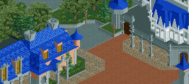
Screenshot / Castle Couture
-
 24-September 14
-
Disneyland
-
13 of 18
- Views 1,561
- Fans 1
- Comments 4
-
Description
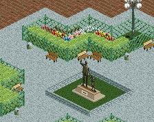
With everything you need to turn your own home into a castle fit for royalty, Castle Couture is a must for those exploring Fantasyland.
Remember all purchases can be held and picked up at Main Street U.S.A. Town Hall within two hours of making the purchase. -
Full-Size
-
1 fan Fans of this screenshot
-
Tags
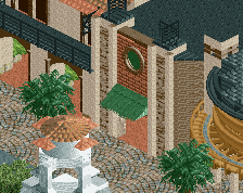
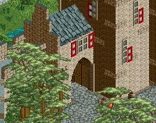
This is a pretty good screen but some things are holding it back for me.
Things I don't like:
- The number of roof textures on the left building. It looks a bit cluttered and the blue is a bit overpowering with this many textures.
- The white part of the structure on the right building. I can't put my finger on whether it's the color or the construction, but it looks a bit "plopped" on top right now. Maybe I need to see the rest of the building to get it.
Things I like:
- The path is quite pleasing and well designed.
- Those wooden castle doors, great touch.
- The dormers on the left side of the left building.
Keep it up, it's looking nice!
Hmmmmm, nice start to a castle you have there.
It is a bit simple, and I agree with Hepta how the white doesn't quite work just et (I don't think it worked well on mine either, and was the main issue I had with the thing).
I don't know how this bit is laid out, but it may be better aesthetically to connect the castle to some other facades, a la Disneyland, just to blend those awkward areas into other buildings to disguise them. I don't know, maybe it's a bit late to do something that drastic.
I'd love to look at the park though and give more thoughts and whatnot, but that's on your discretion, of course. I'm still trying to shake off the Disney itch but I can say I learned quite a bit being there for so long.
As Liam said, this is just far too sterile and lifeless. It's a problem I have with a lot of Disney work, because the detail it takes on such a massive scale means that you can't really include the details that bring it to life.
It also looks as though you're trying to build Nin's Disney, not your own. And also, blue is not a texture, so having 5 different roof textures on the building to the left is just messy.
It's not an awful start, but it could be done much much better, and your previous screens are leagues above this I feel.