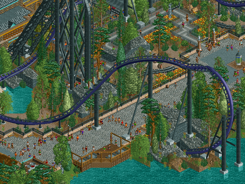
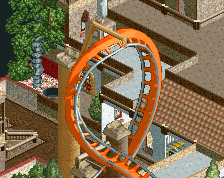
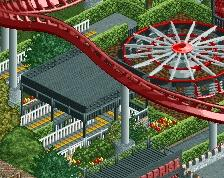
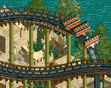
i prefer this screen more, but again feels a little dead. nice innelmann integration with the path but it's still enclosed in a bad way
lightening up the colors a bit may help, but i'd really want you to do is make something really representative of you skills but still taking inspiration from dutch style/efteling (e.g. python/hollander and piranha)
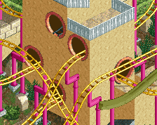
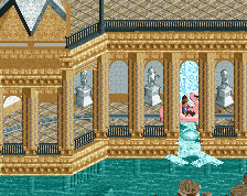
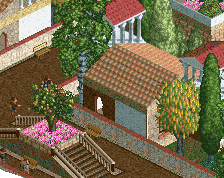
Coupon: I can see why, it's not the ordinary mine theme, as I explained in a comment on my other screen. But I think it's more mine-y than Faas' screen, which has a fucking castle for a station.
Shotguns: true, the Immelman is a bit too shielded off from the paths. In my mind there's path at the other side of the lake but of course anyone else wouldn't know that. A small design flaw in that regard.
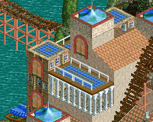
Another modern Efteling design is only a matter of time. There's plenty of rides left that I'd love to do! And don't think I ever build in one style at a time... I've got pre-RCT2 LL going on, modern LL, 2006 Dutch RCT2, 2005-6 NE style RCT2, modern RCT2... I want to try everything.
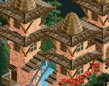
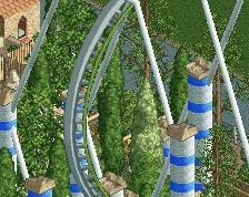
Very good Liam. Still developing that classic style you're sometimes going for. This smells like you may break the plateau.
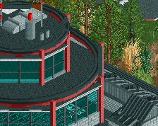
What doesn't work for me is the rock texture with black wood. Used like this it's almost always a visualiser for a theming element. You may even have gone for that. It's just that the rest of the ride is predominantly underthemed. Again, this may as well be intentional, and can be very nice indeed. Just here I feel it doesn't work together much as the design lacks clarity in the stylisations you chose. Try making it a bit more decisive.
 04-October 14
This is actually pretty awesome all around.
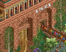
it doesnt really remind me of a mine
i prefer this screen more, but again feels a little dead. nice innelmann integration with the path but it's still enclosed in a bad way
lightening up the colors a bit may help, but i'd really want you to do is make something really representative of you skills but still taking inspiration from dutch style/efteling (e.g. python/hollander and piranha)
55%
I think this is ace. A simple LL atmosphere.
Edit: I should say, LLish atmosphere.
Coupon: I can see why, it's not the ordinary mine theme, as I explained in a comment on my other screen. But I think it's more mine-y than Faas' screen, which has a fucking castle for a station.
Shotguns: true, the Immelman is a bit too shielded off from the paths. In my mind there's path at the other side of the lake but of course anyone else wouldn't know that. A small design flaw in that regard.
Another modern Efteling design is only a matter of time. There's plenty of rides left that I'd love to do!
csw: Funny because this is RCT2. But thanks!
Leave me out of this!
Very good Liam. Still developing that classic style you're sometimes going for. This smells like you may break the plateau.
What doesn't work for me is the rock texture with black wood. Used like this it's almost always a visualiser for a theming element. You may even have gone for that. It's just that the rest of the ride is predominantly underthemed. Again, this may as well be intentional, and can be very nice indeed. Just here I feel it doesn't work together much as the design lacks clarity in the stylisations you chose. Try making it a bit more decisive.