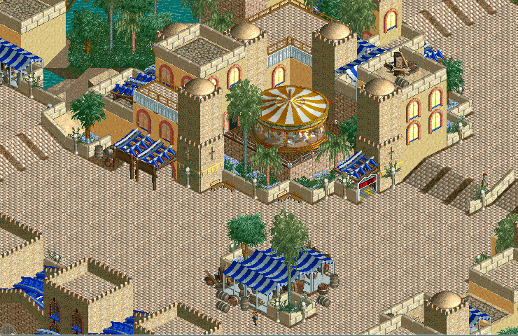
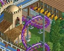
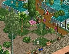
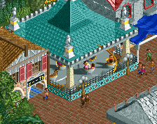
Whow, very nice! I don't really like the side-friction track though. It would look much better with a different type of track. This is really cool though!
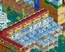
I really like it. It is really strong work. I would try and break up some of the path a bit more. It's nothing major, it's mainly because that path texture can be overpowering in large expanses.
That being said, I do like it when LL parks take advantage of large expanses of path.
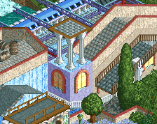
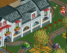
Really great use of the minigolf station for stall covers. As Steve suggested, add in a couple of planters and this is a perfect combination of breathing space, architecture, foliage, and interesting details.
I personally don't mind the side-friction coaster as awnings in this context, although I'd maybe consider a different colour to the white/blue combination you've got on the canvas just for an additional colour in the screen.
Don't listen to everyone saying to break up the paths. I think you are introducing a bold new aesthetic to this site, and it sets you apart. These path oceans are hardly an issue for me, in fact they allow your screens to breathe in a way that other large path screens don't.
I love it, great stuff, great improvement over a few weeks. I agree about the paths though. Large open paths are okay but here it seems like a lack of ideas rather than a stylistic choice. It's cool if you leave it like this but personally I think there's more you could do with it.
When I mentioned to break up the paths, it was just suggesting a palm tree here or something else there. I was only looking for 1x1 elements that would be more part of the path rather than separate the path off. The classic feel of the screen is down to the mass off path, I don't want that to go due to the path being broken up
The 'detail density' is not consistent when you compare the paths and the theming. A randomised path texture could work I think. A tile of crazy paving here and there. Just one in 10 tiles or something like that. More and the area will lose its cleanness... But I'm sure there are other options too.
 07-December 14
Whow, very nice! I don't really like the side-friction track though. It would look much better with a different type of track. This is really cool though!
I really like it. It is really strong work. I would try and break up some of the path a bit more. It's nothing major, it's mainly because that path texture can be overpowering in large expanses.
That being said, I do like it when LL parks take advantage of large expanses of path.
you've got to break up the path here a bit more. maybe add some colours like red too
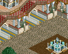
Very nice work.
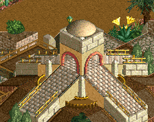
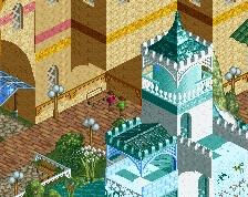
I like the path. The whole style is very old-school.
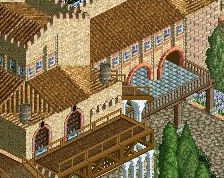
Pretty! What is that white texture under the canvas awnings?
Super pretty.
If you break up the path with some classy vegetation and flowers, you're looking at some classic LL spotlight material here. Great stuff.
Really great use of the minigolf station for stall covers. As Steve suggested, add in a couple of planters and this is a perfect combination of breathing space, architecture, foliage, and interesting details.
I personally don't mind the side-friction coaster as awnings in this context, although I'd maybe consider a different colour to the white/blue combination you've got on the canvas just for an additional colour in the screen.
Don't listen to everyone saying to break up the paths. I think you are introducing a bold new aesthetic to this site, and it sets you apart. These path oceans are hardly an issue for me, in fact they allow your screens to breathe in a way that other large path screens don't.
It's just so astonishing to me how someone pops up in 2014 and builds picture perfect classic LL style from back in the day like nothing.
I totally love this. And of course I agree with tigre53.
I love it, great stuff, great improvement over a few weeks. I agree about the paths though. Large open paths are okay but here it seems like a lack of ideas rather than a stylistic choice. It's cool if you leave it like this but personally I think there's more you could do with it.
When I mentioned to break up the paths, it was just suggesting a palm tree here or something else there. I was only looking for 1x1 elements that would be more part of the path rather than separate the path off. The classic feel of the screen is down to the mass off path, I don't want that to go due to the path being broken up
The 'detail density' is not consistent when you compare the paths and the theming. A randomised path texture could work I think. A tile of crazy paving here and there. Just one in 10 tiles or something like that. More and the area will lose its cleanness... But I'm sure there are other options too.