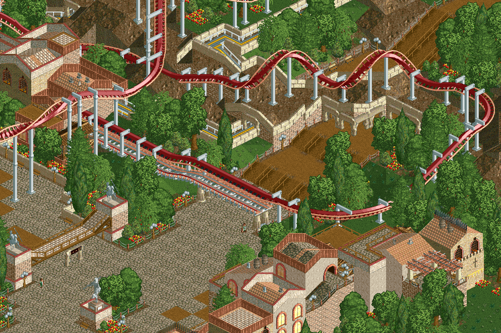
I love the smooth ending to this coaster. The only thing bothering me is that little dip in the brake run as I can't think of an invert that does that but I understand why it has to be there and it's a minor complaint.
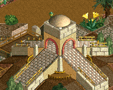
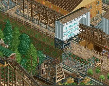
I love the queue by the way as well as your use of banner signs as archways. I know it's a standard LL trick but it works well here.
 06-January 15
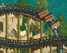
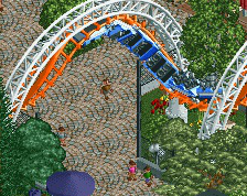
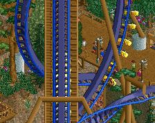
I love the smooth ending to this coaster. The only thing bothering me is that little dip in the brake run as I can't think of an invert that does that but I understand why it has to be there and it's a minor complaint.
I love the queue by the way as well as your use of banner signs as archways. I know it's a standard LL trick but it works well here.
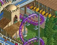
Not sold on the coaster's colours. The area needs some contrasts. Other than that, good composition! Coaster layout looks good as well.
Agree with Liampie, I also generally prefer coasters that stick out a little from their surroundings. Perhaps a magenta could work(?)
Love the use of mine train track in the bottom right.
Echoing intamin.
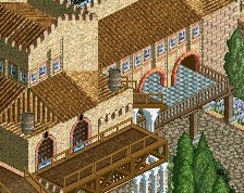
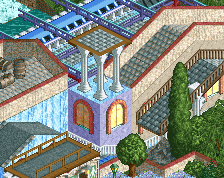
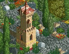
I totally love this. Captures the European Spanish feel very well.
I think the coaster colours need to pop, and the brake run needs to be level.
Apart from that, lovely work.
gawd, this is so brilliant.
BigB Offline
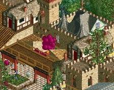
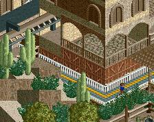
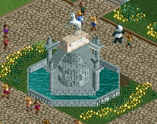
somehow the foliage convinces me most
Love this. Agreed about the brake run dip needing to go, and also about the colors needing to pop.
However the foliage is magnif and I love that path tunneling under the corskrew. Beautifully done.