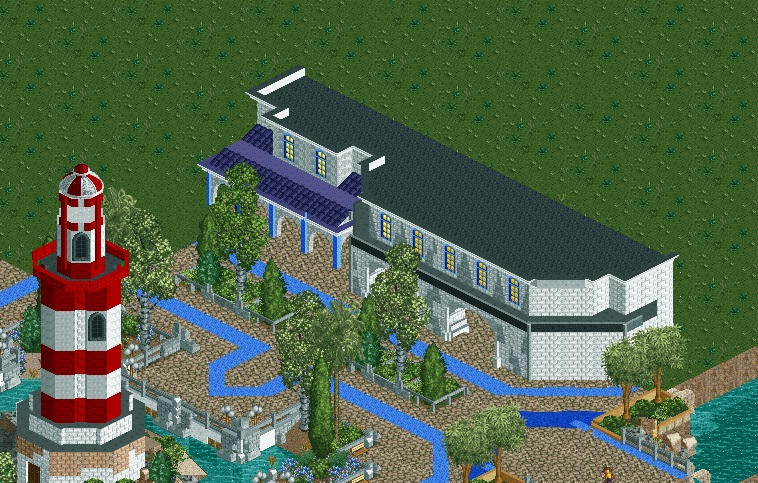
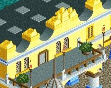
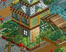
Very nice. I think you overused the corner brick pieces; stick with those only on the actual corners instead of making little pyramids in between windows, or at least use them more sporatically. I really like the purple roof.
On your previous screens I really stressed that I did not like the look of the blue path. However in this screen I really like it. Changed my mind. The purple roof is really nice, As previously mentioned. Black roof is a little boring. Overall great screen, this has peaked my interest. I hope you can keep producing at this level
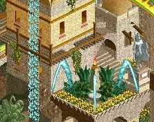
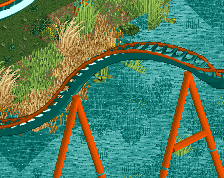
I still don't like the path but it works here better than it did around the lighthouse... maybe try removing it there and using it here so it's not overdone but it's still there for a level of visual interest in areas like this.
Then again it's your park and you seem to love that path so if you want it everywhere don't let me tell you otherwise. Overall though, very nice.
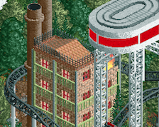
I would encourage you to really look into real life architectural examples to pull from for this space. Its a good start, but more convincing facades could do wonders.
The detailing into the retaining walls around the lighthouse are very nicely done! I've got to jump on the bandwagon with the blue path though, I think the screen would be better off without it.
 06-January 15
I think it looks plenty nice, maybe some roof stuff.
Very nice. I think you overused the corner brick pieces; stick with those only on the actual corners instead of making little pyramids in between windows, or at least use them more sporatically. I really like the purple roof.
hulkpower25 Offline
I still don't like the path but it works here better than it did around the lighthouse... maybe try removing it there and using it here so it's not overdone but it's still there for a level of visual interest in areas like this.
Then again it's your park and you seem to love that path so if you want it everywhere don't let me tell you otherwise. Overall though, very nice.
I would encourage you to really look into real life architectural examples to pull from for this space. Its a good start, but more convincing facades could do wonders.
The detailing into the retaining walls around the lighthouse are very nicely done! I've got to jump on the bandwagon with the blue path though, I think the screen would be better off without it.