I actually like this quite a bit. The viking theme is very clever and while it's a bit rectangular from this angle it looks like that's not the case on the other side so I really have no complaints.
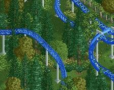
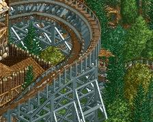
Love this. Especially that station. Two complaints though. First, is the queue entrance in that building with the sign that reads "snacks?" If so, I think you could find a better place for the entrance. Second, I don't like that helix with the square building at the bottom of the screen. I think that space would be better used if you took away the building and put trees/foliage there instead. That way it'd be more open and a little more realistic.
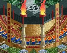
Some time ago I had a conversation with MCI about the planters you mentioned above. I'm not sure if it's already implemented but If my thoughts are right it was planned to do it like the planters in front of Paarthurnax .
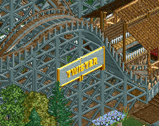
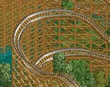
Architecture and foliage are decent, layout less so. Right-angle turns aren't particularly aesthetic when it comes to wooden coasters [or any coaster really]. I get that you want some airtime but there are nicer ways to do it I think.
 21-January 15
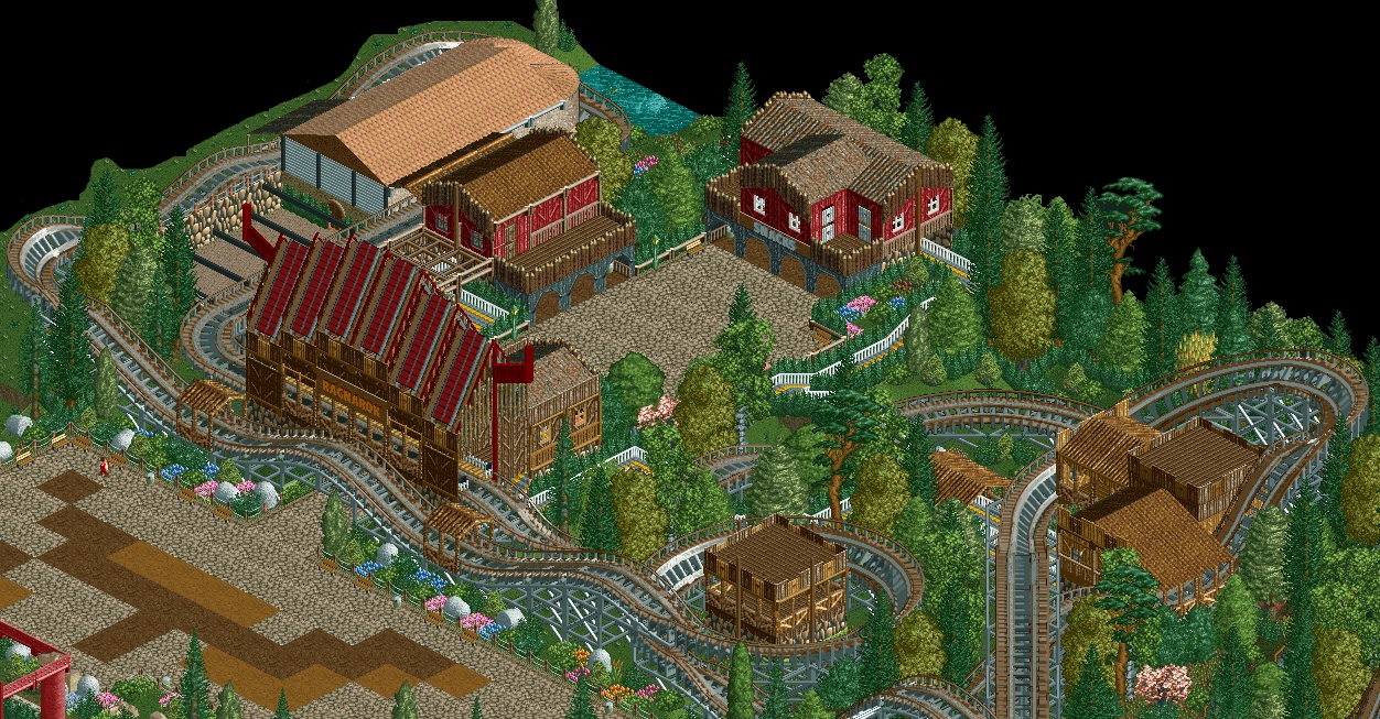
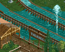
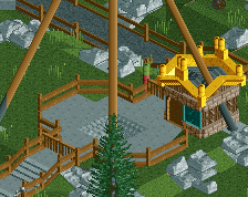
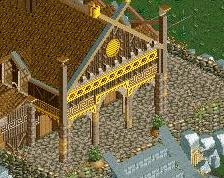
I actually like this quite a bit. The viking theme is very clever and while it's a bit rectangular from this angle it looks like that's not the case on the other side so I really have no complaints.
Love this. Especially that station. Two complaints though. First, is the queue entrance in that building with the sign that reads "snacks?" If so, I think you could find a better place for the entrance. Second, I don't like that helix with the square building at the bottom of the screen. I think that space would be better used if you took away the building and put trees/foliage there instead. That way it'd be more open and a little more realistic.
Glad you two liked it!
@RCT2day: The queue starts just outside the station and goes through the back of those two other buildings.
You´re probably right about the helix though.
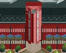
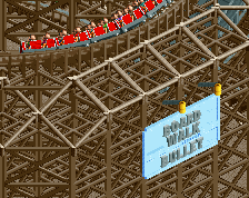
I don't like the mixture of path types at the bottom. I would put a planter or statue or something in it as well. The rest is nice.
BigB Offline
@poke:
Some time ago I had a conversation with MCI about the planters you mentioned above. I'm not sure if it's already implemented but If my thoughts are right it was planned to do it like the planters in front of Paarthurnax .
( latest screen in this topic http://rct2germany.d...=8&p=7618#p7618 )
B'B
Architecture and foliage are decent, layout less so. Right-angle turns aren't particularly aesthetic when it comes to wooden coasters [or any coaster really]. I get that you want some airtime but there are nicer ways to do it I think.