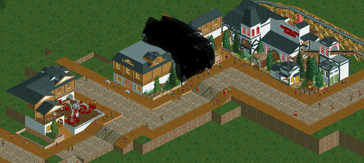
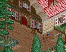
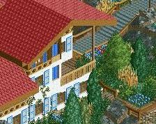
Although its very unfinished what you have is good, definitely has a distinct theme and atmosphere. Good detail and scale. The only thing you might improve on is the thresholds between the interior and exterior of buildings. The entrance in the center of the screen make s the walls look really thin and flimsy. But I'm being really picky, so its not a huge deal.
That is really picky, but its also so true! I love how much attention to detail goes in to the comments made on this site! I also like the theme here, it feels alpine to me so I would say a good practice exercise. I might try something like this myself actually.
The theme is coming across decently well, but to go along with what G Force said about the walls looking thin, also try to add some more depth to your buildings. Right now everything is very flat faced and 2 dimensional. Try experimenting with mixing up shapes and using 1/2, 1/4 and maybe even some 1/8 tile blocks to give your buildings more depth and variety. Good solid start tho!
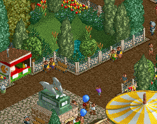
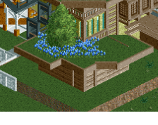
This is coming together very nicely. I like how you break up the otherwise mundane color scheme with flowers and foliage between the structures and the path and I'd like to see you do that around the flat as it's looking a bit bare.
That's my only minor suggestion, otherwise very nice.
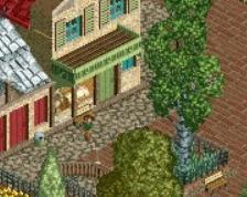
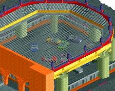
rather good, but a little soulless and rudimentary to really pique any interest. consider re-detailing the white structure too, it seems haphazardly done.
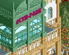
if this had some variety and was broken up into buildings that had a sense of life and form, i would enjoy this loads more
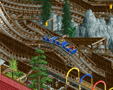
I made this to try out this kind of building style. It is not finished and it never will, but this was practice for me and I would like to recieve some feedback to improve myself.
The black stuff is just a very bad building, it was very bad.
 10-February 15
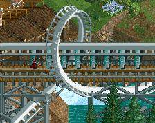
Although its very unfinished what you have is good, definitely has a distinct theme and atmosphere. Good detail and scale. The only thing you might improve on is the thresholds between the interior and exterior of buildings. The entrance in the center of the screen make s the walls look really thin and flimsy. But I'm being really picky, so its not a huge deal.
That is really picky, but its also so true! I love how much attention to detail goes in to the comments made on this site! I also like the theme here, it feels alpine to me so I would say a good practice exercise. I might try something like this myself actually.
The theme is coming across decently well, but to go along with what G Force said about the walls looking thin, also try to add some more depth to your buildings. Right now everything is very flat faced and 2 dimensional. Try experimenting with mixing up shapes and using 1/2, 1/4 and maybe even some 1/8 tile blocks to give your buildings more depth and variety. Good solid start tho!
This is coming together very nicely. I like how you break up the otherwise mundane color scheme with flowers and foliage between the structures and the path and I'd like to see you do that around the flat as it's looking a bit bare.
That's my only minor suggestion, otherwise very nice.
if this had some variety and was broken up into buildings that had a sense of life and form, i would enjoy this loads more