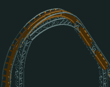
Screenshot / Monorail station
-
 15-February 15
- Views 2,249
- Fans 0
- Comments 9
-
Description
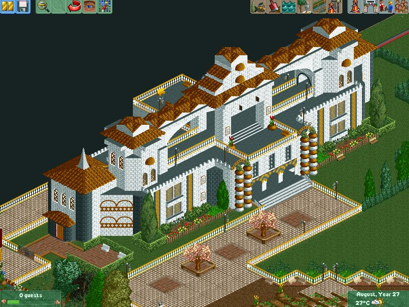
Monorail station at the parks entrance. Any ideas as to good fillers in the blank area to the bottom right of the screen? Would tree foliage be too intrusive here as it is the main entrance area to the park (the path which runs diagonally to the bottom of the screen is anyway.
-
Full-Size
-
No fans of this screenshot
-
Tags
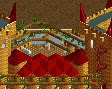
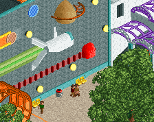
Seems a little elaborate to be a monorail station, especially with seemingly unnecessary multiple stories. Architecture itself is decent, but is really a little too close to the edge of the map in my opinion.
Foliage could work in the bottom right, but I'd go with predominantly flowers and maybe a statue or some other feature in the middle.
Also, don't feel obliged to border every single path with a fence.
Hmm, yeah I had wondered about the distance to edge of map, but something has to go on the edge right? Do you mean that foliage looks better at the edge of the map then. I do know what you mean though for sure. The upper stories are just for effect really, I wanted it to look elaborate though like an old school station feel. Yeah I think I will go with that a statue or feature sounds good. Yeah thanks I had feared I was over fencing the paths, will definitely ease up on that.
Thanks for tips.
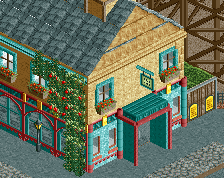
Also my other station for trains at the entrance what do you think of that any points for me to consider, again its close to the edge.
I like the second station better, seems more realistic and well executed to me, foliage could use some work though. I think the first screen could benefit from a wider platform, the whole structure seems a little narrow for how long it is. The colors could also use work, but that's probably preference.
It is more realistic, but the monorail station was supposed to be just an old style building really with oldish architecture for aesthetics I suppose. It it wider than it looks just the screen doesn't display it as well with the angle, but I'll ceratinly experiment in widening it further. Yeah they both need touching up in all areas as you say both foliage and colours but just wanted a heads up. Thanks lads.
White building looks way better in my opinion, but I agree with the Stoksy's critiques.
I don't really mind the style of the white station, but maybe it's because of this:
I prefer the second station though.
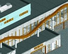
you might have just given me an idea for H2H7 gamma...
also really cool station amblerk! i definitely see fast improvement! the pink station looks quite cool though i do think that it could maybe look a bit grander like gamma's photo
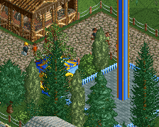
Wow, what a lovely looking station that is, in Sao Paolo it seems! I may take further inspiration from that to extend it slightly!
Thanks gdb good to know I am improving. I think my stations in the city park I made were better though!
Yeah I agree after seeing Gamma's photo I think I will go for a more grander approach which I was going for in the white one!