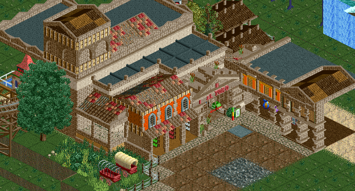
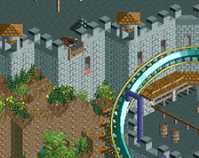
Screenshot / El Toro
-
 18-February 15
- Views 1,954
- Fans 2
- Comments 17
-
Description
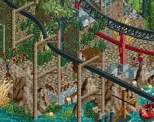
A small screenshot of a little design im currently working on. I know this is pretty unfinished, but i just want to know your opinions, because im not sure about that. On the one hand imo its not bad, but on the other hand this also could be a lot better. :D
I hope with your feedback I can improve it. :) -
Full-Size
-
2 fans Fans of this screenshot
-
Tags
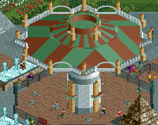
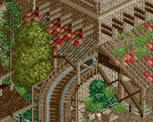
Wow! That's really nice. I could see people bitching about the changing roof textures but personally I love this.
EDIT: Using red brick path might go a long way to help break up the brown though.
Really like it!
Very brown.
I agree with Intamin , but I think it works pretty well. It`s a nice square and the Station of the woody is really nice.
Some colours and a bit brown works on this screen well.
Nice to see something from you
go on !
dibs.
awesome! i look forward to seeing you in H2H
Looks almost John-esque. I really like it, but it is way, way too brown.
double dibs.....oh, right, i'm not a captain
OHOHOHOHOHOH
I think thats pretty great. getting a good dark atmosphere so far, but thats easy to fuck up, so proceed with care!
Probably too brown but decent form. Not sure what's going on with the pole objects on top of the roof in the top.
The brick path suggestion is probably quite a good one.
Great convinving buildings, but I really do hate that oak tree.
I like the street part, but you waste potential at the tower. A tower is something that adds character to a building. In its current situation it is a too modest part. I suggest playing with the size and elements/materials. Maybe let it protrude a bit from the building. Also really remove that tree there.
Shitloads of potential here.
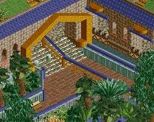
I really like the building on the right. Looks original and charming.
Thank you all for your comments. Dont expected so much positive feedback. But I also understand your improvement suggestions. Ill try to keep them in mind when i go on!