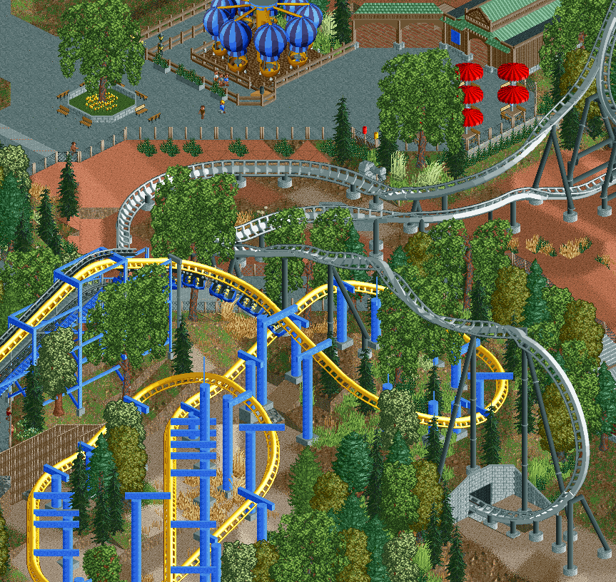
What little I can see of your archy on the top right there loks much improved. That was aleays your biggest weakness imo.
Foliage looks pretty nice, maybe a bit more variation low down, include some new colors.
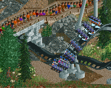
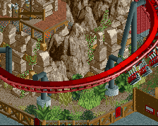
A bit of an overwhelming amount of that blue on the support work imo. Maybe change that up somehow? The way you've done the lifthill supports is fantastic though.
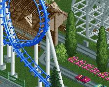
Full Throttle and its interaction with Falcon and the landscaping is very nice but the supports of Falcon are at the connection between the round tiles and the transverse stripes a bit ugly
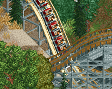
i love that whole screen, its just nice landscape and interaction. does really remind me of SFMM. just... don't slack off on the architecture, or it will get bare
Love the interaction. The lifthill from falcon is also really nice. Maybe change the one non-custom support after the lifthill? Don't know if that was intentional or not. And also some places seem a bit empty but that might just be me. Anyways looks really good.
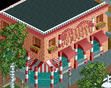
I'm loving the interaction, for sure. It's the highlight of this screen. The architecture reminds me of an underdeveloped Coupon. Foliage is real nice as well.
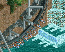
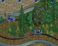
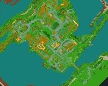
I'm afraid I'm not too keen on this. I haven't been to parks of this type IRL so can't comment on its accuracy, but there's something about the grey coaster that just looks awkward to me. The sparse pieces of foliage aren't to my liking either.
I do like the trees on the greener land though - I think they're well done - and the small building at the top is very neat.
As said, it may just be the actual location that isn't too attractive, but I feel that there's four different terrains here, and they don't settle nicely with each other.
*edit* Sorry, that's not very constructive. My only suggestion would be to add a little more greenery where possible (without straying too far from the intended look of the area)
 03-October 13
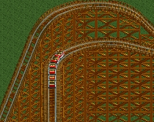
Foliage looks pretty nice, maybe a bit more variation low down, include some new colors.
A bit of an overwhelming amount of that blue on the support work imo. Maybe change that up somehow? The way you've done the lifthill supports is fantastic though.
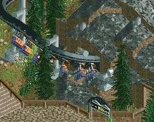
Ditch the chain link fence. It's ugly.
Coasters both look wicked. Stuck at it man.
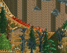
The first barrel roll of Full Throttle seems undersupported. Otherwise really nice and decent work.
Full Throttle and its interaction with Falcon and the landscaping is very nice but the supports of Falcon are at the connection between the round tiles and the transverse stripes a bit ugly
i love that whole screen, its just nice landscape and interaction. does really remind me of SFMM. just... don't slack off on the architecture, or it will get bare
I can't help but wish that the drop on Falcon wrapped around the loop of Full Throttle. It still looks great regardless, though.
Love the interaction. The lifthill from falcon is also really nice. Maybe change the one non-custom support after the lifthill? Don't know if that was intentional or not. And also some places seem a bit empty but that might just be me. Anyways looks really good.
I'm loving the interaction, for sure. It's the highlight of this screen. The architecture reminds me of an underdeveloped Coupon. Foliage is real nice as well.
I'd consider changing out the mesh fence.
Good but too ultra-realistic-sterile.
I'm afraid I'm not too keen on this. I haven't been to parks of this type IRL so can't comment on its accuracy, but there's something about the grey coaster that just looks awkward to me. The sparse pieces of foliage aren't to my liking either.
I do like the trees on the greener land though - I think they're well done - and the small building at the top is very neat.
As said, it may just be the actual location that isn't too attractive, but I feel that there's four different terrains here, and they don't settle nicely with each other.
*edit* Sorry, that's not very constructive. My only suggestion would be to add a little more greenery where possible (without straying too far from the intended look of the area)