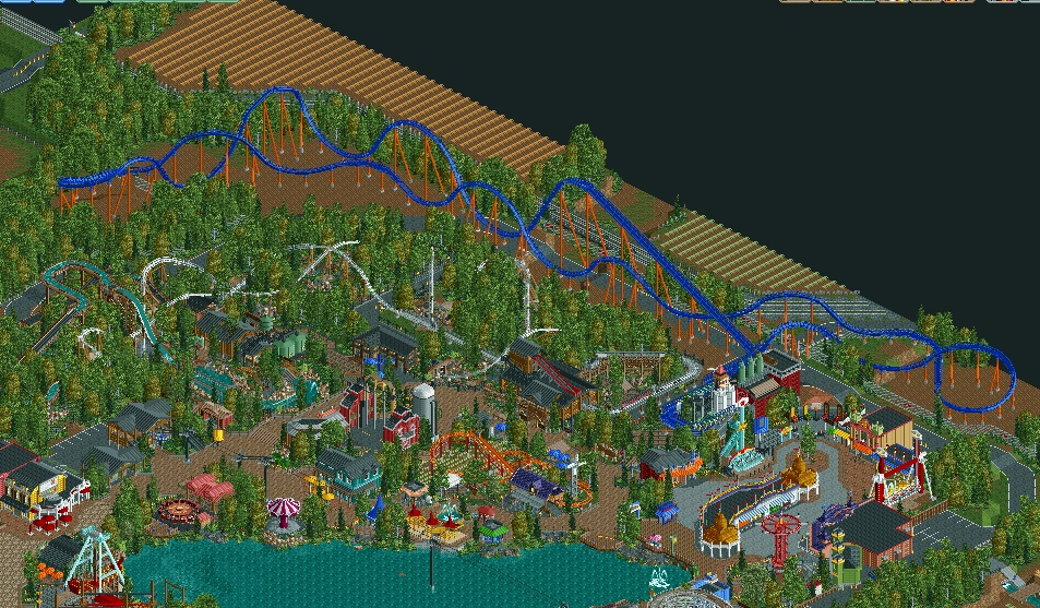
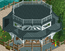
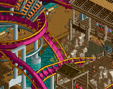
Screenshot / Final screen of BLAP
-
 04-November 15
-
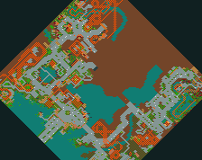
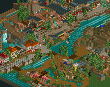
Baker Lake Amusement Park
-
23 of 28
- Views 2,601
- Fans 1
- Comments 14
Community Forum Software by IP.Board
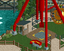


Is that an entrance hut I see? 0/10 b/c unfinished, rest 10/10
Holy shit! No way. Can't wait for this release...
LOVE it.
Looks shit, start over
Hey this isn't Robbie here.
more like BLEH amirite
^lol.
Seriously though, it'll be great to finally see this finished.
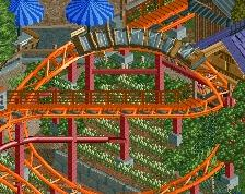
I still reckon the hyper looks tiny
but excited nonetheless
I don't think the hyper fits one bit.
But hey ho.
Rest is good.
If it's set anywhere in North America, that hyper setting is right at home. That's exactly how lots of new, big rides get made. Excess area on the park perimeter and even sometimes into the parking lot (SCREAM!) or along a highway (Goliath) is what's used up. From a realistic, I-can-see-myself-walking-around-this-place stand-point, I'm inclined to say it's basically perfect.
I didn't necessarily mean realistically, I meant visually, aesthetically and in RCT terms.
Realistically, yeah sure, but I still think it has to look right visually in RCT, this doesn't, to me at least.
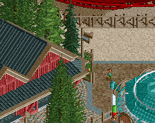
I agree with Louis here. It really throws off the rest of the areas, I feel. Slapped in, but not just in a park-planning method. Maybe if there was some better integration with foliage into the landscape (like freshly-planted young trees or recently-placed hedges and bushes), it would fit a bit better, but right now, it just seems like you cleared out a chunk of your park with the clear scenery tool and placed a standard hyper layout it. There's a difference between making it new and just making it look unfinished. It stands out too much from an RCT parkmaking standpoint and not enough from a realistic viewpoint. Perhaps think about making the entrance area seem newer and grander, which would make it seem like they created a new plaza entrance for their new headlining attraction; right now, the queue and station sink into the background, which is the opposite of what the biggest coaster in the park should be.
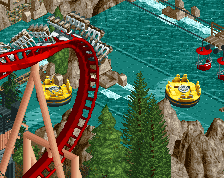
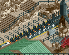
The rest of the park is great and has a pretty good execution on the macro and micro scales, but Tempesto and it's associating surroundings, details, and execution are falling flat compared to the rest and it's glaring.
awesome stuff man!