Holy shit, agreed with Kyle. This is fucking fantastic. Some thoughts for you, Liam:
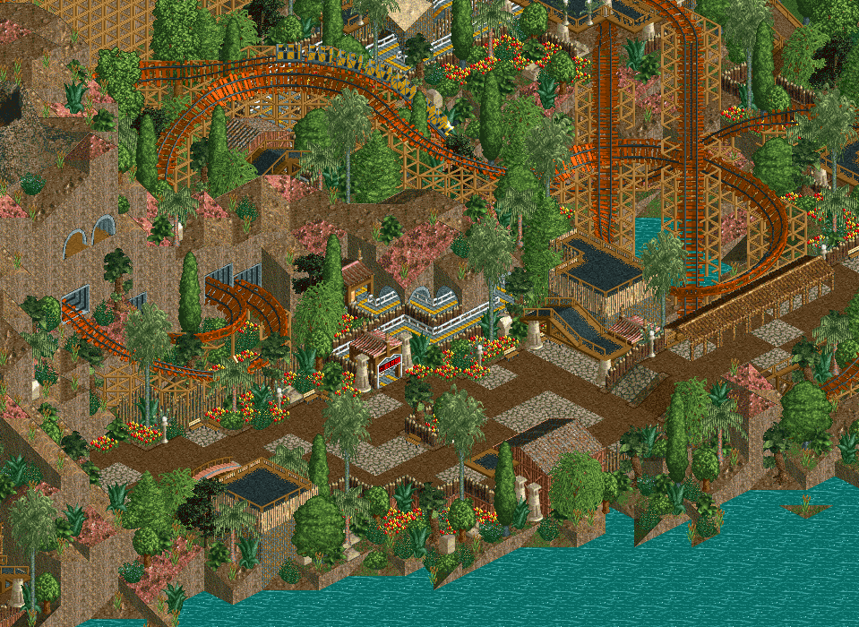
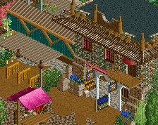
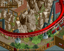
Have you tried just the brown path or crazy path instead of mixing them? Could clean things up a bit. This area isn't exactly "messy" from what I can tell, but it does seem like a lot is going on so it could balance things out.
This is very nitpicky, but delete that short palm tree on the mountain up there. Stick to the short shrubbery for high elevations.
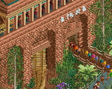
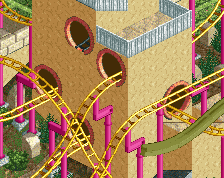
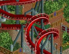
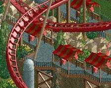
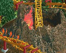
Otherwise this is great. Those swooping turns out of the mountain are sick. Colors on the mine train are as well. And the black dirt paths as roofing are really striking a nice chord here. All around probably my favorite thing you've done in LL.
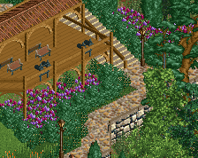
I think the log path covering on the right is a bit too long. You might need some more peach hints so the wooden track at the bottom doesn't look so out of place.
Wow, this response is super flattering! If I want to win spotlight with LL, Giari Palms is probably my only chance for the next few years. I want to make it good. I just started this area last week and wasn't sure if it'd be good enough for a spotlight attempt, but with the screen sitting at 92% right now I can relax, I guess. Great!
Steve: I tried all brown today, and I didn't like the look of it much. Will try again with crazy paving, but don't get your hopes up. Palm tree is gone.
Poke: I could get rid of one piece of the wooden bridge cover, it does look slightly better now so thanks for the suggestion! Also, this is the low density half of the area, the other half is much more dense and even slightly late-nateloxian. The architecture and theming in the screen echoes a lot of stuff going on in the other half, so it makes sense in context. As for the colours, I've been playing around with that a lot. Can't decide between yellow and peach (leaning towards yellow, which was the original colour), and alex was pro-orange when I showed him the park.
Beautiful and so well composed. Excellent use of the red ground tiles to bring a real warmth to the area whilst still maintaining a rocky look. I love the way the colourful flowers are spilling onto the path, and the whole foliage mix in general. Really lovely stuff.
Tbh, I'm also not feeling those colors for that track. Personally I would go for the more traditional style of mine train track colors, but that is just my opinion. Everything else is gucci though! Oh, and keep the palm tree's there adorbs.
 12-December 15
Holy shit, agreed with Kyle. This is fucking fantastic. Some thoughts for you, Liam:
Have you tried just the brown path or crazy path instead of mixing them? Could clean things up a bit. This area isn't exactly "messy" from what I can tell, but it does seem like a lot is going on so it could balance things out.
This is very nitpicky, but delete that short palm tree on the mountain up there. Stick to the short shrubbery for high elevations.
Otherwise this is great. Those swooping turns out of the mountain are sick. Colors on the mine train are as well. And the black dirt paths as roofing are really striking a nice chord here. All around probably my favorite thing you've done in LL.
I think the log path covering on the right is a bit too long. You might need some more peach hints so the wooden track at the bottom doesn't look so out of place.
BigB Offline
Awesome, as said above.
Nevertheless, I miss a colour that really sticks out of it.
9/10. Stick with just brown path.
Steve: I tried all brown today, and I didn't like the look of it much. Will try again with crazy paving, but don't get your hopes up. Palm tree is gone.
Poke: I could get rid of one piece of the wooden bridge cover, it does look slightly better now so thanks for the suggestion! Also, this is the low density half of the area, the other half is much more dense and even slightly late-nateloxian. The architecture and theming in the screen echoes a lot of stuff going on in the other half, so it makes sense in context. As for the colours, I've been playing around with that a lot. Can't decide between yellow and peach (leaning towards yellow, which was the original colour), and alex was pro-orange when I showed him the park.
BigB: disagree with you on that one, sorry.
][ntamin: no :(
Mine train track in colors that arent brown is always appealing.
Also, what a name.
What I love most is the train color .
Yeah, this is A+ work
Beautiful and so well composed. Excellent use of the red ground tiles to bring a real warmth to the area whilst still maintaining a rocky look. I love the way the colourful flowers are spilling onto the path, and the whole foliage mix in general. Really lovely stuff.
Tbh, I'm also not feeling those colors for that track. Personally I would go for the more traditional style of mine train track colors, but that is just my opinion. Everything else is gucci though! Oh, and keep the palm tree's there adorbs.
Super nice Liam.
Tried Mini Golf over Suspended Monorail? Or are you going for the true oldschool look with oldschool methods?
I approve.